
Tip
A Tip is a window that can be placed relative to a Field and keep its position. It can be used to indicate an action that the user should take or that the robot is working on something related to that UI element. It has a smallish to configure the behaviour and appearance of the displayed window.
To show a tip invoke the tip function on a Field instance. In the simplest case you can supply the text to be shown:
Fields.MiddleButton.tip("I am a tip");

// You can then access all tips shown on a Field via the `tips` property
Fields.MiddleButton.tips[0].text = "New text";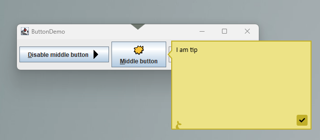
If you want more control over the appearance you should provide an object as argument to tip. E.g. to control the size of the tip window:
Fields.MiddleButton.tip({ text: "I am a tip", width: 150, height: 100 });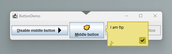
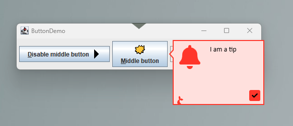
Or to change the color and/or display an icon:
Fields.MiddleButton.tip({
  text: "I am a tip",
  width: 200,
  height: 150,
  color: "MistyRose",
  icon: "BellSolid",
});
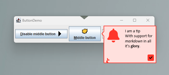
Markdown
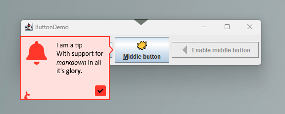
The text displayed in the tip window can be formatted with markdown.
Fields.MiddleButton.tip({
  text: "# I am a tip\nWith support for *markdown* in all its **glory**.",
  width: 200,
  height: 150,
  color: "MistyRose",
  icon: "BellSolid",
});
Placement
Use the pointing property to provide a preferred location of the tip window relative to the Field to which it is anchored. The tip will re-position itself if it extends beyond the screen bounds.
Fields.MiddleButton.tip({
  text: "# I am a tip\nWith support for *markdown* in all its **glory**.",
  width: 200,
  height: 150,
  color: "MistyRose",
  icon: "BellSolid",
  pointing: "right",
});
Buttons
If you need the user to interact with the field you can set the buttons property.
var t = Fields.MiddleButton.tip({
  text: "# I am a tip\nWith support for *markdown* in all its **glory**.",
  width: 200,
  height: 150,
  color: "MistyRose",
  icon: "BellSolid",
  pointing: "right",
  buttons: [
    {
      value: "OK",
      foregroundColor: "White",
      backgroundColor: "Green",
      isDefault: true,
    },
    { icon: "SadCrySolid", backgroundColor: "Yellow", isCancel: true },
  ],
});

if (t.wait(10000) == "OK") {
  // user clicked ok within 10s
}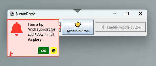
Then you can .wait() on the field and the return value from this invocation will give you the button value or null if timed out or the tip was otherwise closed.
Re-use tips
Tip configurations can be re-used if you e.g. want to display the same information on multiple fields.
var t = Fields.MiddleButton.tip("I am tip");
Fields.DisabledButton.tip(t);
// Update text in both tip windows
t.text = "I am a tip shown twice";
Tip API
Properties
text(string) the (markdown) text to displaypointing(string) whether to point the tip on theleft,right,toporbottomside (defaultleftcolor(string) the color to use as background (the text, icon and border colors will adjust automatically) (defaultKhaki) – see Sticky action colorsicon(string) an optional icon to be displayed (default ´None´) – see Sticky action iconswidth(int) the width of the tip windowheight(int) the height of the tip windownoFin(bool) set totrueto hide the Manatee icontimeout(int) how long to show the tip (default300000= 5 min)isVisible(bool) returns whether or not the field is currently visible (cannot be altered)buttons(array) an array of buttons to show, each button can have the following properties:valuethe text to display on the buttoniconan optional icon to showforegroundColorthe color of the text and iconbackgroundColorthe color of the button backgroundisDefaultto provide an emphasis on the buttonisCancelwhich automatically closes the tip when shown
Methods
closecloses all tip windows displaying this tip