
Dialog
The dialog object contains methods for presenting the user with information or requesting information from the user at runtime.
Dialogs and unattended flows
No dialog is shown when Manatee runs unattended - either because the OperatedByHuman setting is off or because the flow itself is marked as unattended. The call returns immediately with the same result as a cancelled dialog, which means it throws unless you pass throws: false.
Info dialog
Shows a blue information dialog with an OK button. The flow does not proceed until the user has clicked OK. Options is an optional parameter.
Parameters
headeris the title of the dialogtextis the text content shownoptionsis a JavaScript object, supported properties:buttonsis an array of buttons to display in the bottom part of the dialogtimeoutthe number of seconds after which the dialog auto-closes. A dialog that closes this way counts as cancelled, so it throws unlessthrowsisfalse. A countdown is shown to the user while the timer runs.sounda string (one ofasterisk,beep,exclamation,hand,question) which indicates a system sound to play once the dialog is shownthrowsa boolean indicating whether to throw an exception if the dialog was cancelled - default istruedialogPositionTopan indication of the placement of the dialog (in pixels from the top of the screen)dialogPositionLeftan indication of the placement of the dialog (in pixels from the left of the screen)topMost(boolean, defaulttrue) should the sticky be shown top-mostmarkdownwhether or not thetextis formatted using markdown (defaultfalse)
The buttons array consists of button objects with the following properties:
valuethe text to display on the button (should be unique for a dialog)isDefault(boolean) a true/false value indicating whether or not this button is the default (i.e. will be activated on the enter-key) - should only be set totruefor one button per dialog – default isfalseisCancel(boolean) indicating whether or not the button should cancel the dialog – default isfalsebypassValidation(boolean) for input dialogs, close the dialog and return the values entered so far without validating them – default isfalseforegroundColor(string) a color to display the text of this button inbackgroundColor(string) a background color for the button
The default value for buttons is an “OK” button:
[{ value: "OK" }];The button clicked will be available as a property named button on the return value from the dialog. If the user clicks a cancel button then an exception is thrown.
Example
Dialog.info("Hello", "This is some text to be shown.", {});With options:
Dialog.info("Hello", "Some text - I will max be shown for 10 secs.", {
  timeout: 10,
});
With pre-defined buttons:
var r = Dialog.info(
  "Hello",
  "Do you want to continue",
  { timeout: 10
  , buttons: [
      { 'value': 'No', 'isCancel': true },
      { 'value': 'Maybe' },
      { 'value': 'Yes' },
    ]
  }
);
if (r.button == 'Yes') {
  // user answered yes - we can continue
  ...
}
Warn dialog
Shows a red warning dialog to the user with an OK button. Similar to the info dialog, but red. Options is an optional parameter.
Parameters
headeris the title of the dialogtextis the text content shownoptionsis a JavaScript object, supported properties:buttonsis an array of buttons to display in the bottom part of the dialog (see info-dialog for further information)timeoutthe number of seconds after which the dialog auto-closes, as for the info dialogsounda string (one ofasterisk,beep,exclamation,hand,question) which indicates a system sound to play once the dialog is shownthrowsa boolean indicating whether to throw an exception if the dialog was cancelled - default istruedialogPositionTopan indication of the placement of the dialog (in pixels from the top of the screen)dialogPositionLeftan indication of the placement of the dialog (in pixels from the left of the screen)topMost(boolean, defaulttrue) should the sticky be shown top-mostmarkdownwhether or not thetextis formatted using markdown (defaultfalse)
Example
Dialog.warn(
  "Warning!!",
  "This is some text to be shown. Consider yourself warned.",
);

// Do not throw an exception when dialog is cancelled
Dialog.warn("Take heed", "You may enter at your peril", { throws: false });
Input dialog
Shows a dialog into which the user may input data. The type of data which can be input is determined by the options parameter.
Parameters
headeris the title of the dialogtextis the text content shownoptionsis a JavaScript object which determines the input the user should provide. Each property on the object is one input the user must provide. The name of each property is used when returning the results. It can also contain the following properties which affect the dialog itself:buttonsis an array of buttons to display in the bottom part of the dialog (see info-dialog for further information)throwsa boolean indicating whether to throw an exception if the dialog was cancelled - default istruesubmitOnValidationis a boolean flag that determines whether or not the dialog will be automatically submitted when all fields validate - or notmaxDialogWidth/maxDialogHeight(int) change the default maximum width and height for the window,promptWidthsets the width of the label/prompt for every input in the dialog. Each input can override it. Default is150.sounda string (one ofasterisk,beep,exclamation,hand,question) which indicates a system sound to play once the dialog is showndialogPositionTop/dialogPositionLeft(int) to change the default position of the dialog. Note that if one of these properties are set then the dialog will be positioned on the main display.foregroundColorandbackgroundColorcan be used to set the overall colors for the dialog (use html/hex encoded strings)onlyValidateOnSubmitwill when set totruenot do any validation until the dialog is submitted (defaultfalse)topMost(boolean, defaulttrue) should the dialog be shown top-mostmarkdownwhether or not thetextis formatted using markdown (defaultfalse)
savedInputsis an optional fourth argument holding the result of a previous display of the dialog - this can be used to pre-fill the dialog with inputs already filled. See Resuming from a partially filled-in form.
The names above are reserved: a property with one of those names is never turned into an input. timeout is reserved too, but the input dialog does not act on it - an input dialog cannot be made to close on a timer.
The result object
Dialog.input returns an object with one property per input, named after the property that declared the input, plus a button property holding the text of the button the user clicked. The type of each value depends on the input type:
| input type | value |
|---|---|
NUMERIC | a number, or NaN if the field could not be parsed |
DATE, DATETIME | a string with the formatted date, carrying a dateValue property with the corresponding Date object |
CHECKBOX | an array of the values of the checked options |
MULTITEXT | an object with one property per entry in texts, keyed by its name |
TYPEAHEAD | the whole selected object, or the string itself when selectFrom is a list of strings |
TABLE | an array of row objects, keyed by column name |
LISTOF | an array of objects, one per item, each holding the values of that item’s template inputs |
| everything else | a string |
Inputs given as complex objects
If the value of a property of options is either a complex object or a function it is treated as an input element. If you supply an object then the following properties are available to specify:
Each input should contain the following variables:
typeto determine which UI element to display - see options for input types belowdependsOnis an expression that determines when this input should be shown. You can either specify the name of another property - in which case the input will be shown if the other property has a value, or you can specify a<name-of-other-property>=<value>type string - in which case the input will be shown if the other property has the given value. IfdependsOnis empty the input will always be shown. Using a~instead of=in the expression will cause the value to be interpreted as a regular expression (from 1.8.0).
Optionally the following properties may be specified as well:
promptis the text which is displayed as an hint to the user for this option.promptWidthsets the width of the label/prompt for this input, overriding the dialog-widepromptWidth.resetOnHidedetermines whether to clear the value of the input when it is hidden because a dependency fails (default isfalse)showCopyToClipboardButtonadds a button next to the input that copies its current value to the clipboard (default isfalse)
An example of an input dialog with a few objects is:
Dialog.input("header goes here", "text goes here", {
  myTextInput: {
    prompt: "Input text here",
    type: "TEXT",
    value: "Default value",
  },
  anotherInput: {
    prompt: "Another prompt",
    type: "PASSWORD",
  },
});
This will display a dialog with two inputs, one for text and one for password.
Inputs given as functions
If the value of an option is a function then that function is invoked with the current state of the form allowing you to build complex interacting elements. The following example demonstrates this by having the properties of the RADIO input determined by the previous inputs.
Dialog.input("header goes here", "text goes here", {
  radioOptions: {
    prompt: 'Options separated by ","',
    type: "TEXT",
    value: "a,b,c",
  },
  radioPrompt: {
    prompt: "The prompt for the radio",
    type: "TEXT",
    value: "Radio",
  },
  radioPromptWidth: {
    prompt: "The prompt width for the radio",
    type: "TEXT",
    value: "150",
  },
  radioOrientation: {
    prompt: "Orientation",
    type: "RADIO",
    selectBetween: ["vertical", "horizontal"],
  },
  radioTableLayout: {
    prompt: "Table layout",
    type: "MULTITEXT",
    texts: [
      { name: "columns", prefix: "Columns", value: "0" },
      { name: "rows", prefix: "Rows", value: "0" },
    ],
  },
  radioVisible: {
    prompt: "Show RADIO",
    type: "RADIO",
    selectBetween: ["No", "Yes"],
    value: "No",
  },
  d: { type: "DIVIDER" },
  radio: function (s) {
    return {
      prompt: s.radioPrompt,
      selectBetween: s.radioOptions && s.radioOptions.split(","),
      orientation: s.radioOrientation,
      promptWidth: parseInt(s.radioPromptWidth || "150"),
      columns: parseInt(
        (s.radioTableLayout && s.radioTableLayout.columns) || "0",
      ),
      rows: parseInt((s.radioTableLayout && s.radioTableLayout.rows) || "0"),
      dependsOn: s.radioVisible == "Yes",
      type: "RADIO",
    };
  },
});
When you run this flow you can use the inputs above the divider to control the appearance of the RADIO. The dependsOn property can be set to a boolean value to do complex dependency validations.
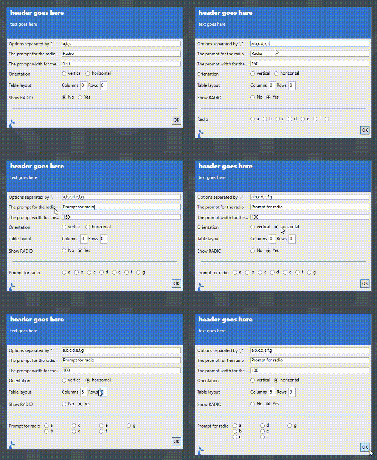
The properties of each option item depends on the value of its type.
TEXT input type
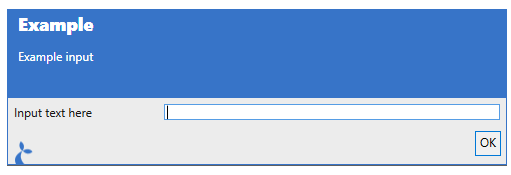
The TEXT input type displays a simple text input.
Dialog.input("Example", "Example input", {
  foo: {
    type: "TEXT",
    prompt: "Input text here",
  },
});
When run, this will display as:
You can specify the following properties:
promptis the text to display to the left of the actual input.promptAlignmentis the alignment the prompt should follow. Available options are: “Center”, “Justify”, “Left” (default), “Right”.toolTipis a text to display when the user hovers the mouse over the input field.helpTextwill display a “?” that when hovered will show the text given here.valueis an optional default value for the input.prefixandsuffixare texts to be shown before and after the input field.focusis whether to focus this field - if multiple fields have focus set to true then the last one will be focused.multilinewhether multiple lines are allowed (defaultfalse).masksee theMASKEDinput type for details. Settingmaskon aTEXTinput turns it into aMASKEDinput.validationis a validation object (see below).enableda boolean to indicate whether or not the input field can be changed by the user (defaulttrue).
NUMERIC input type
The NUMERIC input type allow allows for numbers to be input.
It can be configured with the following properties:
promptis the text to display to the left of the actual input.promptAlignmentis the alignment the prompt should follow. Available options are: “Center”, “Justify”, “Left” (default), “Right”.toolTipis a text to display when the user hovers the mouse over the input field.helpTextwill display a “?” that when hovered will show the text given here.maxthe maximum number it will allow (default is a very large number)minthe minimum number (default is a very large negative number)incrementhow much each up/down on the field should increment/decrement the current value (default is 1)decimalshow many decimals are shown (default is 0)separateThousandswhether to show a separator between thousands (default false)enableda boolean to indicate whether or not the input field can be changed by the user (defaulttrue).
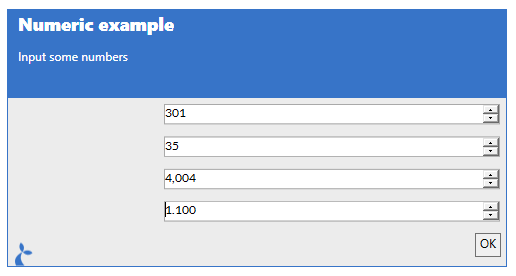
For example:
Dialog.input("Numeric example", "Input some numbers", {
  // Increment/decrement 100 each time up/down is selected
  num1: {
    type: "NUMERIC",
    increment: 100,
  },

  // Set limits and increment size
  num2: {
    type: "NUMERIC",
    increment: 10,
    min: 5,
    max: 89,
  },

  // Show e.g. 1.000 instead of 1000
  num3: {
    type: "NUMERIC",
    increment: 1001,
    separateThousands: true,
  },

  // Show 0.000 and increment w 0.01
  num4: {
    type: "NUMERIC",
    increment: 0.01,
    decimals: 3,
  },
});
Which will be displayed as:
MASKED input type
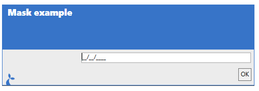
The MASKED input type is a way to provide a pre-formatted text field for the user. It is often used for dates or other types of structured input. It is configured similarly to a TEXT field but has a mask property;
...
m: {
  type: "MASKED",
  mask: "00/00/0000"
},
...
alternatively adding the mask property to a TEXT input will have the same effect;
...
m: {
  type: "TEXT",
  mask: "00/00/0000"
},
...
To display as:
The format of the mask property can be found at https://docs.microsoft.com/en-us/dotnet/api/system.windows.forms.maskedtextbox.mask?view=netcore-3.1 and re-created here:
| Masking element | Description |
|---|---|
| 0 | Digit, required. This element will accept any single digit between 0 and 9. |
| 9 | Digit or space, optional. |
| # | Digit or space, optional. If this position is blank in the mask, it will be rendered as a space in the Text property. Plus (+) and minus (-) signs are allowed. |
| L | Letter, required. Restricts input to the ASCII letters a-z and A-Z. This mask element is equivalent to [a-zA-Z] in regular expressions. |
| ? | Letter, optional. Restricts input to the ASCII letters a-z and A-Z. This mask element is equivalent to [a-zA-Z]? in regular expressions. |
| & | Character, required. If the AsciiOnly property is set to true, this element behaves like the “L” element. |
| C | Character, optional. Any non-control character. If the AsciiOnly property is set to true, this element behaves like the “?” element. |
| A | Alphanumeric, required. If the AsciiOnly property is set to true, the only characters it will accept are the ASCII letters a-z and A-Z. This mask element behaves like the “a” element. |
| a | Alphanumeric, optional. If the AsciiOnly property is set to true, the only characters it will accept are the ASCII letters a-z and A-Z. This mask element behaves like the “A” element. |
| . | Decimal placeholder. The actual display character used will be the decimal symbol appropriate to the format provider, as determined by the control’s FormatProvider property. |
| , | Thousands placeholder. The actual display character used will be the thousands placeholder appropriate to the format provider, as determined by the control’s FormatProvider property. |
| : | Time separator. The actual display character used will be the time symbol appropriate to the format provider, as determined by the control’s FormatProvider property. |
| / | Date separator. The actual display character used will be the date symbol appropriate to the format provider, as determined by the control’s FormatProvider property. |
| $ | Currency symbol. The actual character displayed will be the currency symbol appropriate to the format provider, as determined by the control’s FormatProvider property. |
| < | Shift down. Converts all characters that follow to lowercase. |
| > | Shift up. Converts all characters that follow to uppercase. |
| | | Disable a previous shift up or shift down. |
| \ | Escape. Escapes a mask character, turning it into a literal. “\” is the escape sequence for a backslash. |
| All other characters | Literals. All non-mask elements will appear as themselves. Literals always occupy a static position in the mask at run time, and cannot be moved or deleted by the user. |
PASSWORD input type
Use this input type to display a text input where the input value is not visible, e.g. a password.
Dialog.input("Example", "Example input", {
  foo: {
    type: "PASSWORD",
    prompt: "Input password here",
  },
});
When run, this will display as:
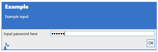
You can specify the following properties:
promptis the text to display to the left of the actual input.promptAlignmentis the alignment the prompt should follow. Available options are: “Center”, “Justify”, “Left” (default), “Right”.toolTipis a text to display when the user hovers the mouse over the input field.helpTextwill display a “?” that when hovered will show the text given here.valueis an optional default value for the input.prefixandsuffixare texts to be shown before and after the input field.focusis whether to focus this field - if multiple fields have focus set to true then the last one will be focused.validationis a validation object (see below).enableda boolean to indicate whether or not the input field can be changed by the user (defaulttrue).
FILE input type
Use this input type to allow the user to pick a file.
Dialog.input("Example", "Example input", {
  foo: {
    type: "FILE",
    prompt: "Choose a file",
  },
});
When run and the user clicks the “…” button, this will display as:
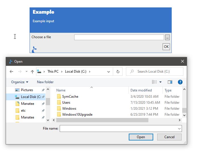
You can specify the following properties:
promptis the text to display to the left of the actual input.promptAlignmentis the alignment the prompt should follow. Available options are: “Center”, “Justify”, “Left” (default), “Right”.toolTipis a text to display when the user hovers the mouse over the input field.helpTextwill display a “?” that when hovered will show the text given here.valueis an optional default value for the inputfocusis whether to focus this field.validationis a validation object (see below).enableda boolean to indicate whether or not the input field can be changed by the user (defaulttrue).
FOLDER input type
Like FILE, but the “…” button opens a folder browser instead of a file browser.
Dialog.input("Example", "Example input", {
  foo: {
    type: "FOLDER",
    prompt: "Choose a folder",
  },
});
It supports the same properties as the FILE input type.
DATE input type
Allow the user to input or select a date.
Dialog.input("Example", "Example input", {
  foo: {
    type: "DATE",
    prompt: "Choose a date",
  },
});
Will display as:
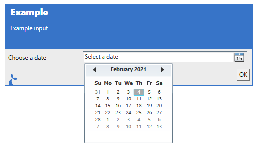
You can specify the following properties:
promptis the text to display to the left of the actual input.promptAlignmentis the alignment the prompt should follow. Available options are: “Center”, “Justify”, “Left” (default), “Right”.toolTipis a text to display when the user hovers the mouse over the input field.helpTextwill display a “?” that when hovered will show the text given here.valueis an optional default value for the input - this may be a javascript Date object or a string formatted as a datefocusis whether to focus this field.validationis a validation object (see below).enableda boolean to indicate whether or not the input field can be changed by the user (defaulttrue).
The return value is a special string with the formatted date as its value. It furthermore contains a property dateValue which holds the date chosen as a proper Date object.
DATETIME input type
Allow the user to input or select a date and/or a time.
Dialog.input("Example", "Example input", {
  dt1: {
    type: "DATETIME",
    notBefore: new Date("August 19, 1975 23:15:30"),
    notAfter: new Date("August 19, 2025 23:15:30"),
  },
  dt2: {
    type: "DATETIME",
    format: "H:mm",
  },
});
Will display as:
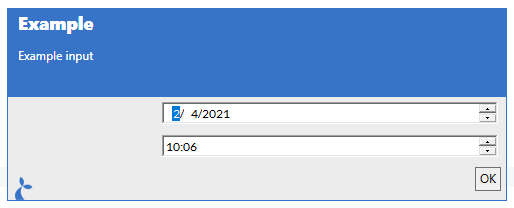
You can specify the following properties:
promptis the text to display to the left of the actual input.promptAlignmentis the alignment the prompt should follow. Available options are: “Center”, “Justify”, “Left” (default), “Right”.toolTipis a text to display when the user hovers the mouse over the input field.helpTextwill display a “?” that when hovered will show the text given here.valueis an optional default value for the input - this may be a javascript Date object or a string formatted as a datefocusis whether to focus this field.formatis a format-string (see below for a list of format specifiers) or"long"or"short"for built-in formats. Defaults to"short".notBeforeaDatespecifying the earliest date allowednotAfteraDatespecifying the latest data allowedshowUpDownwhether or not to show up/down buttons (defaulttrue)enableda boolean to indicate whether or not the input field can be changed by the user (defaulttrue).
Format specifiers can be found here for use in the format string.
SELECT input type
This input lets the user choose an option in a combobox.
Dialog.input("Example", "Example input", {
  foo: {
    type: "SELECT",
    prompt: "Choose a number",
    selectBetween: ["1", "2", "3"],
  },
});
Will display as:
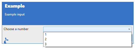
You can specify the following properties:
promptis the text to display to the left of the actual input.promptAlignmentis the alignment the prompt should follow. Available options are: “Center”, “Justify”, “Left” (default), “Right”.toolTipis a text to display when the user hovers the mouse over the input field.helpTextwill display a “?” that when hovered will show the text given here.valueis an optional default value for the input.isSelectEditableiftruethen the user is allowed to enter some text instead of using one of the pre-defined options (default isfalse).selectBetweenis a array of strings which determines the available dropdown options.orientationcan be either ‘vertical’ or ‘horizontal’ and determines the layout direction.columnsis the number of columns to display input elements in to help with alignment - settingcolumnswill void theorientationsetting.rowsis the number of rows to display input elements in to help with alignment.focusis whether to focus this field.validationis a validation object (see below).isSelectEditablewhether the information shown in the dropdown can be edited (works like a text-field).enableda boolean to indicate whether or not the input field can be changed by the user (defaulttrue).
RADIO input type
Choose a single item in a list of radio-buttons.
Dialog.input("Example", "Example input", {
  foo: {
    type: "RADIO",
    prompt: "Choose a number",
    selectBetween: ["1", "2", "3"],
  },
});
Will display as:
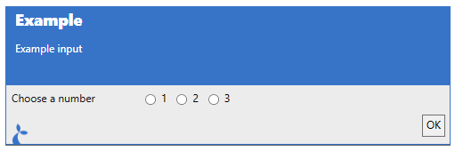
You can specify the following properties:
promptis the text to display to the left of the actual input.promptAlignmentis the alignment the prompt should follow. Available options are: “Center”, “Justify”, “Left” (default), “Right”.toolTipis a text to display when the user hovers the mouse over the input field.helpTextwill display a “?” that when hovered will show the text given here.valueis an optional default value for the input.selectBetweenis a array of strings which determines the available dropdown options.orientationcan be either ‘vertical’ or ‘horizontal’ and determines the layout direction.columnsis the number of columns to display input elements in to help with alignment - settingcolumnswill void theorientationsetting.rowsis the number of rows to display input elements in to help with alignment.focusis whether to focus this field.validationis a validation object (see below).enableda boolean to indicate whether or not the input field can be changed by the user (defaulttrue).
CHECKBOX input type
Here the user can select multiple items in a list of checkboxes.
Dialog.input("Example", "Example input", {
  foo: {
    type: "CHECKBOX",
    prompt: "Choose some numbers",
    options: [
      { name: "1", value: 1 },
      { name: "2", value: 2 },
      { name: "3", value: 3 },
    ],
  },
});
Will display as:
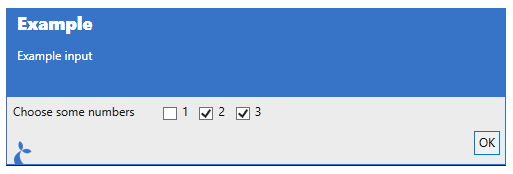
You can specify the following properties:
promptis the text to display to the left of the actual input.promptAlignmentis the alignment the prompt should follow. Available options are: “Center”, “Justify”, “Left” (default), “Right”.toolTipis a text to display when the user hovers the mouse over the input field.helpTextwill display a “?” that when hovered will show the text given here.valueis an optional default value for the input,optionsis a array of objects which determines the checkboxes,orientationcan be either ‘vertical’ or ‘horizontal’ and determines the layout direction,columnsis the number of columns to display input elements in to help with alignment - settingcolumnswill void theorientationsetting,rowsis the number of rows to display input elements in to help with alignment,focusis whether to focus this fieldvalidationis a validation object (see below).enableda boolean to indicate whether or not the input field can be changed by the user (defaulttrue).
Each object in the options array can have the following properties:
namethe name of the item,suffix/prefixthe suffix and prefix shown,valuethe valueselectedwhether the checkbox is selected.
A simple example of a CHECKBOX input could be:
Dialog.input(..., {
  cb: {
    prompt: "Checkbox example",
    type: "CHECKBOX",
    options: [{name: "cb1", selected: true}, {name: "cb2"}]
  }
});
HEADER input type
This will add a header-style text to the input dialog. The user cannot interact with this element.
Dialog.input("Example", "Example input", {
  foo: {
    type: "HEADER",
    value: "I am a header",
  },
});
Will display as:
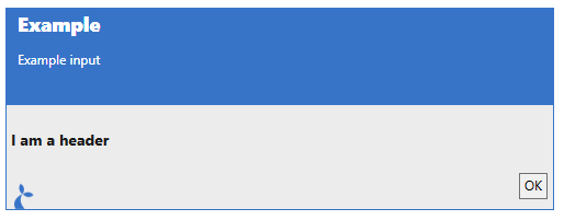
You can specify the following properties:
valueis used as the text displayed.textis (sort of) an alias ofvaluebut this must be used if the content of the header is dynamic.
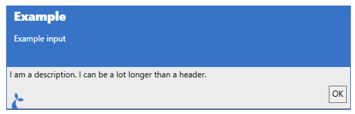
DESCRIPTION input type
This is similar to the HEADER input type but will add a body-style text to the input dialog. The user cannot interact with this element.
Dialog.input("Example", "Example input", {
  foo: {
    type: "DESCRIPTION",
    value: "I am a description. I can be a lot longer than a header.",
  },
});
Will display as:
You can specify the following properties:
valueis used as the text displayed.textis (sort of) an alias ofvaluebut this must be used if the content of the description is dynamic.
MULTITEXT input type
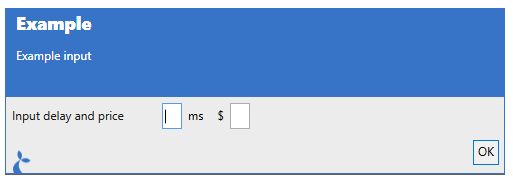
Will display multiple text inputs on a single line.
Dialog.input("Example", "Example input", {
  foo: {
    type: "MULTITEXT",
    prompt: "Input delay and price",
    texts: [
      { name: "Delay", suffix: "ms" },
      { name: "Price", prefix: "$" },
    ],
  },
});
Will display as:
You can specify the following properties:
promptis the text to display to the left of the actual input.promptAlignmentis the alignment the prompt should follow. Available options are: “Center”, “Justify”, “Left” (default), “Right”.toolTipis a text to display when the user hovers the mouse over the input field.helpTextwill display a “?” that when hovered will show the text given here.textsis an array of text inputs to show - each input may have the following properties set;nameis used to refer to the input,prefixandsuffixare texts to be shown before and after the input field,valueis the default value,multilinewhether multiple lines are allowed (defaultfalse)focusis whether to focus this fieldvalidationis a validation object (see below).enableda boolean to indicate whether or not the input field can be changed by the user (defaulttrue).
TYPEAHEAD input type
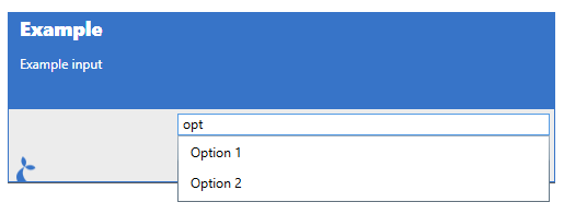
The typeahead type can be used to allow the user to search in a large set of options.
The following properties can be specified:
promptis the text to display to the left of the actual input.promptAlignmentis the alignment the prompt should follow. Available options are: “Center”, “Justify”, “Left” (default), “Right”.toolTipis a text to display when the user hovers the mouse over the input field.helpTextwill display a “?” that when hovered will show the text given here.selectFromis the construction which determines what the user is able to select from.enableda boolean to indicate whether or not the input field can be changed by the user (defaulttrue).
...
myProp: {
  type: 'TYPEAHEAD',
  selectFrom: ['Option 1', 'Option 2']
}
...
To display as:
It can be a list of objects with a value or display property that is displayed for the user. As in the example below where the user can select or get auto-completion on ‘a’ and ‘b’.
...
myProp: {
  type: 'TYPEAHEAD',
  selectFrom: [
    {display: 'a', id: 100},
    {display: 'b', id: 100}
  ],
  preselect: { display: 'a', id: 100}
}
...
The value of the myProp property after the input dialog is completed will be the full object selected, e.g. {display: 'a', id: 100}.
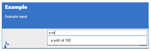
You can also supply arbitrary objects and a formatting string.
...
myProp: {
  type: 'TYPEAHEAD',
  selectFrom: {
    format: '{{foo}} with id {{id}}',
    items: [
      {foo: 'a', id: 100},
      {foo: 'b', id: 100}
    ],
  }
}
...
This will display e.g. “a with id 100” in the suggestion dropdown as shown below.
The object selected will be available in the myProp property (not just the formatted string). In addition to the format string, you can also set the following options:
minInputLengththe minimum number of characters the user must input in order to get suggestions (default3)filterModewhich mode should be used to filter the suggestions. One of'startswith'(the default),'contains','equals'or'none'. Each of the three matching modes also has…casesensitive,…ordinaland…ordinalcasesensitivevariants, e.g.'containsordinal'. An unrecognised value falls back to'startswith'.
A callback function can also be used. The function supplied will get invoked with the string entered by the user. E.g.:
...
myProp: {
  type: 'TYPEAHEAD',
  selectFrom: {
    format: '{{foo}} with id {{id}}',
    items: function(searchString) {
      return [
        {foo: 'a', id: 100},
        {foo: 'b', id: 100}
      ];
    },
  }
}
...
In this case we’re not using the input for anything but other cases might do so, like when fetching options from e.g. a remote resource (via http or similar). When items is a function the suggestions are shown exactly as returned - filterMode is forced to 'none', since filtering is the function’s job.
Lastly, the contents of a Table can be used as options.
...
myProp: {
  type: 'TYPEAHEAD',
  selectFrom: Table.map('nameOfTable', 'propToIndexBy').selectFrom('{{foo}} with id {{id}}')
}
...
This will use the table rows and generate a formatted string for each row - the result will again be an object representing the row.
TABLE input type
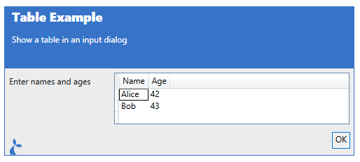
The TABLE input can be used for tabular (ie like a spreadsheet) input. It supports the following properties.
tableHeaderis a list of strings or a list of objects and defines the columns of a tabletableRowsis the initial list of rows - the user can possibly add more rows to the table. Each row is either an array of cell values or an object whose property values are used in order.canAddRowswhether or not new rows can be added to the table (defaulttrue)canDeleteRowswhether or not rows can be deleted from the table (defaulttrue)
When a column in tableHeader is given as an object it supports:
namethe column header, also the key the column is returned undertypethe type of the column - one ofint,number(alsodouble/float),date,bool(alsoboolean). Anything else, including a missingtype, gives a text column.expressiona computed-column expression, using the DataColumn expression syntax. Columns with an expression are always read-only.readonlywhether the user can edit the column (defaultfalse). Ignored whenexpressionis set.
An example is given here:
var result = Dialog.input("Table Example", "Show a table in an input dialog", {
  t: {
    type: "TABLE",
    prompt: "Enter names and ages",
    tableHeader: [
      { name: "Name", type: "string" },
      { name: "Age", type: "int" },
    ],
    tableRows: [
      ["Alice", 42],
      ["Bob", 43],
    ],
  },
});
To display as:
LISTOF input type
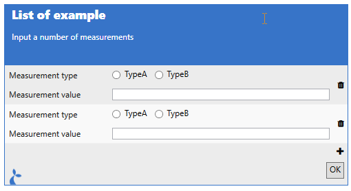
The LISTOF input type is a compound input type. It can be used to allow the user to input multiple items each composed of a number of other input types. For instance; to input a number of measurements we could make a configuration as follows:
var results = Dialog.input(
  "List of example",
  "Input a number of measurements",
  {
    measurements: {
      type: "LISTOF",
      template: {
        mtype: {
          prompt: "Measurement type",
          type: "RADIO",
          selectBetween: ["TypeA", "TypeB"],
        },
        mvalue: {
          prompt: "Measurement value",
          type: "TEXT",
        },
      },
      maxItems: 5,
      maxHeight: 200,
      initialItems: 2,
    },
  },
);
Which will result in the following dialog being shown:
The property values available for a LISTOF input is:
templatewhich contains an object defining a single input element. Required.maxItemsthe max number of items a user is allowed to input. Unlimited by default.maxHeightthe max height of theLISTOFinput. Unbounded by default.initialItemsthe number of initial items in theLISTOFlist (default0). Ignored when the dialog is pre-filled fromsavedInputs.
MARKDOWN input type
The MARKDOWN input type can be used to display some text (non-interactive) formatted with markdown.
var results = Dialog.input("MARKDOWN", "Markdown example", {
  md: {
    type: "MARKDOWN",
    text: "I'm some *markdown* to display.",
  },
});
The text to display is taken from text, falling back to value if text is not set.
DIVIDER input type
The DIVIDER type does not support any options.
SPACER input type
Has no options either, will provide some vertical space.
Validation
Input fields may have a validation object, function or boolean in their options which determines valid values for the inputs. If you supply an object then it can have the following properties;
isRequiredboolean value indicating whether a value must be supplied for the field,regexis a regular expression which must match the given input in order for the field to validate,messageis an optional message to be displayed in case validation fails.
Supplying validation: true is shorthand for validation: { isRequired: true }, and validation: false means no validation at all.
Regex gotchas
- Use either
isRequiredorregex, not both at the same time.isRequiredis checked first and, when set, theregexis never applied. \in the regex must be escaped to\\
For function-based validation you should supply a function that returns either a message (in case of failed validation) or nothing in case of a successful validation. The function is given the current value of the input as its single argument. Anything the function returns other than null or undefined is shown to the user as an error message. An example;
var result = Dialog.input("Function-based validation demo", "", {
  foo: {
    type: "CHECKBOX",
    options: [{ name: "1" }, { name: "2" }, { name: "3" }],
    validation: function (selected) {
      // We check whether 2 or more options are selected
      if (selected && selected.length < 2) {
        return "You must select at least 2 options";
      }
    },
  },
});
Function-based validation gotchas - Scoping of variables
If you use a function to do validation you need to be aware that any variables you reference from outside the scope of the function definition will not be updated from their initial value. An example could be a validation function that uses a value from another input element:
...
foo: { type: 'TEXT' },
bar: function(s) {
  return {
    type: 'TEXT',
    validation: function(barValue) {
      if (s.foo === "1" && barValue !== "2") return "Must be 2 when foo is 1";
    }
  };
}
...
Here the referencing of s.foo will never change from its initial value as it is “captured” by the validation function. If you need to use such a value then you can do something like:
foo: { type: 'TEXT' },
bar: function(s) {
  return {
    type: 'TEXT',
    validation:
        s.foo === "1"
        ? function(barValue) { if (barValue !== "2") return "Must be 2"; }
        : false
  };
}
Which evaluates the s.foo value outside the scope of the validation function and will work as expected.
Example
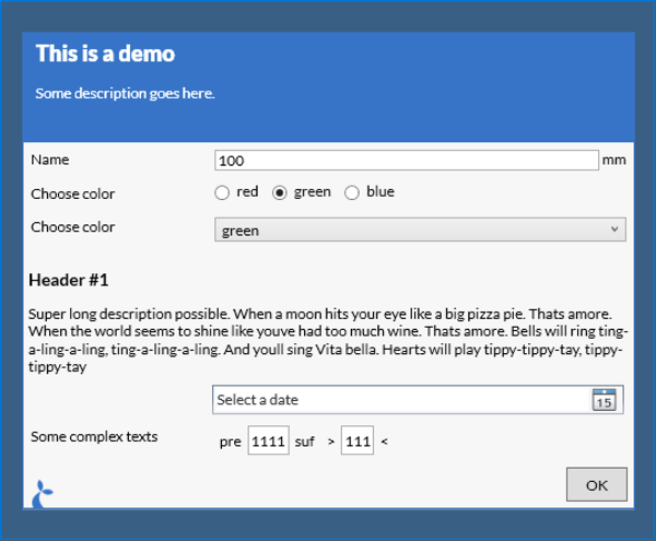
var result = Dialog.input("This is a demo", "Some description goes here.", {
  submitOnValidation: true,
  maxDialogHeight: 1000,
  maxDialogWidth: 2000,
  name: {
    prompt: "Name",
    type: "TEXT",
    suffix: "mm",
  },
  colorRadio: {
    prompt: "Choose color",
    type: "RADIO",
    selectBetween: ["red", "green", "blue"],
  },
  foo: {
    prompt: "Show only on blue",
    dependsOn: "colorRadio=blue",
    type: "TEXT",
  },
  colorCombo: {
    prompt: "Choose color",
    type: "SELECT",
    selectBetween: ["red", "green", "blue"],
    validation: { isRequired: true, message: "Color must be selected" },
  },
  header: {
    type: "HEADER",
    value: "Header #1",
  },
  desc: {
    type: "DESCRIPTION",
    value:
      "Super long description possible. When a moon hits your eye like a big pizza pie. Thats amore. When the world seems to shine like youve had too much wine. Thats amore. Bells will ring ting-a-ling-a-ling, ting-a-ling-a-ling. And youll sing Vita bella. Hearts will play tippy-tippy-tay, tippy-tippy-tay",
  },
  date: {
    type: "DATE",
  },
  multi: {
    type: "MULTITEXT",
    prompt: "Some complex texts",
    texts: [
      {
        name: "a",
        prefix: "pre",
        suffix: "suf",
        validation: { regex: "a+", message: 'Must contain at least one "a"' },
      },
      { name: "b", prefix: ">", suffix: "<" },
    ],
  },
});
// Now use the input values for something
var name = result.name;
var eyecolor = result.colorRadio;
This will result in the dialog shown below.
It is possible to bypass validation by using the attribute bypassValidation on a button in the dialog. When the user clicks this button then the dialog is closed and the intermediate result is returned to the flow.
Resuming from a partially filled-in form
var inputOptions = {
  name: {
    prompt: "Name",
    type: "TEXT",
    suffix: "mm",
  },
  buttons: [
    { value: "No", isCancel: true },
    { value: "Continue", bypassValidation: true },
    { value: "Ok" },
  ],
};
var results = Dialog.input("Input 1", "1", inputOptions);

if (results.button == "Continue") {
  // Show an indentical dialog but pre-fill values from Dialog 1
  results = Dialog.input("Input 2", "2", inputOptions, results);
}
HTML based input dialog
In addition to the normal native input function we also support using HTML input forms. This approach does not bring as much built-in functionality - validation, conditional displays etc - but offers a larger degree of customization in the appearance of the displayed form. It works by taking the form, either HTML directly or a URL to a page containing the form and then displaying this in a dialog. When the user accepts the form (clicks “ok”) the page is parsed and information about the contents of the individual fields are extracted for use in the flow.
The input values entered can be retrieved from the dialog result by using the name or id property of the input element. For more info on forms see e.g. https://developer.mozilla.org/en-US/docs/Learn/HTML/Forms. For a concrete example with a number of different input elements see e.g. http://sirenia.eu/tutorial/ie-form.html. div tags with a input class will also be returned - the id of the div will be used as key.
Closing the dialog from within
You can close the dialog window from a snippet of Javascript embedded in the html displayed or when the user clicks a special link. These links are of the form dialog:close:ok or dialog:close:cancel to respectively close the dialog with a success result or with a failure (similar to when the user clicks the “Cancel” button. So a link would look like:
<a href="dialog:close:ok">Click me to close</a>and a Javascript version would be:
<div onclick="window.location = 'dialog:close:ok'">Also click me to close</div>Note that some new input types introduced in the html5 standard are not currently supported. Unsupported input types will fall back to type ‘text’.
Parameters
header- [string] the header to displaytext- [string] a longer text to displayoptions- [object] containing options for the dialog itself:source- [string] the form to display - either HTML directly or a URLembed- [bool] only used whensourceis a URL. Iftrue, Manatee fetches the URL and displays the retrieved html as content. Iffalse(default) the native browser navigates to the URL.maxDialogWidth- [int] the max width the dialog must takemaxDialogHeight- [int] the max height the dialog must takethrowsa boolean indicating whether to throw an exception if the dialog was cancelled - default istrueforegroundColorsets the foreground color of the dialogbackgroundColorsets the background color of the dialogbrowserwhich browser engine to use -"Edge"(default) or"IE"markdownwhether or not thetextis formatted using markdown (defaultfalse)buttonsis an array of buttons to display in the bottom part of the dialog (see info-dialog for further information)sounda string (one ofasterisk,beep,exclamation,hand,question) which indicates a system sound to play once the dialog is showndialogPositionTop/dialogPositionLeft(int) to change the default position of the dialogtopMost(boolean, defaulttrue) should the dialog be shown top-most
Relative paths break when embed is true
When using embed: true, the supplied HTML is wrapped in a template and thus has no base URL. Therefore relative references to stylesheets, scripts, and images will not work.
Use embed: true only at a page whose references are absolute URLs.
Example
Source directly as an option.
var result = Dialog.inputHtml("Header", "Some more text", {
  source: "<input type='text' id='myText'></input>",
});
// The result will have a `myText` property since we added the `id` property with the value to the input field
Debug.showDialog("Result was " + result.myText);
Using a remote document.
var result = Dialog.inputHtml("Header", "Some more text", {
  source: "http://sirenia.eu/tutorial/form.html",
  embed: true,
});
// The result will have a `myText` property since we added the `id` property with the value to the input field
Debug.ger(result);