
This page documents the API for interacting with fields and the global objects in flows.
There is also a tutorial to the Cuesta tool which also contains a few examples of flows. It is highly recommend that you go through the tutorial before diving into this reference documentation.
# Javascript as a flow language
In general flows are Javascript code and thus any valid (ES5) JavaScript is allowed. See Mozilla (opens new window) for a nice JavaScript intro. The objects Inputs, Fields and all the rest of the modules listed below are made available for all flows s.t. they can be accessed in the JavaScript code. In addition to these modules you can dynamically load new modules (and other types of plugins) via Module.load and Plugin.load. You can find the documentation for each of these under the Plugins left-hand side menu.
We include the utility library lodash 4.7.10 in all flows. Typing _. prompts the code editor to show you the methods available. See lodash documentation (opens new window) to read up on the available functions.
The manatee script engine understands ecmascript 5 javascript. As an added convenience we load polyfills for ecmascript 6 string functions so that these may be used (available from manatee v1.29). They are as follows: .startsWith, .endsWith, .includes, .trim, .repeat, String.fromCodePoint, .codePointAt. For documentation of these and the rest of the language, a good resource is MDN (opens new window).
# Inputs
Inputs to a flow can be accessed via the Inputs array. Inputs are generally strings.
# Example
var mi = Inputs["myinput"];
# Fields
Fields represent user-interface elements which can be manipulated from a flow. The basics of defining a fields and how to use it in flows is described in detail in the field documentation.
# Built-in modules and core functionality
The global objects and core types listed below are available in all flows and are built into Manatee.
# Dialog
The dialog object contains methods for presenting the user with information or requesting information from the user at runtime.
# Info dialog
Shows a blue information dialog with an OK button. The flow does not proceed until the user has clicked OK. Options is an optional parameter.
# Parameters
headeris the title of the dialogStextis the text content shownoptionsis a JavaScript object, supported properties:buttonsis an array of buttons to display in the bottom part of the dialogtimeoutan int determining when the dialog should auto-closesounda string (one ofasterisk,beep,exclamation,hand,question) which indicates a system sound to play once the dialog is shownthrowsa boolean indicating whether to throw an exception if the dialog was cancelled - default istruedialogPositionTopan indication of the placement of the dialog (in pixels from the top of the screen)dialogPositionLeftan indication of the placement of the dialog (in pixels from the left of the screen)topMost(boolean, defaulttrue) should the sticky be shown top-mostmarkdownwhether or not thetextis formatted using markdown (opens new window) (defaultfalse)
The buttons array consists of button objects with the following properties:
valuethe text to display on the button (should be unique for a dialog)isDefault(boolean) a true/false value indicating whether or not this button is the default (i.e. will be activated on the enter-key) - should only be set totruefor one button per dialog – default isfalseisCancel(boolean) indicating whether or not the button should cancel the dialog – default isfalseforegroundColor(string) a color to display the text of this button inbackgroundColor(string) a background color for the button
The default value for buttons is an “OK” button:
[{ value: "OK" }];
The button clicked will be available as a property named button on the return value from the dialog. If the user clicks a cancel button then an exception is thrown.
# Example
Dialog.info("Hello", "This is some text to be shown.", {});
With options:
Dialog.info("Hello", "Some text - I will max be shown for 10 secs.", {
  timeout: 10,
});
With pre-defined buttons:
var r = Dialog.info(
  "Hello",
  "Do you want to continue",
  { timeout: 10
  , buttons: [
      { 'value': 'No', 'isCancel': true },
      { 'value': 'Maybe' },
      { 'value': 'Yes' },
    ]
  }
);
if (r.button == 'Yes') {
  // user answered yes - we can continue
  ...
}
# Warn dialog
Shows a red warning dialog to the user with an OK button. Similar to the info dialog, but red. Options is an optional parameter.
# Parameters
headeris the title of the dialogtextis the text content shownoptionsis a JavaScript object, supported properties:buttonsis an array of buttons to display in the bottom part of the dialog (see info-dialog for further information)timeoutan int determining when the dialog should auto-closesounda string (one ofasterisk,beep,exclamation,hand,question) which indicates a system sound to play once the dialog is shownthrowsa boolean indicating whether to throw an exception if the dialog was cancelled - default istruedialogPositionTopan indication of the placement of the dialog (in pixels from the top of the screen)dialogPositionLeftan indication of the placement of the dialog (in pixels from the left of the screen)topMost(boolean, defaulttrue) should the sticky be shown top-mostmarkdownwhether or not thetextis formatted using markdown (opens new window) (defaultfalse)
# Example
Dialog.warn(
  "Warning!!",
  "This is some text to be shown. Consider yourself warned.",
);

// Do not throw an exception when dialog is cancelled
Dialog.warn("Take heed", "You may enter at your peril", { throws: false });
# Input dialog
Shows a dialog into which the user may input data. The type of data which can be input is determined by the options parameter.
# Parameters
headeris the title of the dialogtextis the text content shownoptionsis a JavaScript object which determines the input the user should provide. Each property on the object is one input the user must provide. The name of each property is used when returning the results. It can also contain the following properties which affect the dialog itself:buttonsis an array of buttons to display in the bottom part of the dialog (see info-dialog for further information)throwsa boolean indicating whether to throw an exception if the dialog was cancelled - default istruesubmitOnValidationis a boolean flag that determines whether or not the dialog will be automatically submitted when all fields validate - or notmaxDialogWidth/maxDialogHeight(int) change the default maximum width and height for the window,promptWidthsets the with of the label/promptsounda string (one ofasterisk,beep,exclamation,hand,question) which indicates a system sound to play once the dialog is showndialogPositionTop/dialogPositionLeft(int) to change the default position of the dialog. Note that if one of these properties are set then the dialog will be positioned on the main display.foregroundColorandbackgroundColorcan be used to set the overall colors for the dialog (use html/hex encoded strings)savedInputsis an optional result from a previous display of the dialog - this can be used to pre-fill the dialog with inputs already filledonlyValidateOnSubmitwill when set totruenot do any validation until the dialog is submitted (defaultfalse)topMost(boolean, defaulttrue) should the sticky be shown top-mostmarkdownwhether or not thetextis formatted using markdown (opens new window) (defaultfalse)
# Inputs given as complex objects
If the value of a property of options is either a complex object or a function it is treated as an input element. If you supply an object then the following properties are available to specify:
Each input should contain the following variables:
typeto determine which UI element to display - see options for input types belowdependsOnis an expression that determines when this input should be shown. You can either specify the name of another property - in which case the input will be shown if the other property has a value, or you can specify a<name-of-other-property>=<value>type string - in which case the input will be shown if the other property has the given value. IfdependsOnis empty the input will always be shown. Using a~instead of=in the expression will cause the value to be interpreted as a regular expression (from 1.8.0).
Optionally the following properties may be specified as well:
promptis the text which is displayed as an hint to the user for this option.promptWidthsets the with of the label/promptresetOnHidedetermines whether to clear the value of the input when it is hidden because a dependency fails (default isfalse)
An example of an input dialog with a few objects is:
Dialog.input("header goes here", "text goes here", {
  myTextInput: {
    prompt: "Input text here",
    type: "TEXT",
    value: "Default value",
  },
  anotherInput: {
    prompt: "Another prompt",
    type: "PASSWORD",
  },
});
This will display a dialog with two inputs, one for text and one for password.
# Inputs given as functions
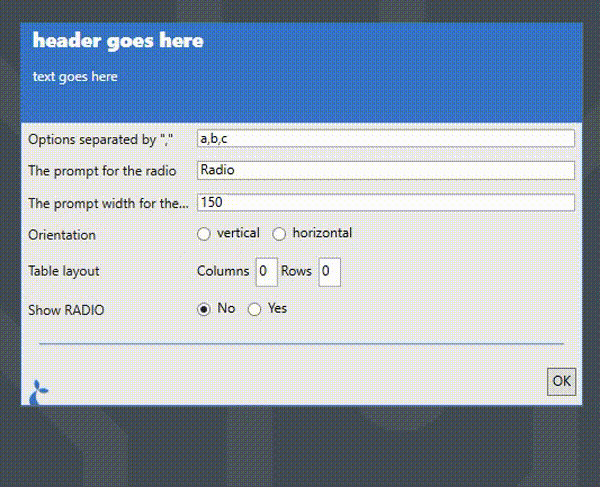
If the value of an option is a function then that function is invoked with the current state of the form allowing you to build complex interacting elements. The following example demonstrates this by having the properties of the RADIO input determined by the previous inputs.
Dialog.input("header goes here", "text goes here", {
  radioOptions: {
    prompt: 'Options separated by ","',
    type: "TEXT",
    value: "a,b,c",
  },
  radioPrompt: {
    prompt: "The prompt for the radio",
    type: "TEXT",
    value: "Radio",
  },
  radioPromptWidth: {
    prompt: "The prompt width for the radio",
    type: "TEXT",
    value: "150",
  },
  radioOrientation: {
    prompt: "Orientation",
    type: "RADIO",
    selectBetween: ["vertical", "horizontal"],
  },
  radioTableLayout: {
    prompt: "Table layout",
    type: "MULTITEXT",
    texts: [
      { name: "columns", prefix: "Columns", value: "0" },
      { name: "rows", prefix: "Rows", value: "0" },
    ],
  },
  radioVisible: {
    prompt: "Show RADIO",
    type: "RADIO",
    selectBetween: ["No", "Yes"],
    value: "No",
  },
  d: { type: "DIVIDER" },
  radio: function (s) {
    return {
      prompt: s.radioPrompt,
      selectBetween: s.radioOptions && s.radioOptions.split(","),
      orientation: s.radioOrientation,
      promptWidth: parseInt(s.radioPromptWidth || "150"),
      columns: parseInt(
        (s.radioTableLayout && s.radioTableLayout.columns) || "0",
      ),
      rows: parseInt((s.radioTableLayout && s.radioTableLayout.rows) || "0"),
      dependsOn: s.radioVisible == "Yes",
      type: "RADIO",
    };
  },
});
When you run this flow you can use the inputs above the divider to control the appearance of the RADIO. The dependsOn property can be set to a boolean value to do complex dependency validations.
The properties of each option item depends on the value of its type.
# TEXT input type
The TEXT input type displays a simple text input.
Dialog.input("Example", "Example input", {
  foo: {
    type: "TEXT",
    prompt: "Input text here",
  },
});
When run, this will display as:

You can specify the following properties:
promptis the text to display to the left of the actual input.promptAlignmentis the alignment the prompt should follow. Available options are: “Center”, “Justify”, “Left” (default), “Right”.toolTipis a text to display when the user hovers the mouse over the input field.helpTextwill display a “?” that when hovered will show the text given here.valueis an optional default value for the input.prefixandsuffixare texts to be shown before and after the input field.focusis whether to focus this field - if multiple fields have focus set to true then the last one will be focused.multilinewhether multiple lines are allowed (defaultfalse).masksee the [#masked-input-type](MASKEDinput type) for details.validationis a validation object (see below).enableda boolean to indicate whether or not the input field can be changed by the user (defaulttrue).
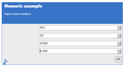
# NUMERIC input type
The NUMERIC input type allow allows for numbers to be input.
It can be configured with the following properties:
promptis the text to display to the left of the actual input.promptAlignmentis the alignment the prompt should follow. Available options are: “Center”, “Justify”, “Left” (default), “Right”.toolTipis a text to display when the user hovers the mouse over the input field.helpTextwill display a “?” that when hovered will show the text given here.maxthe maximum number it will allow (default is a very large negative number)minthe minimum number (default is a very large number)incrementhow much each up/down on the field should increment/decrement the current value (default is 1)decimalshow many decimals are shown (default is 0)thousandsSeparatorwhether to show a separator between thousands (default false)enableda boolean to indicate whether or not the input field can be changed by the user (defaulttrue).
For example:
Dialog.input("Numeric example", "Input some numbers", {
  // Increment/decrement 100 each time up/down is selected
  num1: {
    type: "NUMERIC",
    increment: 100,
  },

  // Set limits and increment size
  num2: {
    type: "NUMERIC",
    increment: 10,
    min: 5,
    max: 89,
  },

  // Show e.g. 1.000 instead of 1000
  num3: {
    type: "NUMERIC",
    increment: 1001,
    separateThousands: true,
  },

  // Show 0.000 and increment w 0.01
  num4: {
    type: "NUMERIC",
    increment: 0.01,
    decimals: 3,
  },
});
Which will be displayed as:
# MASKED input type
The MASKED input type is a way to provide a pre-formatted text field for the user. It is often used for dates or other types of structured input. It is configured similarly to a TEXT field but has a mask property;
...
m: {
  type: "MASKED",
  mask: "00/00/0000"
},
...
alternatively adding the mask property to a TEXT input will have the same effect;
...
m: {
  type: "TEXT",
  mask: "00/00/0000"
},
...
To display as:

The format of the mask property can be found at https://docs.microsoft.com/en-us/dotnet/api/system.windows.forms.maskedtextbox.mask?view=netcore-3.1 (opens new window) and re-created here:
| Masking element | Description |
|---|---|
| 0 | Digit, required. This element will accept any single digit between 0 and 9. |
| 9 | Digit or space, optional. |
| # | Digit or space, optional. If this position is blank in the mask, it will be rendered as a space in the Text property. Plus (+) and minus (-) signs are allowed. |
| L | Letter, required. Restricts input to the ASCII letters a-z and A-Z. This mask element is equivalent to [a-zA-Z] in regular expressions. |
| ? | Letter, optional. Restricts input to the ASCII letters a-z and A-Z. This mask element is equivalent to [a-zA-Z]? in regular expressions. |
| & | Character, required. If the AsciiOnly property is set to true, this element behaves like the “L” element. |
| C | Character, optional. Any non-control character. If the AsciiOnly property is set to true, this element behaves like the “?” element. |
| A | Alphanumeric, required. If the AsciiOnly property is set to true, the only characters it will accept are the ASCII letters a-z and A-Z. This mask element behaves like the “a” element. |
| a | Alphanumeric, optional. If the AsciiOnly property is set to true, the only characters it will accept are the ASCII letters a-z and A-Z. This mask element behaves like the “A” element. |
| . | Decimal placeholder. The actual display character used will be the decimal symbol appropriate to the format provider, as determined by the control’s FormatProvider property. |
| , | Thousands placeholder. The actual display character used will be the thousands placeholder appropriate to the format provider, as determined by the control’s FormatProvider property. |
| : | Time separator. The actual display character used will be the time symbol appropriate to the format provider, as determined by the control’s FormatProvider property. |
| / | Date separator. The actual display character used will be the date symbol appropriate to the format provider, as determined by the control’s FormatProvider property. |
| $ | Currency symbol. The actual character displayed will be the currency symbol appropriate to the format provider, as determined by the control’s FormatProvider property. |
| < | Shift down. Converts all characters that follow to lowercase. |
| > | Shift up. Converts all characters that follow to uppercase. |
| \ | Escape. Escapes a mask character, turning it into a literal. “\” is the escape sequence for a backslash. |
| All other characters | Literals. All non-mask elements will appear as themselves. Literals always occupy a static position in the mask at run time, and cannot be moved or deleted by the user. |
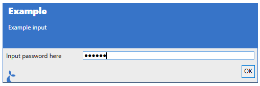
# PASSWORD input type
Use this input type to display a text input where the input value is not visible, e.g. a password.
Dialog.input("Example", "Example input", {
  foo: {
    type: "PASSWORD",
    prompt: "Input password here",
  },
});
When run, this will display as:
You can specify the following properties:
promptis the text to display to the left of the actual input.promptAlignmentis the alignment the prompt should follow. Available options are: “Center”, “Justify”, “Left” (default), “Right”.toolTipis a text to display when the user hovers the mouse over the input field.helpTextwill display a “?” that when hovered will show the text given here.valueis an optional default value for the input.prefixandsuffixare texts to be shown before and after the input field.focusis whether to focus this field - if multiple fields have focus set to true then the last one will be focused.validationis a validation object (see below).enableda boolean to indicate whether or not the input field can be changed by the user (defaulttrue).
# FILE input type
Use this input type to allow the user to pick a file.
Dialog.input("Example", "Example input", {
  foo: {
    type: "FILE",
    prompt: "Choose a file",
  },
});
When run and the user clicks the “…” button, this will display as:
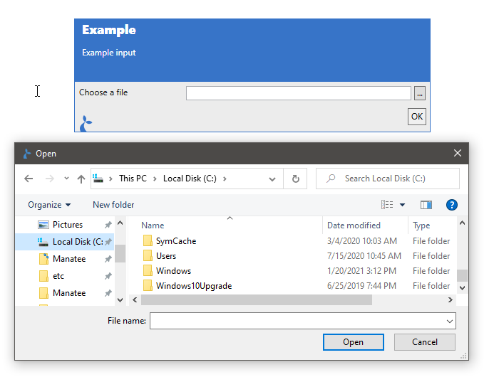
You can specify the following properties:
promptis the text to display to the left of the actual input.promptAlignmentis the alignment the prompt should follow. Available options are: “Center”, “Justify”, “Left” (default), “Right”.toolTipis a text to display when the user hovers the mouse over the input field.helpTextwill display a “?” that when hovered will show the text given here.valueis an optional default value for the inputfocusis whether to focus this field.validationis a validation object (see below).enableda boolean to indicate whether or not the input field can be changed by the user (defaulttrue).
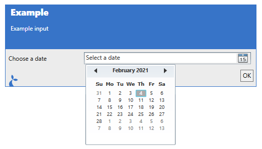
# DATE input type
Allow the user to input or select a date.
Dialog.input("Example", "Example input", {
  foo: {
    type: "DATE",
    prompt: "Choose a date",
  },
});
Will display as:
You can specify the following properties:
promptis the text to display to the left of the actual input.promptAlignmentis the alignment the prompt should follow. Available options are: “Center”, “Justify”, “Left” (default), “Right”.toolTipis a text to display when the user hovers the mouse over the input field.helpTextwill display a “?” that when hovered will show the text given here.valueis an optional default value for the input - this may be a javascript Date (opens new window) object or a string formatted as a datefocusis whether to focus this field.validationis a validation object (see below).enableda boolean to indicate whether or not the input field can be changed by the user (defaulttrue).
The return value is a special string with the formatted date as its value. It furthermore contains a property dateValue which holds the date chosen as a proper Date (opens new window) object.
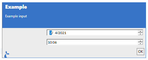
# DATETIME input type
Allow the user to input or select a date and/or a time.
Dialog.input("Example", "Example input", {
  dt1: {
    type: "DATETIME",
    notBefore: new Date("August 19, 1975 23:15:30"),
    notAfter: new Date("'August 19, 2025 23:15:30"),
  },
  dt2: {
    type: "DATETIME",
    format: "H:mm",
  },
});
Will display as:
You can specify the following properties:
promptis the text to display to the left of the actual input.promptAlignmentis the alignment the prompt should follow. Available options are: “Center”, “Justify”, “Left” (default), “Right”.toolTipis a text to display when the user hovers the mouse over the input field.helpTextwill display a “?” that when hovered will show the text given here.valueis an optional default value for the input - this may be a javascript Date (opens new window) object or a string formatted as a datefocusis whether to focus this field.formatis a format-string (see below for a list of format specifiers) or"long"or"short"for built-in formatsnotBeforeaDatespecifying the earliest date allowednotAfteraDatespecifying the latest data allowedshowUpDownwhether or not to show up/down buttons (defaulttrue)enableda boolean to indicate whether or not the input field can be changed by the user (defaulttrue).
Format specifiers can be found here (opens new window) for use in the format string.
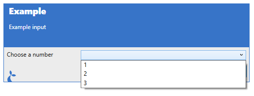
# SELECT input type
This input lets the user choose an option in a combobox.
Dialog.input("Example", "Example input", {
  foo: {
    type: "SELECT",
    prompt: "Choose a number",
    selectBetween: ["1", "2", "3"],
  },
});
Will display as:
You can specify the following properties:
promptis the text to display to the left of the actual input.promptAlignmentis the alignment the prompt should follow. Available options are: “Center”, “Justify”, “Left” (default), “Right”.toolTipis a text to display when the user hovers the mouse over the input field.helpTextwill display a “?” that when hovered will show the text given here.valueis an optional default value for the input.isSelectEditableiftruethen the user is allowed to enter some text instead of using one of the pre-defined options (default isfalse).selectBetweenis a array of strings which determines the available dropdown options.orientationcan be either ‘vertical’ or ‘horizontal’ and determines the layout direction.columnsis the number of columns to display input elements in to help with alignment - settingcolumnswill void theorientationsetting.rowsis the number of rows to display input elements in to help with alignment.focusis whether to focus this field.validationis a validation object (see below).isSelectEditablewhether the information shown in the dropdown can be edited (works like a text-field).enableda boolean to indicate whether or not the input field can be changed by the user (defaulttrue).
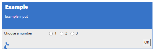
# RADIO input type
Choose a single item in a list of radio-buttons.
Dialog.input("Example", "Example input", {
  foo: {
    type: "RADIO",
    prompt: "Choose a number",
    selectBetween: ["1", "2", "3"],
  },
});
Will display as:
You can specify the following properties:
promptis the text to display to the left of the actual input.promptAlignmentis the alignment the prompt should follow. Available options are: “Center”, “Justify”, “Left” (default), “Right”.toolTipis a text to display when the user hovers the mouse over the input field.helpTextwill display a “?” that when hovered will show the text given here.valueis an optional default value for the input.selectBetweenis a array of strings which determines the available dropdown options.orientationcan be either ‘vertical’ or ‘horizontal’ and determines the layout direction.columnsis the number of columns to display input elements in to help with alignment - settingcolumnswill void theorientationsetting.rowsis the number of rows to display input elements in to help with alignment.focusis whether to focus this field.validationis a validation object (see below).enableda boolean to indicate whether or not the input field can be changed by the user (defaulttrue).
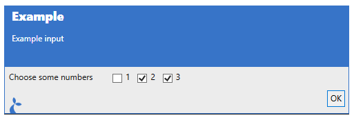
# CHECKBOX input type
Here the user can select multiple items in a list of checkboxes.
Dialog.input("Example", "Example input", {
  foo: {
    type: "CHECKBOX",
    prompt: "Choose some numbers",
    options: [
      { name: "1", value: 1 },
      { name: "2", value: 2 },
      { name: "3", value: 3 },
    ],
  },
});
Will display as:
You can specify the following properties:
promptis the text to display to the left of the actual input.promptAlignmentis the alignment the prompt should follow. Available options are: “Center”, “Justify”, “Left” (default), “Right”.toolTipis a text to display when the user hovers the mouse over the input field.helpTextwill display a “?” that when hovered will show the text given here.valueis an optional default value for the input,optionsis a array of objects which determines the checkboxes,orientationcan be either ‘vertical’ or ‘horizontal’ and determines the layout direction,columnsis the number of columns to display input elements in to help with alignment - settingcolumnswill void theorientationsetting,rowsis the number of rows to display input elements in to help with alignment,focusis whether to focus this fieldvalidationis a validation object (see below).enableda boolean to indicate whether or not the input field can be changed by the user (defaulttrue).
Each object in the options array can have the following properties:
namethe name of the item,suffix/prefixthe suffix and prefix shown,valuethe valueselectedwhether the checkbox is selected.
A simple example of a CHECKBOX input could be:
Dialog.input(..., {
  cb: {
    prompt: "Checkbox example",
    type: "CHECKBOX",
    options: [{name: "cb1", selected: true}, {name: "cb2"}]
  }
});
# HEADER “input” type
This will add a header-style text to the input dialog. The user cannot interact with this element.
Dialog.input("Example", "Example input", {
  foo: {
    type: "HEADER",
    value: "I am a header",
  },
});
Will display as:

You can specify the following properties:
valueis used as the text displayed.textis (sort of) an alias ofvaluebut this must be used if the content of the header is dynamic.
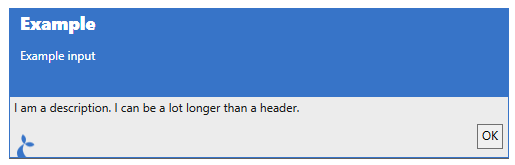
# DESCRIPTION “input” type
This is similar to the HEADER input type but will add a body-style text to the input dialog. The user cannot interact with this element.
Dialog.input("Example", "Example input", {
  foo: {
    type: "DESCRIPTION",
    value: "I am a description. I can be a lot longer than a header.",
  },
});
Will display as:
You can specify the following properties:
valueis used as the text displayed.textis (sort of) an alias ofvaluebut this must be used if the content of the description is dynamic.
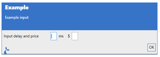
# MULTITEXT input type
Will display multiple text inputs on a single line.
Dialog.input("Example", "Example input", {
  foo: {
    type: "MULTITEXT",
    prompt: "Input delay and price",
    texts: [
      { name: "Delay", suffix: "ms" },
      { name: "Price", prefix: "$" },
    ],
  },
});
Will display as:
You can specify the following properties:
promptis the text to display to the left of the actual input.promptAlignmentis the alignment the prompt should follow. Available options are: “Center”, “Justify”, “Left” (default), “Right”.toolTipis a text to display when the user hovers the mouse over the input field.helpTextwill display a “?” that when hovered will show the text given here.textsis an array of text inputs to show - each input may have the following properties set;nameis used to refer to the input,prefixandsuffixare texts to be shown before and after the input field,valueis the default value,multilinewhether multiple lines are allowed (defaultfalse)focusis whether to focus this fieldpreselectan object which will be pre-selectedvalidationis a validation object (see below).enableda boolean to indicate whether or not the input field can be changed by the user (defaulttrue).
# TYPEAHEAD input type
The typeahead type can be used to allow the user to search in a large set of options.
The following properties can be specified:
promptis the text to display to the left of the actual input.promptAlignmentis the alignment the prompt should follow. Available options are: “Center”, “Justify”, “Left” (default), “Right”.toolTipis a text to display when the user hovers the mouse over the input field.helpTextwill display a “?” that when hovered will show the text given here.selectFromis the construction which determines what the user is able to select from.enableda boolean to indicate whether or not the input field can be changed by the user (defaulttrue).
...
myProp: {
  type: 'TYPEAHEAD',
  selectFrom: ['Option 1', 'Option 2']
}
...
To display as:
It can be a list of objects with a value or display property that is displayed for the user. As in the example below where the user can select or get auto-completion on ‘a’ and ‘b’.
...
myProp: {
  type: 'TYPEAHEAD',
  selectFrom: [
    {display: 'a', id: 100},
    {display: 'b', id: 100}
  ],
  preselect: { display: 'a', id: 100}
}
...
The value of the myProp property after the input dialog is completed will be the full object selected, e.g. {display: 'a', id: 100}.
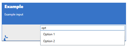
You can also supply arbitrary objects and a formatting string.
...
myProp: {
  type: 'TYPEAHEAD',
  selectFrom: {
    format: '{{foo}} with id {{id}}',
    items: [
      {foo: 'a', id: 100},
      {foo: 'b', id: 100}
    ],
  }
}
...
This will display e.g. “a with id 100” in the suggestion dropdown as shown below.

The object selected will be available in the myProp property (not just the formatted string). In addition to the format string, you can also set the following options:
minInputLengththe minimum number of characters the user must input in order to get suggestionsfilterModewhich mode should be used to filter the suggestions; select from'contains','startswith','endswith'.
A callback function can also be used. The function supplied will get invoked with the string entered by the user. E.g.:
...
myProp: {
  type: 'TYPEAHEAD',
  selectFrom: {
    format: '{{foo}} with id {{id}}',
    items: function(searchString) {
      return [
        {foo: 'a', id: 100},
        {foo: 'b', id: 100}
      ];
    },
  }
}
...
In this case we’re not using the input for anything but other cases might do so, like when fetching options from e.g. a remote resource (via http or similar).
Lastly, the contents of a Table can be used as options.
...
myProp: {
  type: 'TYPEAHEAD',
  selectFrom: Table.map('nameOfTable', 'propToIndexBy').selectFrom('{{foo}} with id {{id}}')
}
...
This will use the table rows and generate a formatted string for each row - the result will again be an object representing the row.
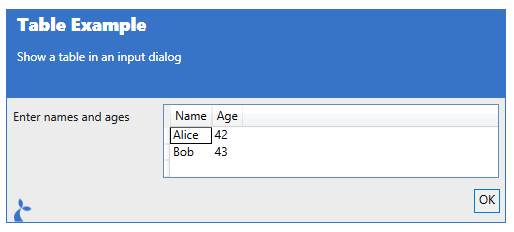
# TABLE input type
The TABLE input can be used for tabular (ie like a spreadsheet) input. It supports the following properties.
tableHeaderis a list of strings or a list of objects with anameand atypeand defines the columns of a tabletableRowsis the initial list of rows - the user can possibly add more rows to the tablecanAddRowswhether or not new rows can be added to the table (defaulttrue)canDeleteRowswhether or not rows can be deleted from the table (defaulttrue)
An example is given here:
var result = Dialog.input("Table Example", "Show a table in an input dialog", {
  t: {
    type: "TABLE",
    prompt: "Enter names and ages",
    tableHeader: [
      { name: "Name", type: "string" },
      { name: "Age", type: "int" },
    ],
    tableRows: [
      ["Alice", 42],
      ["Bob", 43],
    ],
  },
});
To display as:
# LISTOF input type
The LISTOF input type is a compound input type. It can be used to allow the user to input multiple items each composed of a number of other input types. For instance; to input a number of measurements we could make a configuration as follows:
var results = Dialog.input(
  "List of example",
  "Input a number of measurements",
  {
    measurements: {
      type: "LISTOF",
      template: {
        mtype: {
          prompt: "Measurement type",
          type: "RADIO",
          selectBetween: ["TypeA", "TypeB"],
        },
        mvalue: {
          prompt: "Measurement value",
          type: "TEXT",
        },
      },
      maxItems: 5,
      maxHeight: 200,
      initialItems: 2,
    },
  },
);
Which will result in the following dialog being shown:
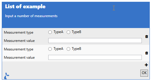
The property values available for a LISTOF input is:
templatewhich contains an object defining a single input elementmaxItemsthe max number of items a user is allowed to input,maxHeightthe max height of theLISTOFinputinitialItemsthe number of initial items in theLISTOFlist
# MARKDOWN input type
The MARKDOWN input type can be used to display some text (non-interactive) formatted with markdown (opens new window).
var results = Dialog.input(
  'MARKDOWN',
  'Markdown example',
  {
    md: {
      type: 'MARKDOWN',
      text: 'I'm some *markdown* to display.'
    }
  }
);
# DIVIDER input type
The DIVIDER type does not support any options.
# SPACER input type
Has no options either, will provide some vertical space.
# Validation
Input fields may have a validation object or function in their options which determines valid values for the inputs. If you supply an object then it can have the following properties;
isRequiredboolean value indicating whether a value must be supplied for the field,regexis a regular expression (opens new window) which must match the given input in order for the field to validate,messageis an optional message to be displayed in case validation fails.
Regex gotchas
- Use either
isRequiredorregex, not both at the same time. \in the regex must be escaped to\\
For function-based validation you should supply a function that returns either a message (in case of failed validation) or null in case of a successful validation. The function is given the current value of the input as its single argument. An example;
var result = Dialog.input("Function-based validation demo", "", {
  foo: {
    type: "CHECKBOX",
    options: [{ name: "1" }, { name: "2" }, { name: "3" }],
    validation: function (selected) {
      // We check whether 2 or more options are selected
      if (selected && selected.length < 2) {
        return "You must select at least 2 options";
      }
    },
  },
});
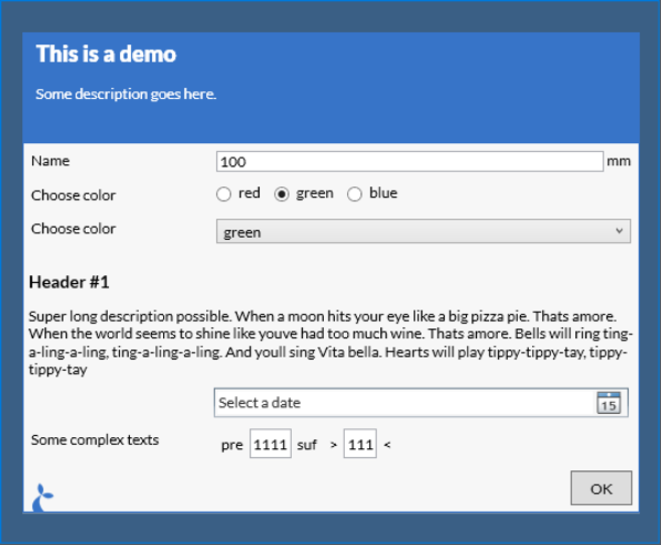
# Example
var result = Dialog.input("This is a demo", "Some description goes here.", {
  submitOnValidation: true,
  maxDialogHeight: 1000,
  maxDialogWidth: 2000,
  name: {
    prompt: "Name",
    type: "TEXT",
    suffix: "mm",
  },
  colorRadio: {
    prompt: "Choose color",
    type: "RADIO",
    selectBetween: ["red", "green", "blue"],
  },
  foo: {
    prompt: "Show only on blue",
    dependsOn: "colorRadio=blue",
    type: "TEXT",
  },
  colorCombo: {
    prompt: "Choose color",
    type: "SELECT",
    selectBetween: ["red", "green", "blue"],
    validation: { isRequired: true, message: "Color must be selected" },
  },
  header: {
    type: "HEADER",
    value: "Header #1",
  },
  desc: {
    type: "DESCRIPTION",
    value:
      "Super long description possible. When a moon hits your eye like a big pizza pie. Thats amore. When the world seems to shine like youve had too much wine. Thats amore. Bells will ring ting-a-ling-a-ling, ting-a-ling-a-ling. And youll sing Vita bella. Hearts will play tippy-tippy-tay, tippy-tippy-tay",
  },
  date: {
    type: "DATE",
  },
  multi: {
    type: "MULTITEXT",
    prompt: "Some complex texts",
    texts: [
      {
        name: "a",
        prefix: "pre",
        suffix: "suf",
        validation: { regex: "a+", message: 'Must contain at least one "a"' },
      },
      { name: "b", prefix: ">", suffix: "<" },
    ],
  },
});
// Now use the input values for something
var name = result.name;
var eyecolor = result.colorRadio;
This will result in the dialog shown below.
It is possible to bypass validation by using the attribute bypassValidation on a button in the dialog. When the user clicks this button then the dialog is closed and the intermediate result is returned to the flow.
# Resuming from a partially filled-in form
var inputOptions = {
  'name': {
    'prompt': 'Name',
    'type': 'TEXT',
    'suffix': 'mm'
  },
  buttons: [
      { 'value': 'No', 'isCancel': true },
      { 'value': 'Continue', bypassValidation: true },
      { 'value': 'Ok' },
    ]
  }
};
var results = Dialog.input("Input 1", "1", inputOptions);

if (partialResults.button == 'Continue') {
  // Show an indentical dialog but pre-fill values from Dialog 1
  results = Dialog.input("Input 2", "2", inputOptions, results);
}
# HTML based input dialog
In addition to the normal native input function we also support using HTML input forms. This approach does not bring as much built-in functionality - validation, conditional displays etc - but offers a larger degree of customization in the appearance of the displayed form. It works by taking the form, either HTML directly or a URL to a page containing the form and then displaying this in a dialog. When the user accepts the form (clicks “ok”) the page is parsed and information about the contents of the individual fields are extracted for use in the flow.
The input values entered can be retrieved from the dialog result by using the name or id property of the input element. For more info on forms see e.g. https://developer.mozilla.org/en-US/docs/Learn/HTML/Forms. For a concrete example with a number of different input elements see e.g. http://sirenia.eu/tutorial/ie-form.html. div tags with a input class will also be returned - the id of the div will be used as key.
Closing the dialog from within
You can close the dialog window from a snippet of Javascript embedded in the html displayed or when the user clicks a special link. These links are of the form dialog:close:ok or dialog:close:cancel to respectively close the dialog with a success result or with a failure (similar to when the user clicks the “Cancel” button. So a link would look like:
<a href="dialog:close:ok">Click me to close</a>
and a Javascript version would be:
<div onclick="window.location = 'dialog:close:ok'">Also click me to close</div>
Note that some new input types introduced in the html5 standard are not currently supported. Unsupported input types will fall back to type ‘text’.
# Parameters
header- [string] the header to displaytext- [string] a longer text to displayoptions- [object] containing options for the dialog itself:source- [string] the form to display - either HTML directly or a URLembed- [bool] if true, manatee will add some styling and html/body tags to the page, if false nothing is addedmaxDialogWidth- [int] the max width the dialog must takemaxDialogHeight- [int] the max height the dialog must takethrowsa boolean indicating whether to throw an exception if the dialog was cancelled - default istrueforegroundColorsets the foreground color of the dialogbackgroundColorsets the background color of the dialogbrowserwhich browser engine to use"IE"(default) or"Edge"markdownwhether or not thetextis formatted using markdown (opens new window) (defaultfalse)
# Example
Source directly as an option.
var result = Dialog.inputHtml("Header", "Some more text", {
  source: "<input type='text' id='myText'></input>",
  embed: true,
});
// The result will have a `myText` property since we added the `id` property with the value to the input field
Debug.showDialog("Result was " + result.myText);
Using a remote document.
var result = Dialog.inputHtml("Header", "Some more text", {
  source: "http://sirenia.eu/tutorial/form.html",
  embed: true,
});
// The result will have a `myText` property since we added the `id` property with the value to the input field
Debug.ger(result);
# Flow
The flow object provides a mechanism to invoke other flows. This allows some flows to become superflows connecting multiple flows together. Flows from other applications may also be invoke in this fashion.
# Shared functionality
You can use the include(...) method to include code from a MODULE typed flow. This is great if you have some code that you want to share between multiple flows.
The code in the module flow can export its functionality by assigning variables to the global exports object. See the example below.
# Parameters
namethe name or subject of the module to include
# Examples
We’ll define a handy math module (given the subject = math):
var times = function (a, b) {
  return a * b;
};

var plus = function (a, b) {
  return a + b;
};

var bigNumber = 10000;

exports.times = times;
exports.plus = plus;
exports.bn = bigNumber;
and this can then be used in another flow:
var math = Flow.include("math");
var ten = math.times(2, 5);
# Run flow
Run another flow with the run(...) method. You provide the input to the flow and will get the outputs of the flow.
# Parameters
namethe name, subject or id of the flow to run - if there are 0 or more than 1 flow with this name anErrorwill be thrownenvironmentis a JavaScript object containing the input to the flow. Each property on the object will be mapped to an input. Currently only string values are supported. Inputs are accessed in the running flow withInputs["<inputname>"]e.g.Inputs["myinput"]or simply<inputname>e.g.myinput(if the <inputname> is a valid JavaScript identifier).sessiona session selector (see below)options(optional) which can include;allowLaunch(bool) allow Manatee to launch the application, default istrueallowVirgin(bool) allow Manatee to run the flow before the state of the application has been synchronised
# Disambiguation
Since it is possible and valid to have flows in multiple apps with the same name, it can be ambiguous which flow should be chosen by Flow.run. If flows called ExampleFlow exist in apps A and B and a flow on app A runs Flow.run('ExampleFlow'), manatee will always prefer the matching flow from the same app (A) as the calling flow.
Note that if ExampleFlow exists in apps B and C and a flow in app A calls Flow.run('ExampleFlow'), you can’t be sure which flow is called. In such cases you can use the subject or id of the flow as the first argument instead - or rename one of the colliding flows.
# Examples
var result = Flow.run("MyOtherFlow", { inputA: "AAA", inputB: "BBB" });
// "MyOtherFlow" will now get executed, the inputs may be accessed via e.g. Inputs["inputA"] in "MyOtherFlow"
var outputC = result.outputC; // providing "MyOtherFlow" has a defined output called "outputC"
It is possible to chain flows like:
var result = Flow.run("RunLast", Flow.run("RunFirst", {}));
Run a flow only if the application is already running and connected to Manatee:
var result = Flow.run("RunThisOnlyIfAppIsRunning", {}, null, {
  allowLaunch: false,
});
# Flow.run to run flows in another session
In order to run a flow in another session you need to provide a third argument to Flow.run. This “session selector” argument can either be a function acting as a predicate on the states of the sessions or a an object that contains keys and values to match.
# Using a predicate
We’ll assume we have the following sessions currently available.
- Session 1 with app A (instance 1) has the following state;
s1 = v1. - Session 2 with app A (instance 2) has the following state;
s1 = v2.
If we want to run the flow “foo” in session 2 then we do:
Flow.run("foo", null, function (state) {
  return state["s1"] === "v2";
});
# Using a key-value match
Using the same sessions described above we can match session 2 again using a the key-value match:
Flow.run("foo", null, { s1: "v2" });
The key-value matcher will also create the session if it does not exist - this will not happen using the predicate approach.
# Wait
# Wait for seconds
Wait the given amount of seconds.
# Parameters
timeoutthe number of seconds to wait
# Example
Wait.forSeconds(2);
# Wait for milliseconds
Wait the given amount of milliseconds.
# Parameters
timeoutthe number of milliseconds to wait
# Example
Wait.forMilliseconds(200); // Wait for 0.2 seconds
# Wait for field
Wait for the given field to appear - will return when field appear or throw an exception when the given amount of seconds has elapsed.
# Parameters
fieldthe field to wait for e.g.Fields["myfield"]timeoutthe max amount of seconds to wait for the field to appearoptionsadditional optional argumentspollDelayInMsint, how many ms between checks that the field is present or not - default is200
# Example
Wait.forField(Fields["myfield"], 10);

// Poll every 1s
Wait.forField(Fields["myField"], 10, { pollDelayInMs: 1000 });
# Wait for field to disappear
Wait for the given field to disappear - will return when field disappears or throw an exception when the given amount of seconds has elapsed.
# Parameters
fieldthe field to wait for e.g.Fields["myfield"]timeoutthe max amount of seconds to wait for the field to disappear
Wait.forFieldToDisappear(Fields["myfield"], 10);
# Wait for window
Wait for the given window to appear - will return when a matching window appears or throw an exception when the given amount of seconds has elapsed. There is also a forWindowToDisappear variant.
# Parameters
titlethe title of the window to wait fortimeoutthe max amount of seconds to wait for the field to appear
# Example
// Wait for a window with Notepad in its title to appear, max 10s
Wait.forWindow("Notepad", 10);
// Wait for Notepad to disappear again
Wait.forWindowToDisappear("Notepad", 10);
# Wait for lock
Wait.forLock(...) allows for exclusive access to a shared resource among concurrently running flows (from separate sessions) or from other asynchronous tasks (e.g. when using the Task module).
# Parameters
lockNameThe name of the lockcallbackThe function to call with exclusivity under the named lockoptsOptions (default: { timeout: 3000 })
# Return value
true if the lock was obtained within the timeout. false otherwise
# Example
To access a shared resource with exclusivity:
function accessSharedResourceFn() {
  // Access the shared resource here...
}

if (!Wait.forLock("resourceLock", accessSharedResourceFn, { timeout: 5000 })) {
  throw Error("Failed to access the shared resource");
}
# Wait for click
Wait.forClick(...) and Wait.forRightClick(...) can be used to wait for a user to click a given field.
# Parameters
fieldan instance of aFieldto wait for click onoptionsan object containing optional arguments;throwsbool, iftruethen an exception is thrown if the field was not clicked beforetimouthas elapsed - default istruetimeoutint, for how many ms should we wait before giving up - default is60000
# Return value
If option.throw is false then true is returned if the field was clicked, false otherwise.
# Example
// Simple wait - will throw error if "OK" is not clicked within 60s
Wait.forClick(Fields["OK"]);

// Do not throw an error and wait only 5s
if (!Wait.forRightClick(Fields["Cancel"], { throws: false, timeout: 5000 })) {
  // No click
} else {
  // "Cancel" was clicked
}
# Wait for predicate
Wait.for(...) can be used to wait for an arbitrary condition to be met. Use this for any condition that isn’t directly supported by other methods in the Wait api.
# Parameters
predicatea function returning a truthy value when the awaited condition is met and falsy values otherwise.optionsan optional object containing arguments;throwsbool, iftruethen an exception is thrown if the predicate has not returned a truthy value beforetimouthas elapsed - default istruetimeoutthe number of ms we wait before giving up - default is10000intervalthe number of ms to pause between each invocation of the predicate. Default is200
# Return value
The first truthy value returned by the predicate is returned or null if no such value was produced. If the throw option is true (default) and no truthy value is produced by the predicate, an exception is thrown in stead.
# Example
function predicate() {
  return new Field("**/combobox").read();
}
// Wait 3 seconds for field to get a value - no timeout exception
var maybeValue = Wait.for(predicate, { throws: false, timeout: 3000 });
if (!maybeValue) {
  // Handle timeout
}
// Wait 10 seconds with exception on timeout
try {
  Wait.for(predicate);
} catch (e) {
  // Handle the timeout
}
# Xml
The Xml module enables parsing information stored in local or remote xml files.
# Load xml
Parse the given string as xml and return an XmlDoc object which can be queried or turned into JSON.
# Parameters
xmlan xml formatted string to parse
# Example
var d = Xml.load("<hello>world</hello>");
# Load XML from url
Fetch a local or a remote file and parse as xml. Returns an XmlDoc object.
# Parameters
urlis a local or remote path to an xml file
# Example
// A remote file
var remote = Xml.loadFrom("http://somewhere/over/the/rainbow.xml");
// A local file
var local = Xml.loadFrom("c:\\somewhere\over\the\rainbow.xml");
# Load XML from JSON string
You can use the loadJson function to parse a JSON string into an XmlDoc object. It should have the same structure as the output of the Xml.toJson function.
var json = JSON.stringify({ a: { b: 2 }, c: 3 });
var doc = Xml.loadJson(json);
# XmlDoc
An XmlDoc is an object that wraps an xml document and which has a few functions for querying the underlying document.
# XPath
Execute an XPath (opens new window) query and return the results. The result is a list of objects, each object represents the matching xml node.
# Parameters
xpatha well-formed XPath (opens new window) expression
# Example
var doc = Xml.load("<hello>world</hello>");
var allHellos = doc.xpath("//hello");
# Xml to JSON
Returns a JSON/JavaScript version of the document which can then be inspected in the flow.
# Example
var doc = Xml.load("<hello>world</hello>");
var docObject = doc.json();
# XmlDoc to XML string
Use the toString function to return the xml document as a string.
var doc = Xml.load("<hello>world</hello>");
var xmlString = doc.toString(); // "<hello>world</hello>"
# Modify an XML document
The walk function implements a visitor-pattern for the underlying xml document. It can be used to modify the document.
You supply it with a function that may either return a new value as an object or xml string or a boolean value where false indicates that the node should be removed.
The function will get called for each node in the document.
var doc = Xml.load("<root><hello>world</hello></root>");
doc.walk(function(node) {
    if (node.hello) {
        return "<hello>universe</hello>";
    }
});
var greeting = doc.toString(); // <root><hello>universe</hello></root>
# HTTP
The Http module enables http requests to be sent within a flow.
# GET
Send a HTTP GET request. Returns a reply object containing;
statusthe http status-codedataa string containing the data receivedheadersan object containing the headers receivedtoDiskis a method to write the response data to disk
# Parameters
urlthe url to GEToptsoptions, an object which may contain the following properties:credentials(optional) for basic-auth - an object containing;authshould be set to"basic"for basic-authusernameusername for the http resourcepasswordpassword for the http resource
headers(optional) an object defining additional headers to include in the requestuseragent(optional) a string overriding the default useragenttimeout(optional, default60000) how many ms to wait for the request to completecontenttype(optional) the contenttype of the requestaccept(optional) an Accept headerhost(optional) the Host headeruseWebRequest(optional, defaultfalse) whether to use the .NET built-in http-clientuseWindowsAuth(optional, defaultfalse) use NTML authorization with current users credentials
# Example
// Anonymous
var reply = Http.get("http://somewhere/over/the/rainbow.txt", {});
if (reply.status == 200)  { // Status: OK
  ...
}
// With basic-auth user/pass
Http.get("http://somewhere/over/the/rainbow.txt", { 'credentials': { 'auth': 'basic', 'username': 'John', 'password': 'ramb0' } });
# POST
Send a HTTP POST request. Returns a reply object containing;
statusthe http status-codedataa string containing the data received
# Parameters
urlthe url to POST todataa string to POSToptsoptions, an object containing additation options for the request (see description in Http.get)
# Example
// Anonymous
var reply = Http.post("http://somewhere/over/the/rainbow.txt", "data=123", {});
if (reply.status == 200)  { // Status: OK
  ...
}
# PUT
Send a HTTP PUT request. Returns a reply object containing;
statusthe http status-codedataa string containing the data received
# Parameters
urlthe url to PUT todataa string to PUToptsoptions, an object containing additation options for the request (see description in Http.get)
# Example
// Anonymous
var reply = Http.put("http://somewhere/over/the/rainbow.txt", "data=123" {});
if (reply.status == 200)  { // Status: OK
  ...
}
# DELETE
Send a HTTP DELETE request. Returns a reply object containing;
statusthe http status-codedataa string containing the data received
# Parameters
urlthe url to DELETEoptsoptions, an object containing additation options for the request (see description in Http.get)
# Example
// Anonymous
var reply = Http.delete("http://somewhere/over/the/rainbow.txt", {});
if (reply.status == 200)  { // Status: OK
  ...
}
# Upload a file using a form post
Upload a file using a POST request with multi-part data (as from a html input form):
Http.upload("http://save.my/file", "C:\\here\\is\\my\\file.txt");
# Download a file and store it to disk
Downloading a remote file and storing it to a local disk can be done like:
Http.get("http://save.my/file.txt").toDisk("C:\\here\\is\\my\\file.txt");
# FTP
The Ftp module enables reading and writing files on ftp servers.
The common parameters for all Ftp methods are;
urlthe url to the file to do the action onoptsoptions, an object which may contain the following properties:userusername for the ftp server, blank if anonymous access is allowedpasspassword for the ftp server
# Read
Read a file using the read method.
// Anonymous
var data = Ftp.read("ftp://somewhere/over/the/rainbow.txt", {});
// With user/pass
var data = Ftp.read("ftp://somewhere/over/the/rainbow.txt", {
  user: "John",
  pass: "ramb0",
});
# Write
Write a file to a remote ftp server.
Has the additional data parameter.
urlthe url to the file to writedatathe content of the fileoptsoptions, an object which may contain the following properties:userusername for the ftp server, blank if anonymous access is allowedpasspassword for the ftp server
Ftp.write("ftp://somewhere/over/the/rainbow.txt", "red, green, blue", {});
# Upload
Upload a file from disk using the Ftp.upload method:
Ftp.upload("http://save.my/file", "C:\\here\\is\\my\\file.txt");
# Download
Download a file using .download.
Ftp.download("http://download.me/file.txt", "C:\\here\\is\\my\\file.txt");
# List
List the contents of a remote dir.
var result = Ftp.ls("http://some.remote/dir");
# Create directory
Create a new remote dir.
Ftp.mkdir("http://some.remote/dir");
# Delete directory
Delete a remote dir.
Ftp.rmdir("http://some.remote/dir");
# Delete a file
Delete an existing file.
Ftp.rm("http://some.remote/dir.txt");
# Db
The Db module has functionality for connecting to databases. It currently supports sqlite, mssql, msaccess, oracle and postgresql databases.
Requires Manatee v1.29 or greater
This version of the Db module cannot be used with Manatee v1.28 or earlier.
# Connect
The connect method initialises a connection to a given database and returns a Database object.
# Parameters
typethe type of the database, currently this should be “mssql”, “sqlite”, “msaccess”, “oracle” or “postgresql”.connectionthe connection-string which contains information about how to connect to the database in question
# Example
var db = Db.connect('sqlite', 'Data Source=C:\\MyFolder\\Test.db;Version=3;');
# Database
The database object returned from a Db.connect(...) invocation represents a database connection. It has two primary methods for interacting with a database; query and exec.
# Exec
The exec method will execute a non-query (e.g. INSERT, UPDATE) and return the number of affected rows.
# Example
var affectedRows = db.exec('CREATE TABLE Test (id int, name string)');
Also supports db parameters:
Db.exec(
  "INSERT INTO Mammals (name, species) VALUES (@name, @species)",
  { "@name": "John", "@species": "Seacow" }
);
The arguments in the 2nd argument must be prefixed with “@”.
# Query
The query method is used for queries (e.g. SELECT etc) and returns an array of objects representing the result of the query.
# Example
var rows = db.query('SELECT id, name from Test');
for (var i=0; i<rows.length; i++) {
  Debug.showDialog("id="+rows[i].id+", name="+rows[i].name);
}
# Begin
The begin() method is used to initiate a transaction.
# Example
var tx = db.begin();
# Close
You can use the close() method to close the database connection.
db.close();
# Transaction
A transaction object is conceptually similar to the database object. It has the same query and exec methods, but will delay the execution of the query or command until commit() is invoked and of course maintains transactional integrity. If the rollback() method is invoked the query and exec operations already made are discarded.
# Commit
A commit() invocation will commit the tx to the db.
# Example
tx.exec("INSERT INTO Test (id, name) VALUES (1, 'John')");
tx.exec("INSERT INTO Test (id, name) VALUES (2, 'Jane')");
// Commit John and Jane
tx.commit();
# Rollback
A rollback() invocation will rollback the tx.
# Example
tx.exec("INSERT INTO Test (id, name) VALUES (1, 'John')");
tx.exec("INSERT INTO Test (id, name) VALUES (2, 'Jane')");
// John and Jane are not needed anyways
tx.rollback();
# Csv
The Csv module can be used for parsing, manipulating and generating comma-separated files.
# Parse
The parse method takes a csv formatted string and returns an array of objects or arrays - one for each row in the string. There is also a parseFile variant which is identical to the parse method except that it takes a filename as its first argument.
# Parameters
contentthe csv stringoptionsprovides the options for the parser
The options object can have the following fields:
delimetersa list strings used to separate the columns of the content - default is[',',';']headercan be set totrueto indicate that a header is present in the first line of the content or you can set it to an- array of strings to provide the header manually (the first line is treated as normal data) or you can
- leave it or or set it to
null(the default) which will cause the parsed result to be an array of arrays instead of an array of objects
quotedFieldswhich will strip quotes from the data (if present in the content) - defaultfalse
# Examples
var csv = Csv.parse("foo;bar\n100;200", { header: true });
The csv variable will now contain:
[{ foo: 100, bar: 200 }];
or if there is no header:
var csv = Csv.parse("100;200\n300;400", {});
The csv variable will now contain:
[
  [100, 200],
  [300, 400],
];
# Stringify
The stringify(arr, quoteStrings, delim) method will take an array of objects or an array of arrays generate a csv string.
# Parameters
arrthe array to convert to a csv stringquoteStringsa boolean value indicating whether to add quotes to strings or not (defaultfalse)delimthe delimeter string to separate fields (default',')
# Example
var arr1 = [
  ["foo", "bar"],
  [1, 2],
];
var arr2 = [{ foo: 3, bar: 4 }];
var csvStr1 = Csv.stringify(arr1);
var csvStr2 = Csv.stringify(arr2);
csvStr1 and csvStr2 will now both have the value foo,bar\n1,2.
# Excel
# Load
Load and parse an Excel spreadsheet. It can either return the entire spreadsheet or a selected range of cells. If the header option is set then the returned value will be be a map/object with the column names as keys - otherwise an array is used. If index is set then then values in the index column will be used as keys - otherwise an array is used. If both are set then both dimensions will use values as keys. See the examples below.
# Parameters
filepath for an Excel spreadsheet to loadoptionsoptions for parsing the spreadsheet - use{}to return the entire spreadsheettabledefine a table to returnrangewhich range does the table reside in e.g.'A1:D20'headeris a boolean to determine if the top row of the table is a headerindexis a boolean to determine if the initial column is an index columnworksheetis the name of the sheet to load data from
# Example with simple table
Given the following simple spreadsheet in the worksheet named ‘Sheet1’:
| cell 1 | cell 2 |
| cell 3 | cell 4 |
The following code will load the spreadsheet and pick out the value stored at cell1.
var table = Excel.load("myspreadsheet.xlsx", {});
var cell1 = table["Sheet1"][0][0];
# Example with table with header defined by range
Given the table below, situated in worksheet “Sheet1” at A1:B3:
| header 1 | header 2 |
|---|---|
| cell 1 | cell 2 |
| cell 3 | cell 4 |
Use the following code to pick out cell4.
var table = Excel.load("myspreadsheet.xlsx", {
  table: { range: "A1:B3", worksheet: "Sheet1", header: true },
});
var cell4 = table[2]["header 2"]; // 3rd row (0 is first row), column with header 'header 2'
# Example with both header and index
Given the table below, situated in worksheet “Sheet1” at A1:B3:
| header 1 | header 2 | |
|---|---|---|
| I1 | cell 1 | cell 2 |
| I2 | cell 3 | cell 4 |
Use the following code to pick out cell2.
var table = Excel.load("myspreadsheet.xlsx", {
  table: { range: "A1:C4", worksheet: "Sheet1", header: true, index: true },
});
var cell2 = table["I1"]["header 2"];
# Delete a sheet
Removes a single sheet from the workbook.
# Parameters
filenamethe path to the excel file to be updatedsheetthe name of the sheet to delete
# Example
Excel.deleteSheet("data.xlsx", "Sheet1");
# Update single cell
Update the value stored in a single cell in a spreadsheet.
# Parameters
filenamethe path to the excel file to be updated - if the file does not exist a new one will be createdsheetthe name of the sheet to updateaddressan “address” to a cell, e.g. “A1”valuethe value to write into the celloptionsis an object which may contain the following properties:formula(bool) to indicate that thevalueis a formula (not a scalar value)
# Example
// write 1000 into A3 of Sheet1 in data.xlsx
Excel.updateCell("data.xlsx", "Sheet1", "A3", 1000);
Add a formula to A4:
Excel.updateCell("data.xlsx", "Sheet1", "A4", "=A3+100", { formula: true });
# Update multiple cells
Update values stored in a spreadsheet. This method is a lot more performant than the single cell version if you need to store multiple values.
# Parameters
filenamethe path to the excel file to be updated - if the file does not exist a new one will be createdsheetthe name of the sheet to updateaddressan “address” of the starting cellvaluesthe valued to write into the cells - this should be a 2 dimensional array (like a table)
# Example
// The data to write
var data = [
  [10, 20, 30],
  [40, 50, 60],
];
// write data into data.xlsx, Sheet1 starting at A1
Excel.updateCells("data.xlsx", "Sheet1", "A1", data);
This will result in a table that looks like:
| A | B | C | |
|---|---|---|---|
| 1 | 10 | 20 | 30 |
| 2 | 40 | 50 | 60 |
# Deleting rows and columns from a sheet
You can delete a single, multple or a range of rows from a sheet with the deleteRows method.
// Delete a *single* row - row 100
Excel.deleteRows("data.xlsx", "Sheet1", 100);
// Delete *multiple* rows, rows 100, 150 and 155
Excel.deleteRows("data.xlsx", "Sheet1", [100, 150, 155]);
// Detele a range of rows, rows from 100 to 150
Excel.deleteRows("data.xlsx", "Sheet1", { from: 100, count: 50 });
Deleting columns is done with the deleteColumns method with the same semantics as above.
# Settings
The Settings object contains values that can be read/written to affect the behaviour of a flow. The following properties are available:
CommandRetries(int - read+write) defines the number of times a command is retried before it is considered to fail. Default is3.CommandRetryDelays(Array<int> - read+write) defines the delays in milliseconds between each retry. Default is[100, 200, 400, 800, 1600]. When the number of retries exceed the given delays the last value in this array is used for all overflowing retries.
# Example writing a value
Settings.CommandRetryDelays = [100, 100, 100];
# Example reading a value
var retries = Settings.CommandRetries;
Debug.showDialog("Retries: " + retries);
# Settings.Manatee
The Settings.Manatee object gives read/write access to the settings that govern Manatee itself. The full list of available settings can be seen in the Manatee settings dialog. Settings can be updated one at the time or multiple values in one go.
Note that for most changes to take effect, Manatee must be restarted.
# Example writing values
// Set just one setting
Settings.Manatee.set("ProductionGroup", "MyOwnGroup");

// Set multiple settings
Settings.Manatee.set({
  productionGroup: "MyOwnGroup",
  mode: "FullAuto",
});
Manatee.restart();
# Example reading a value
var prodGroup = Settings.Manatee.productionGroup;
Debug.showDialog("Production group: " + prodGroup);
# Log
# Stats from running flow
It is possible to have extra stats logged from a running flow - these items will get logged when the flow finishes along with timing and other info.
// Log "foo" and "bar" values
Log.flowStats = {
  foo: 1200,
  bar: "abc",
};
// or
Log.flowStats.qux = true;
# Debug, Info, Warn, Error and Fatal
Inserts a line with the appropriate log level in the log.
# Parameters
keythe key of the message - keep this as a constanttextthe text to insert
# Examples
Log.debug("watch-this", "A bug in the hand is better than 10 on the root");
Log.Info("greeting", "Hello there");
Log.warn("stay-away", "You cant go in there");
Log.error("not-as-planned", "It did no go according to plan");
Log.fatal("very-wrong", "We should never get to here. Its bad.");
# Set log level
Controls the log verbosity of the application driver.
# Parameters
levelthe new log level. Must be one of the following: none, fatal, error, warn, info, debug.optionsoptional additional optionsuseStdOut(defaults to false) boolean value indicating if instrumentation log should go to the application stdout or to manatee log.
# Example
Log.setDriverLogging("info", { useStdOut: true });
# HID
The HID modules deals with human-input devices (e.g. mouse and keyboard) and allows us to simulate a low-level input from within a flow.
# Block input
You can block the user from providing input via mouse and keyboard for a specified time interval. The user will always be able to abort the block by pressing ctrl+alt+del.
# Parameters
timeoutfor how long should the user be blocked (in ms)
# Example
// Block input for max 2 seconds
var unblock = HID.blockInput(2000);
// Unblock manually after 1s
Wait.forSeconds(1);
unblock();
A notification showing that input is blocked will be displayed as long as the block lasts.
# HID.Mouse
The Mouse module can be accessed using HID.mouse or simply Mouse.
# Move cursor relative
Move the mouse cursor relative to its current position.
# Parameters
dxthe relative pixels to move vertically (positive to move right on the screen)dythe relative pixels to move horizontally (positive to move down on the screen)
# Example
// Nudge the cursor 10px to the right and 10 down
HID.mouse.moveBy(10, 10);

// All mouse functions are chainable meaning you can move, then click.
Mouse.moveBy(10, 10).click();
# Move to an absolute position
Move the cursor to a specified position on the screen.
# Parameters
xthe absolute vertical position to move the cursor toythe absolute horizontal position to move the cursor to
# Example
// Move to (10,10)
HID.mouse.moveTo(10, 10);
# Move to a Field
Move the cursor to the middle of the specified field.
HID.mouse.moveToField(Fields.MyButton);
# Hold a mouse button down
The command will depress the given mouse button until the flow finishes or the Mouse.up function (with the same button as argument) is called.
# Parameters
buttonthe button to hold down (options areMouse.LEFTBUTTON,Mouse.RIGHTBUTTONorMouse.MIDDLEBUTTON). If no argument is given theMouse.LEFTBUTTONis assumed.
# Example
Mouse.down(Mouse.MIDDLEBUTTON);
# Release a held down mouse button
The command will release the given mouse button.
# Parameters
buttonthe button to hold down (options areMouse.LEFTBUTTON,Mouse.RIGHTBUTTONorMouse.MIDDLEBUTTON). If no argument is given theMouse.LEFTBUTTONis assumed.
# Example
Mouse.up();
# Click with a mouse button
This command will click (depress, then release) with the given button button.
# Parameters
buttonthe button to hold down (options areMouse.LEFTBUTTON,Mouse.RIGHTBUTTONorMouse.MIDDLEBUTTON). If no argument is given theMouse.LEFTBUTTONis assumed.doubleClicka boolean indicating whether the click should be a double-click or not. Default isfalse.
# Example
Mouse.click(Mouse.RIGHTBUTTON);

// Double-click with left button
Mouse.click(Mouse.LEFTBUTTON, true);
# Scrolling
The scroll function simulates a mouse wheel rotation and takes two arguments; a vertical and a horizontal amount of clicks to turn.
Mouse.scroll(-100); // scroll "down" 100 mouse wheel "clicks"
Mouse.scroll(100); // scroll "up" 100 mouse wheel "clicks"
Mouse.scroll(0, 100); // scroll "right" 100 mouse wheel "clicks"
Mouse.scroll(10, 10); // scroll both vertically and horizontally
You can also read or write the amount of scrolling is done for each click via the wheelClickSize property.
Mouse.wheelClickSize = 10;
# HID.Keyboard
The Keyboard module contains methods for simulating keyboard key presses. It also contains an alternative to Window.sendKeys which adds ScanCodes to inputs which some applications prefer (Citrix etc).
The Window.sendKeys method has also been modified to be able to invoke the Keyboard.send method. This is done as follows by setting the useHID flag:
Window.sendKeys("{TAB}", { useHID: true });
The keys used in most of the keyboard methods are available on the Keyboard module itself. The full list is also given here:
Keyboard.LBUTTON;
Keyboard.RBUTTON;
Keyboard.CANCEL;
Keyboard.MBUTTON;
Keyboard.XBUTTON1;
Keyboard.XBUTTON2;
Keyboard.BACK;
Keyboard.TAB;
Keyboard.CLEAR;
Keyboard.RETURN;
Keyboard.SHIFT;
Keyboard.CONTROL;
Keyboard.MENU;
Keyboard.PAUSE;
Keyboard.CAPITAL;
Keyboard.HANGEUL;
Keyboard.HANGUL;
Keyboard.KANA;
Keyboard.JUNJA;
Keyboard.FINAL;
Keyboard.HANJA;
Keyboard.KANJI;
Keyboard.ESCAPE;
Keyboard.CONVERT;
Keyboard.NONCONVERT;
Keyboard.ACCEPT;
Keyboard.MODECHANGE;
Keyboard.SPACE;
Keyboard.PRIOR;
Keyboard.NEXT;
Keyboard.END;
Keyboard.HOME;
Keyboard.LEFT;
Keyboard.UP;
Keyboard.RIGHT;
Keyboard.DOWN;
Keyboard.SELECT;
Keyboard.PRINT;
Keyboard.EXECUTE;
Keyboard.SNAPSHOT;
Keyboard.INSERT;
Keyboard.DELETE;
Keyboard.HELP;
Keyboard.VK_0;
Keyboard.VK_1;
Keyboard.VK_2;
Keyboard.VK_3;
Keyboard.VK_4;
Keyboard.VK_5;
Keyboard.VK_6;
Keyboard.VK_7;
Keyboard.VK_8;
Keyboard.VK_9;
Keyboard.VK_A;
Keyboard.VK_B;
Keyboard.VK_C;
Keyboard.VK_D;
Keyboard.VK_E;
Keyboard.VK_F;
Keyboard.VK_G;
Keyboard.VK_H;
Keyboard.VK_I;
Keyboard.VK_J;
Keyboard.VK_K;
Keyboard.VK_L;
Keyboard.VK_M;
Keyboard.VK_N;
Keyboard.VK_O;
Keyboard.VK_P;
Keyboard.VK_Q;
Keyboard.VK_R;
Keyboard.VK_S;
Keyboard.VK_T;
Keyboard.VK_U;
Keyboard.VK_V;
Keyboard.VK_W;
Keyboard.VK_X;
Keyboard.VK_Y;
Keyboard.VK_Z;
Keyboard.LWIN;
Keyboard.RWIN;
Keyboard.APPS;
Keyboard.SLEEP;
Keyboard.NUMPAD0;
Keyboard.NUMPAD1;
Keyboard.NUMPAD2;
Keyboard.NUMPAD3;
Keyboard.NUMPAD4;
Keyboard.NUMPAD5;
Keyboard.NUMPAD6;
Keyboard.NUMPAD7;
Keyboard.NUMPAD8;
Keyboard.NUMPAD9;
Keyboard.MULTIPLY;
Keyboard.ADD;
Keyboard.SEPARATOR;
Keyboard.SUBTRACT;
Keyboard.DECIMAL;
Keyboard.DIVIDE;
Keyboard.F1;
Keyboard.F2;
Keyboard.F3;
Keyboard.F4;
Keyboard.F5;
Keyboard.F6;
Keyboard.F7;
Keyboard.F8;
Keyboard.F9;
Keyboard.F10;
Keyboard.F11;
Keyboard.F12;
Keyboard.F13;
Keyboard.F14;
Keyboard.F15;
Keyboard.F16;
Keyboard.F17;
Keyboard.F18;
Keyboard.F19;
Keyboard.F20;
Keyboard.F21;
Keyboard.F22;
Keyboard.F23;
Keyboard.F24;
Keyboard.NUMLOCK;
Keyboard.SCROLL;
Keyboard.LSHIFT;
Keyboard.RSHIFT;
Keyboard.LCONTROL;
Keyboard.RCONTROL;
Keyboard.LMENU;
Keyboard.RMENU;
Keyboard.BROWSER_BACK;
Keyboard.BROWSER_FORWARD;
Keyboard.BROWSER_REFRESH;
Keyboard.BROWSER_STOP;
Keyboard.BROWSER_SEARCH;
Keyboard.BROWSER_FAVORITES;
Keyboard.BROWSER_HOME;
Keyboard.VOLUME_MUTE;
Keyboard.VOLUME_DOWN;
Keyboard.VOLUME_UP;
Keyboard.MEDIA_NEXT_TRACK;
Keyboard.MEDIA_PREV_TRACK;
Keyboard.MEDIA_STOP;
Keyboard.MEDIA_PLAY_PAUSE;
Keyboard.LAUNCH_MAIL;
Keyboard.LAUNCH_MEDIA_SELECT;
Keyboard.LAUNCH_APP1;
Keyboard.LAUNCH_APP2;
Keyboard.OEM_1;
Keyboard.OEM_PLUS;
Keyboard.OEM_COMMA;
Keyboard.OEM_MINUS;
Keyboard.OEM_PERIOD;
Keyboard.OEM_2;
Keyboard.OEM_3;
Keyboard.OEM_4;
Keyboard.OEM_5;
Keyboard.OEM_6;
Keyboard.OEM_7;
Keyboard.OEM_8;
Keyboard.OEM_102;
Keyboard.PROCESSKEY;
Keyboard.PACKET;
Keyboard.ATTN;
Keyboard.CRSEL;
Keyboard.EXSEL;
Keyboard.EREOF;
Keyboard.PLAY;
Keyboard.ZOOM;
Keyboard.NONAME;
Keyboard.PA1;
Keyboard.OEM_CLEAR;
All the keyboard methods are chainable - meaning you can do:
Keyboard.down(Keyboard.SHIFT).press("f").up(Keyboard.SHIFT);
which will give you an “F”.
# Key down
Simulates pressing a key and holding it down (until up is called for the same key).
Keyboard.down(Keyboard.SHIFT);
// or using a case insensitive string
Keyboard.down("shift");
Remember to follow this with an Keyboard.up(key);.
# Key up
Simulates releasing a key.
Keyboard.up(Keyboard.SHIFT);
# Key press
Simulates a down followed by an up ie a key press.
Keyboard.press(Keyboard.VK_M);
# Input
Input is used for pure text input (ie no special- or modifier keys in the string you need to input).
Keyboard.input("Hello, world!");
# Send
The send method is used to ship more complex key-sequences to an application. It uses the same format as Window.sendKeys (see here (opens new window) for available keys).
// Send 2 TAB keys followed by 'f', 'o', 'o' and then `ctrl+a` to select all.
Keyboard.send("{TAB 2}foo^a");
An optional 2nd argument with options can be given. Currently supported is a wait option to define how long to wait between sending keystrokes.
// Wait 2s between keystrokes
Keyboard.send("abc", { wait: 2000 });
# Window
The Window module has functionality for dealing primarily with the main window of an application. In contrast the Windows module supports interacting with all the windows on the desktop.
# Title
Get the title of the main window. Optionally supply a timeout for the operation - default timeout is 500ms normally.
# Example
var title = Window.title();
// or with a timeout of 2s
title = Window.title(2000);
# Minimize
Minimize the main window.
# Example
Window.minimize();
# Is minimized
Check if the main window is minimized.
# Example
if(Window.isMinimized()) {
  ...
}
# Maximize
Maximize the main window.
# Example
Window.maximize();
# Is maximized
Check if the main window is maximized.
# Example
if(Window.isMaximized()) {
  ...
}
# Focus
Put focus on the main window.
# Parameters
optionsoptional object with options for focus. Supported options:useCachedUIboolean indicating if UI component lookup should use the UI itself or the underlying model. Defaults tofalse(underlying model traversal).askForPermissionwhether or not the user is asked for permission if Manatee is not allowed to focus (default istrue)
# Example
Window.focus();
// or do not ask for permission (then no focus is done if Manatee cannot focus)
Window.focus({ askForPermission: false });
# Send keys
Send keyboard events (simulated typing) to a window. Supports special strings (opens new window) for sending special keys.
# Parameters
keysthe keys to send - this is a stringoptionsoptional object with options for sendkeys, supported options:focus[bool] whether to focus the window prior to sending the keys
# Example
Window.sendKeys("foo bar");
// or to focus the window prior to sending the keys
Window.sendKeys("foo bar", { focus: true });
# Restore
Restore the main window to a previous state and location.
# Example
Window.restore();
# Window with modal dialog shown
Get whether or not a modal (dialog) is shown.
# Example
var modalIsShown = Window.modalShown();
WARNING
Only java
# Shown with title
Get whether or not a window with the given title is shown.
# Example
var windowIsShown = Window.withTitleShown("My Window");
WARNING
Only java
# Dim
Dims the window owned by the flow.
# Parameters
levelthe amount of dimming, 0-255. 255 is opaque and 0 is transparent.
# Example
Window.dim(100);
# Windows
The Windows module has functionality to inspect and manipulate the Windows of the desktop.
# All windows
The all() method will return an array of window proxy objects representing all windows on the desktop.
# Example
var allWindows = Windows.all();
# Windows for current application
The forApp() method returns an array of window proxy objects representing all the windows of the application.
# Example
var applicationWindows = Windows.forApp();
# Primary window
The primary property returns a single window proxy object representing the primary or main window of the application.
# Example
var pw = Windows.primary;
# Frontmost/focused window
Get the frontmost or focused window with this command.
# Example
var w = Windows.focused;
// and the same can be done via
w = Windows.frontMost;
# Given a window handle
Get access to a window if you know its handle.
// 12345 is probably not a valid handle, I'm an example ...
var w = Windows.byHwnd(12345);
# Window Proxy
The window proxy object returned by the Windows module methods represents a desktop window and can be manipulated with the following methods and properties.
# Close
Close the window.
Windows.primary.close();
# Move
Move the window to the given x,y coordinates.
var pw = Windows.primary;
// Move the window to (100,100) from the topmost left corner of the screen.
pw.move(100, 100);
# Resize
Resize the window to the given dimensions.
var pw = Windows.primary;
pw.resize(100, 100);
# Focus
Make the window the focused (topmost) window.
var pw = Windows.primary;
pw.focus();
# Maximize
Maximize the window.
var pw = Windows.primary;
pw.maximize();
# Minimize
Minimize the window.
var pw = Windows.primary;
pw.minimize();
# Show
Show a window that is hidden.
var pw = Windows.primary;
pw.show();
# Restore
Restore the original state of the window (after having maximized or minimized it).
var pw = Windows.primary;
pw.restore();
# Screenshot
Grab a screenshot of the window. The screenshot will be returned as a base64 encoded string. Accepts an optional options object.
optionsoptional object with options for screenshot, supported options:focus[bool] whether to focus the window prior to taking the screenshot - defaults to true
var pw = Windows.primary;

// img is a base64 encoded string
var img = pw.screenshot();

// get screenshot without setting focus first
var img2 = pw.screenshot({ focus: false });
# SendKeys
Send keyboard strokes to the window.
var pw = Windows.primary;
pw.sendKeys("abc");
# Hwnd
Get the window handle of the window.
var pw = Windows.primary;
var hwnd = pw.hwnd;
# Title
Get the title of the window.
var pw = Windows.primary;
var t = pw.title;
# Class
Get the class of the window.
var pw = Windows.primary;
var t = pw.class;
# IsPrimary
Get/set whether this window is considered the primary for the application.
var ws = Windows.forApp();
if (!ws[0].isPrimary) {
  ws[0].isPrimary = true;
}
# IsMaximized
Get a boolean value indicating whether or not the window is maximized.
var ws = Windows.forApp();
if (!ws[0].isMaximized) {
  // do something then
}
# IsMinimized
Get a boolean value indicating whether or not the window is minimized.
var ws = Windows.forApp();
if (!ws[0].isMinimized) {
  // do something then
}
# Bounds
Get/set the bounds (location and size) of the window.
var pw = Windows.primary;
var bounds = pw.bounds;

// Move 10px left and down
bounds.x = bounds.x + 10;
bounds.y = bounds.y + 10;
// Decrease width and height with 10px
bounds.width = bounds.width - 10;
bounds.height = bounds.height - 10;

// Update the window bounds with the new values
pw.bounds = bounds;
# Process for window
window.process();
// is a ProcessProxy object
# Transparency
A transparency property. The value to set is between 0 and 255. 0 is fully transparent, 255 is fully opaque.
Windows.primary.transparency = 60;
Dialog.info("Transparency is " + Windows.primary.transparency, "");
# Native field in window
Resolve a field in the given window using the native driver. This is particularly useful for interacting with native dialogs in browser apps such as a printer dialog or a file dialog in a Chrome app. It may also be useful for java apps embedded in a native shell. The field method returns a field object with the usual See methods/properties.
// This could be a case of a chrome flow that needs to pick a file for upload
window.field("**/(type)edit").input("C:\\aFolder\\aFile.txt");
window.field("**/Ok").click();
# Registry
The Registry module is used to access the Windows registry for reading/writing of data.
You start by accessing one of the root keys which are properties of the Registry module;
HKLMHKCUHKCRHKUHKCCHKEY_PERFORMANCE_DATA
these then return a JsRegistryKey with the following properties:
name(string) The name of the key.valueNames(string[]) A list of the names of values stored at this key.subkeys(string[]) A list of the names of subkeys stored under this key.
The JsRegistryKey then has the following methods:
# Open
To open a subkey. Supply the path the key (delimited by “/”), e.g.
var k = Registry.HKCU.open("Software/Sirenia/Manatee/Ports");
# Read
To read the value stored at the given name, e.g.
var port = Registry.HKCU.open("Software/Sirenia/Manatee/Ports").read(
  "websocketserversecureselfsigned",
);
# Delete
To delete a subkey or a whole subkeytree, e.g.
// Delete the Manatee subkey
Registry.HKCU.open("Software/Sirenia/Manatee/Ports").delete(
  "websocketserversecureselfsigned",
);

// To delete the whole subtree
Registry.HKCU.open("Software/Sirenia/Manatee").delete("Ports", {
  subtree: true,
});
# Write
Write a new value to the name of the key, e.g.
Registry.HKCU.open("Software/Sirenia/Manatee/Ports").write(
  "websocketserversecureselfsigned",
  12345,
);
Per default the type of the value written is String, however you can specify the type to use explicitly:
Registry.HKCU.open("Software/Sirenia/Manatee/Ports").write(
  "websocketserversecureselfsigned",
  12345,
  "dword",
);
The following strings can be used as registry type:
"binary""string""unknown""none""dword""qword""expandstring""multistring"
# Processes
The Processes module similarly to the windows module is used to enumerate and manipulate processes running on the local machine.
# All processes
The all() methods enumerates all processes on the local machine. It returns an array of process proxy objects.
var ps = Processes.all();
for (var i = 0; i < ps.length; i++) {
  // then do something with each process proxy
}
# Current
Get the current process for the application (for which the flow is defined).
var p = Processes.current;
Debug.showDialog(p.name);
# Spawning new processes
The spawn(...) method can be used to create new processes. It takes 4 arguments;
pathto the executable to launchargumentsfor the executable (optional - default null)working directory(optional - default null)shell(boolean) whether to launch the process in a shell environment - this must be set to true for url-handlers to activate (optional - default false)
It returns a process proxy object fronting the process spawned.
var p = Processes.spawn("C:\\Path\\ToExecutable.exe");
Debug.showDialog(p.name);
# Process proxy
# Kill
Kills a process.
var p = Processes.all()[0];
p.kill();
or with more violence:
p.kill({ force: true });
which will use taskkill to kill the process.
# Wait for a process to exit
The wait(...) method will wait for the given process to exit. It takes an integer, the maximum number of milliseconds to wait for the process as its argument. It returns a boolean indicating whether the processes exited (true) or the given timespan elapses (false).
// Wait max 1s for the first process to exit
if (Processes.all()[0].wait(1000)) {
  // it exited
} else {
  // 1s elapsed
}
# Send input (via standard-in)
Sending some input to a running process is achieved with the stdin(...) method.
This can normally only be done for processes spawned by yourself via the Processes.spawn(...)](#spawning-new-processes) method.
var p = Processes.spawn(...);
p.stdin("hello");
# Read from process output (standard-out)
Reading from the output of a process is done via the stdout(...) method. It takes an int - the number of lines to read - and returns a task which completes with the lines read as an array of strings once the given number of lines has been read.
This can normally only be done for processes spawned by yourself via the Processes.spawn(...)](#spawning-new-processes) method.
var p = Processes.spawn(...);
var lines = null;
// Read 3 lines, then kill the process
p.stdout(3).then(function(threelines) {
  lines = threelines;
  p.kill();
});
p.wait(20000);
Debug.ger(lines);
It is also possible to read from standard-error output - simply use the stderr(...) method instead of stdout(...).
An alternative approach to reading from stdout when you dont know how many lines you need to read upfront is to use processStdout and processStderr.
var lines = [];
// p is a ProcessProxy
// Here we'll process 100 lines but the termination condition could be anything
p.processStdout(
  function (line) {
    // do something with the given line
    lines.push(line);
    // if you return true the processing will continue - false it will stop
    return lines.length < 100;
  },
  // Deadline is 10s
  10000,
);
for (var i = 0; i < lines.length; i++) {
  Log.info("key", "Line #" + i + ":" + lines[i]);
}
# Read output from cmd.exe/powershell.exe
As a practical example of the use of Processes.spawn, we can retrieve all registered printers on the system. Note that the termination criteria here amount to reading until we are just getting empty lines out, with an upper limit for safety.
var p = Processes.spawn("cmd.exe", '/c "wmic printer list brief"');
var lines = [];
var emptyLines = 0;
p.processStdout(
  function (line) {
    if (line) {
      lines.push(line);
      // A non-empty line was received: Reset empty counter
      emptyLines = 0;
    } else {
      emptyLines++;
    } // if you return true the processing will continue - false it will stop
    return lines.length < 100 && emptyLines < 2;
  }, // Deadline is 10s
  10000,
);
for (var i = 0; i < lines.length; i++) {
  Log.info("key", lines[i]);
}
The same thing can be done with powershell by replacing the first line with the following:
var p = Processes.spawn("powershell.exe", '-Command "wmic printer list brief"');
# Process Id
Get the id of the process.
var pid = Processes.current.id;
# Process name
Get the name of the process.
var pname = Processes.current.name;
# Process path
Get the path of the executable for the process.
var path = Processes.current.path;
# Process working directory
Get the working directory of the executable for the process.
var pwd = Processes.current.wd;
# Process mem usage
Get the virtual or private memory (integers) usage of the process.
var virtualMem = Processes.current.vmem;
var privateMem = Processes.current.pmem;
# Process exited?
Gets a boolean indicating whether the process has exited.
if (Processes.current.exited) {
  // whoops
}
# Process uptime
Gets the number of milliseconds elapsed since the process was spawned (as longs as it has not exited).
var uptime = Processes.current.uptime;
# Process arguments
Get the arguments supplied to the process - can only be counted on to return valid arguments if process was spawned by Manatee.
var args = Processes.current.arguments;
# Process windows
process.mainWindow;
A list of all windows for process
process.windows;
// returns an array of WindowProxy objects
# Process commandline
Get the full commandline incl arguments for the process.
process.commandLine;
# Process filename
Get the full path to the filename of the executable.
process.fileName;
# Debug
# Show dialog
Show some text in a debug dialog. Essentially the same as Dialog.info("Debug", text).
# Parameters
textthe text to display
# Example
Debug.showDialog("hello there");
# ger
The Debug.ger() method pauses the running flow (as any other dialog) and shows a debugger dialog which includes an inspector and a REPL (read-eval-print loop).
# Inspector
The inspector window lets you inspect the global values in the flow as well as the argument given. The variables are displayed in a tree which can be expanded to reveal the structure of the objects.
The debugger shown above was shown with the following code:
var x = { foo: "bar", baz: 123 };
Debug.ger(x);
Expanding the CURRENT node will give you:
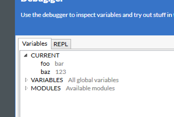
You can also explore the global variables (those defined in the outermost) scope of a flow. Here we show a field.
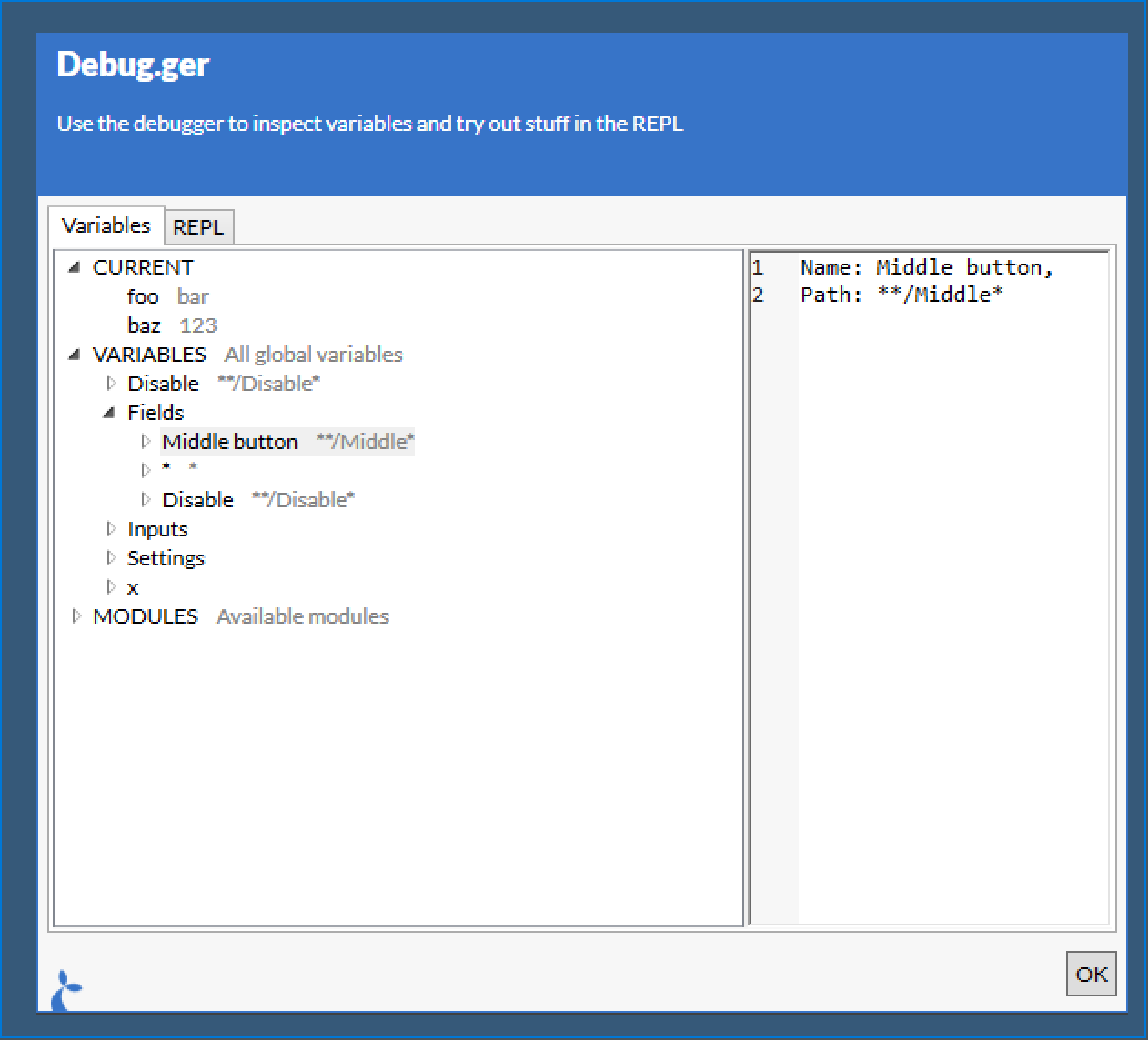
# REPL
The REPL tab of the Debug.ger can be used to try running small snippets of code in the context of the current flow. You can do anything via the REPL that you can do in a flow.
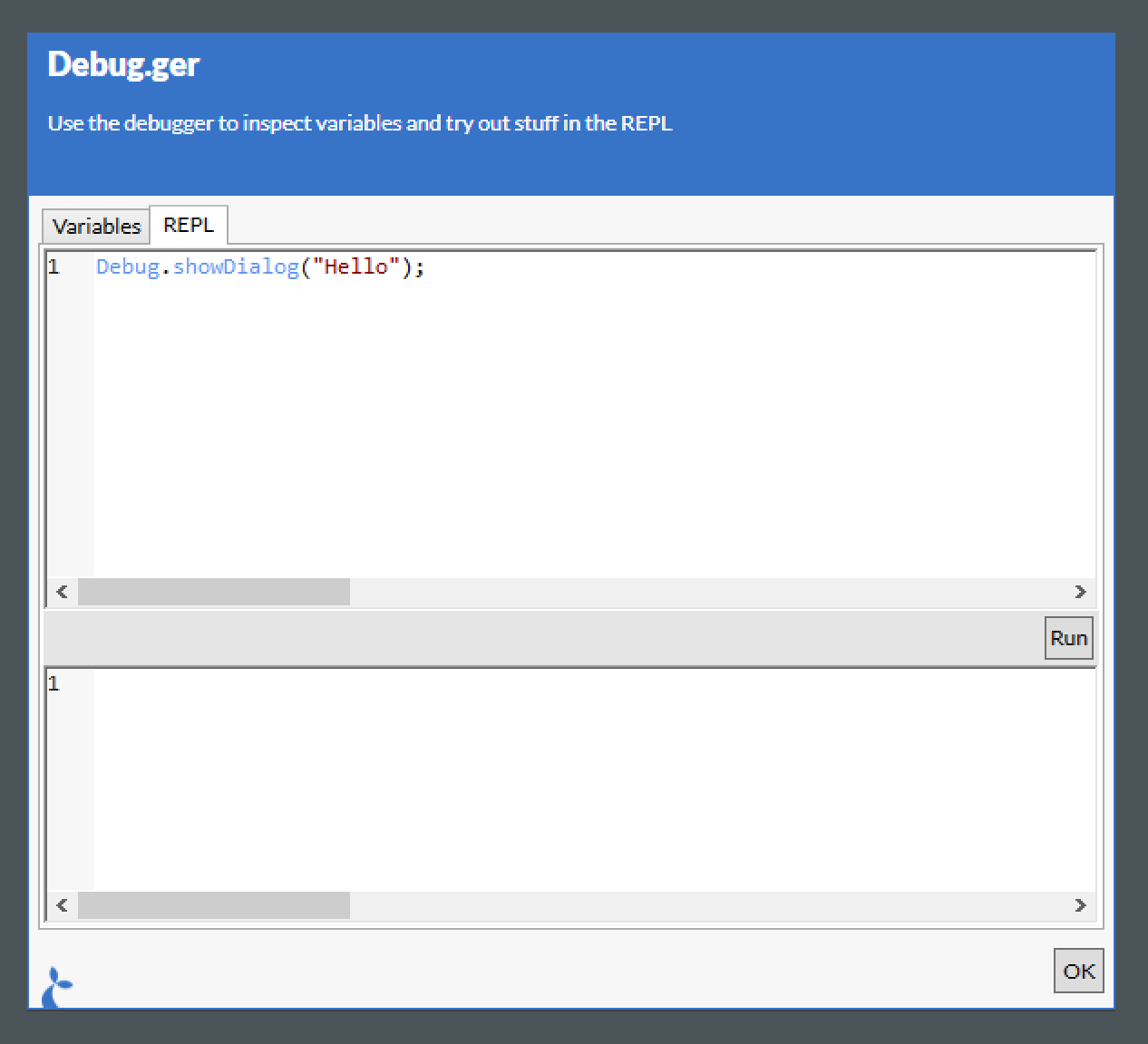
Clicking the “Run” button will run the code written and display the time it took to run as well as the result.
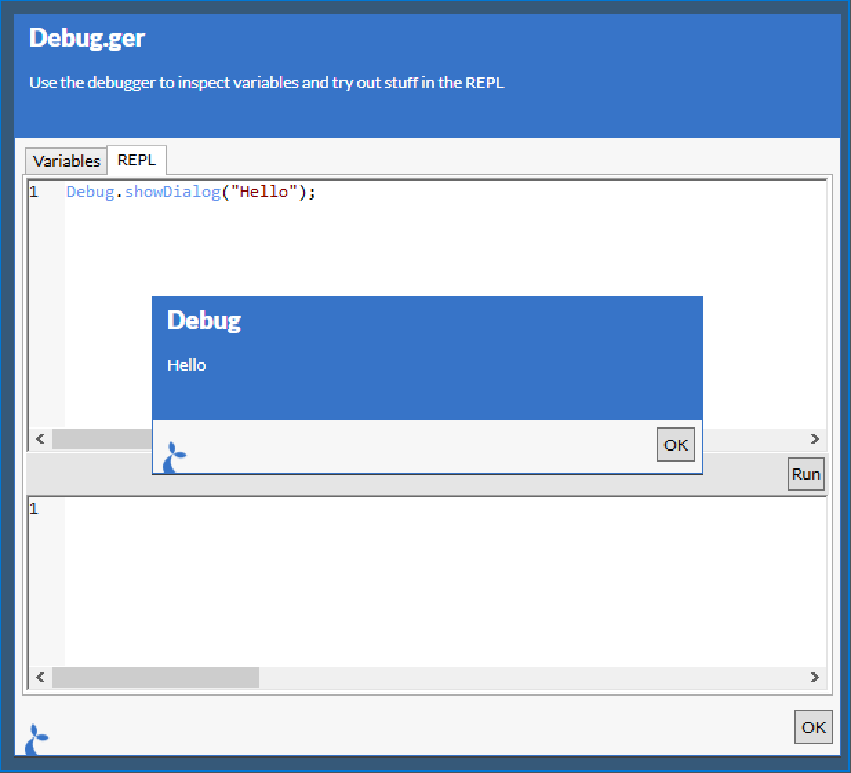
This method can also be used as Debug.attach() and Debug.inspect() but some of us prefer the simplicity and raw hipster essence of Debug.ger().
# Debug dialog size
You can pass an option object as the second argument. It accepts the following properties:
maxWidth: Allows control of the width of the debug window
var s = "data for the variable";
Debug.ger(s, { maxWidth: 1200 });
# Fs
The Fs module is used to interact with the filesystem of the local machine.
# System folders
Provides access to the following system folders:
tmpfolder: A directory for temporarily storing filesdesktop: The user’s windows desktopappdata: The user app data folder. Applications can write user specific data here without requiring administrator privilegestartup: The folder which contains shortcuts to applications that should start when the user logs inpersonal: The root user folder - egC:\Users\<user name>
# Example
var folder = Fs.tmpfolder;
# List (ls)
Returns a list of files and directories found in the directory given by the path argument. The path may contain wildcards * in its last segment.
A second option argument can be passed with the following properties:
deepMatchboolean indicating if the listing should include contents of subdirectories. Defaults to false. When this property is set to true, files matching the filename given in thepathargument in any sub-folder will be returned.includeDirectoriesboolean indicating if the listing should include directories. Defaults to false. So by default only files are included.
Default behavior is to do a shallow file listing of only the files in the given folder.
Weird behaviour with 3-letter extensions
When you use the asterisk wildcard character in a searchPattern such as *.txt, the number of characters in the specified extension affects the search as follows:
If the specified extension is exactly three characters long, the method returns files with extensions that begin with the specified extension. For example, *.xls returns both “book.xls” and “book.xlsx”.
In all other cases, the method returns files that exactly match the specified extension. For example, *.ai returns “file.ai” but not “file.aif”.
When you use the question mark wildcard character, this method returns only files that match the specified file extension. For example, given two files, “file1.txt” and “file1.txtother”, in a directory, a search pattern of file?.txt returns just the first file, whereas a search pattern of file*.txt returns both files.
WARNING
Because this method checks against file names with both the 8.3 file name format and the long file name format, a search pattern similar to *1*.txt may return unexpected file names. For example, using a search pattern of *1*.txt returns “longfilename.txt” because the equivalent 8.3 file name format is “LONGFI~1.TXT”.
# Return value
The resulting array can be used as a string array of the paths to the files. It can also be used as an array of objects with detailed information about the files. Each such object has the following properties:
folderis the folder part of the path.C:\folder\file.txthas the folder pathC:\folder.pathis the full path of the item. Corresponds to the string value of the object.extensionis the extension of the item.C:\folder\file.txthas the extension.txt.nameis the name of the item.C:\folder\file.txthas the namefile.txt.C:\folderhas the namefolder.readonlyboolean value indicating if the file is read only.sizeis the size of the file in bytes.createdis the time of creation.modifiedis the time of the last modification.accessedis the time of the last file access.
The objects further have the following methods:
mvmoves the file or directory. Pass the new path as an argument.cpcopies the file or directory. Pass the new path as an argument.rmdeletes the file.encryptencrypts the file.decryptdecrypts the file.
# Example
// Get all .txt files prefixed with somefile in somedir
var files = Fs.ls("c:\\somedir\\somefile*.txt");

// Get all .txt files in any sub directory under C:\somedir - at any depth
var files = Fs.ls("c:\\somedir\\*.txt", { deepMatch: true });

// Copy readonly files to a backup sub directory
var readonlyFiles = files.filter(function (file) {
  return file.readonly;
});
_.each(readonlyFiles, function (file) {
  file.cp(file.folder + "\\backup\\" + file.name);
});
# Make a new directory
Create a new directory if it does not already exist.
Fs.mkdir("C:\\some\\path");
# Move file
Move a file to a different path.
Fs.mv("C:\\some\\path\\file.txt", "C:\\some\\other\\path\\file.txt");
If you want to allow the target file to be overwritten (if it exists):
Fs.mv("C:\\some\\path\\file.txt", "C:\\some\\other\\path\\file.txt", {
  overwrite: true,
});
# Copy file
Copy a file to a different path
Fs.cp("C:\\some\\path\\file.txt", "C:\\some\\other\\path\\file.txt");
// and to allow overwrite of target file
Fs.cp("C:\\some\\path\\file.txt", "C:\\some\\other\\path\\file.txt", {
  overwrite: true,
});
# Delete file
Delete a file
Fs.rm("C:\\some\\path\\file.txt");
# Check file presence
Determines if a file exists at a given path
# Example
if (!Fs.exists("C:\\some\\path\\file.txt")) {
  // Create the file
}
# Build a path
Convenience for building a valid file system path to a file or a directory.
# Example
var p = Fs.buildPath("C:\\root", "foo", "bar.txt");
// p represents the path C:\root\foo\bar.txt
# Encrypt file
Activates windows file encryption for the file at the given path. Only the currently logged in user will be able to read the file.
# Example
Fs.encrypt("C:\\some\\path\\file.txt");
# Decrypt file
Deactivates windows file encryption for the file at the given path. Any user will be able to read the file.
# Example
Fs.decrypt("C:\\some\\path\\file.txt");
# Read
Read the contents of a file with the read function.
# Example
var html = Fs.read("c:\\somedir\\somefile.html");
Both Fs.read and Fs.write methods can take an encoding option, like:
Fs.write("C:/somewhere/test.txt", "String to write", { encoding: "UTF-16" });
// or for short
Fs.write("C:/somewhere/test.txt", "String to write", { encoding: Fs.UTF16 });
// and
Fs.read("C:/somewhere/test.txt", { encoding: "UTF-16" });
// default if no `encoding` arg is given is UTF-8 no bom
The list of encoding (names) which can be used is found at https://www.iana.org/assignments/character-sets/character-sets.xhtml (opens new window). Note that not all of these may be available on your machine, to see those, run:
Debug.ger(Fs.encodings);
The following are encodings are defined on Fs;
Fs.UTF8Fs.UTF16Fs.ASCII
If you think your file is ANSI or ASCII encoded, but none if these seem to work then you might be looking for the ISO-8859-1 encoding which sometimes does the trick.
# Write
Writes arbitrary text to an arbitrary text file. If the file exists, it will be overwritten. If the file doesn’t exist, it will be created with the given contents. The contents are written using UTF-8 encoding without a byte order mark (BOM).
Throws appropriate exceptions if the write fails.
# Parameters
paththe file system path to write todataa string with the data to writeoptionsan optional options object. Supported options are;base64a boolean. If true, interprets the data argument as a base64 string and writes the data to disk as binary data. Defaults to falsewriteBoma boolean. If true, a utf-8 byte-order-mark sequence is prepended to the file. This helps other applications detect the encoding of the file. Defaults to false. Is ignored if thebase64option is true.encodingThe encoding with with to write the file (default is"UTF-8").appenda boolean. If true, text is appended to the file in the path in question. Is ignored if thebase64option is true.
# Example
Fs.write(
  "c:\\somedir\\somefile.html",
  "<html><body><h1>Generated html!</h1></body></html>",
);
# Synchronise two directories
If you need two synchronise the files in two directories, i.e. make sure all files in the source directory are copied to the destination directory you can use the Fs.sync(...) method.
# Examples
// Make sure the two directories are completely synchronised, delete superfluous files from destination
Fs.sync("C:\\MySourceDirectory", "C:\\MyDestinationDirectory");
// uhe same but don't delete those files in the destination directory which are not present in the source
Fs.sync("C:\\MySourceDirectory", "C:\\MyDestinationDirectory", {
  deleteSuperfluous: false,
});
# Temp file
The tmpfile function will generate a random, non-conflicting filename in the temp folder.
# Example
var tmpFilePath = Fs.tmpfile();
# Dynamic applications
A dynamic application is like a regular application but it is defined and instantiated during the execution of a flow. It can be used to create cross-application flows in a more fluid manner than having to define regular applications and using Flow.run to execute parts of the overall flow. Dynamically created applications are attached to or launched on-the-fly.
The Application constructor takes two arguments. The first argument is the application configuration. It can be either a string in which case we will;
- try to find an existing application with the same identifier or name and use its configuration, or
- construct a
NATIVEapp configuration with atitleBarContainsmatch based on the argument.
So if you have a “Notepad” application, the example above will use that configuration, if not then it will try to find a window that contains the text “Notepad” in the titlebar and attach to that window as a native application.
If you provide an object to the constructor it will be used as the configuration for the application. In that case the following properties are supported (the same ones you use in Cuesta to configure an app):
typethe type of the application (see ApplicationTypes for a list of pre-defined types)launchWiththe command or url used to launch the applicationlaunchWithArgumentsthe arguments given to the process when launchinglaunchWithFlowIdthe id of the flow to be used to launch the application (this flow must spin up the application)launchTimeoutin secondsworkingDirectorythe working directory to set for the application when launchingtitleBarContainsa regex to match the titlebar when attachingframeContainsa regex to match the frame-type when attachingprocessContainsa regex to match the process name when attachingexecutablePathContainsa regex to match the path to the executable when attachingurlContainsa regex to match the url when attaching (for web-based applications)jvmLocationan alternative location to look for a JVM (if Java app)openInselect between “window”, “tab”, “app” and “incognito” for browsers that support these modesswitchesextra switches for embedded Chrome browserpopupHandlinguse “PopupShowInInternalWindow” to use an alternative popup-handling for embedded browserskillOnDetachclose the embedded browser once the flow ends (defaults totrue)
Most properties are optional, however you need launchWith to be able to launch an application. Only mandatory options are type and at least one of the *Contains properties.
Attach to an existing notepad window:
var notepad = new Application({
  titleBarContains: "Notepad",
  type: ApplicationTypes.NATIVE,
});
If no existing “Notepad” instance is running we might want to be able to launch a new instance:
var notepad = new Application({
  launchWith: "notepad.exe",
  titleBarContains: "Notepad",
  type: ApplicationTypes.NATIVE,
});
The second argument contains configuration options for the behaviour of the Application, it can hold the following properties:
noImmediateLaunchOrAttachmeans that we don’t automatically attach/launch the application - you then have to invoke thelaunchOrAttachmethod on the application instance to actually interact with the application.noLaunchdisables the launch functionality s.t. the application must be running already
# Application methods
# Create a field
For convenience you can invoke the newField(...) function on the Application instance instead of creating new Fields using their own constructor.
var notepad = new Application("Notepad");
var contentField = notepad.newField("**/(name)RichEdit Control");
// is equivalent to
contentField = new Field("**/(name)RichEdit Control", notepad);
Then you can interact with the field as any normal field invoking .click(...), .inspect(...) etc.
# Launch and/or attach
The launchOrAttach function will attach (if it can find a matching application) or launch the application. It can be invoked if you have set the noImmediateLaunchOrAttach to true when you created the application.
# App methods
The Application instance contains approximately (no session()) the same set of methods as on the global App instance. This means you can read the title(), exit() the application, navigate(...) to other urls if the application is browser-based and so on.
# Application types
A list of predefined application types to use in a dynamic app. The following are available:
ApplicationTypes.JAVA;
ApplicationTypes.NATIVE;
ApplicationTypes.CHROME;
ApplicationTypes.FIREFOX;
ApplicationTypes.EDGE;
ApplicationTypes.IE;
ApplicationTypes.EMBEDDED_CHROME;
ApplicationTypes.EMBEDDED_IE;
ApplicationTypes.PROXIED_IE;
# App
The App variable contains functions relating to the app itself.
# Location
Returns the current location (if applicable for the given application type – non-webapps do not support this).
# Example
var loc = App.location();
WARNING
Only web
# Navigate
Navigates to the given url. If the url is relative (e.g. somefolder/somefile.html) it will get appended to the current url.
# Parameters
urla string representing the destination for the navigation act
# Example
// Absolute url
App.navigate("http://dr.dk");

// Relative url
App.navigate("news");
WARNING
Only web
# Session write
Store a value in the current session storage. This will be available across flows and for all applications.
# Parameters
keya string denoting the key to store the value undervaluean object to storeoptionsan optional options object. Supported options are;expiresa timeout in minutes - after this interval has passed the value will be deleted. Default is 1440 min (= 1 day).
# Example
// Storing a simple value - a string
App.session().write("mykey", "myvalue");

// Storing an object - expires in 1 hour
App.session().write("myotherkey", { greeting: "hello" }, { expires: 60 });
# Session read
Read a value stored in the current session.
# Parameters
keya string denoting the key to retrieve the value for
# Example
var v = App.session().read("mykey"); // e.g. will return 'myvalue'
# Session delete
Delete a value.
# Parameters
keya string denoting the key to delete
# Returns
The value deleted.
# Example
var v = App.session().delete("mykey"); // e.g. will return 'myvalue'
# Quit
Quits the application - be aware that this is a hard shutdown and the user will not be prompted to save any information before the application exits.
# Example
App.quit();
# Focused field
Returns a special field, which targets the currently focused UI element of the application. This can help in tricky cases where a UI element must be reached by means of tabbing. Using App.focusedField, even such a UI element can support actions like inspect, read and input. App.focusedField can also be used to verify that the focus is where it’s meant to be.
# Example
var inspect = App.focusedField.inspect();
# Getting access to an embedded browser instance
Note: The following only applies to native applications with embedded Internet Explorers and java applications with the teamdev JxBrowser commercial browser component.
Use the App.browserAt(path, options) method to get a DOM instance. The path argument is the path to the UI element containing the embedded browser - this normally has the url of the page displayed as its name and you can thus use the url as (part of) the path.
Alternatively you can use an existing field;
var f = new Field("**/Browser");
var b = App.browserAt(f);
// or simply
b = f.asBrowser();
# DOM methods
Once you have DOM object you can invoke methods on it and read selected properties.
# Title
var b = App.browserAt("**/Browser");
// Access the title
var title = b.title;
# Location
var b = App.browserAt("**/Browser");
// Access the location
var url = b.location;
# Eval(js)
Eval some JavaScript in the embedded instance.
var b = App.browserAt("**/Browser");
var result = b.eval("(function() { return 'Hello, world!'; })();");
# getElementById(id)
Returns a DOMElement (see below) given one with the id exists.
var b = App.browserAt("**/Browser");
var elm = b.getElementById("foo");
# getElementsByTagName(tag)
Returns an array of DOMElements with the given tag.
var b = App.browserAt("**/Browser");
var allInputElements = b.getElementsByTagName("input");
# querySelector(query)
Returns the first DOMElement matching the given query.
var b = App.browserAt("**/Browser");
var foo = b.querySelector(".foo");
# querySelectorAll(query)
Returns an array of DOMElements matching the given query.
var b = App.browserAt("**/Browser");
var allFooClassedElements = b.querySelectorAll(".foo");
# DOMElement methods
A DOMElement represents a single element in the DOM. It has the following properties and methods.
# TagName
// we assume we have gotten the `elm` from a `DOM` method invocation e.g. via `getElementById`
var tag = elm.tagName;
# InnerText, innerHTML and outerHtml
var t = elm.innerText;
var hi = elm.innerHTML;
var ho = elm.outerHTML;
# Checked
Applies only to checkboxes and radio buttons.
var isChecked = elm.checked;
// we can also check the input using this property
if (!isChecked) {
  elm.checked = true;
}
# GetAttribute(attr)
Get an attribute of the DOMElement.
var id = elm.getAttribute("id");
# Click()
Click the DOMElement - only makes sense for elements that are clickable.
elm.click();
# Input
Get/set the value of an input- or textarea element.
var content = elm.input;
// update it
elm.input = "foo";
# Select()
Selects and element.
elm.select();
# Eval()
Evaluate javascript with the dom element available in the variable element. Note: this is currently only supported for the teamdev JxBrowser embedded in a java app.
// trigger event on an input
elm.eval('element.dispatchEvent(new Event("input", { bubbles: true }));');
# QuerySelectorAll()
Query for child elements under the given element. Note: this is currently only supported for the teamdev JxBrowser embedded in a java app.
var allInputs = elm.querySelectorAll("form input");
# Set browser popup behavior
For the embedded chrome browser, you can specify what should happen when the automated page wants to open a popup window. The available options are as follows:
defaultthe popup is loaded in a new desktop window. Note that no automation is available in such a popup window. As the name suggests, this is the default behavior.preventno popup window is shown. The user does not see any indication that a popup window was requested by the sitenavigatethe main window navigates to the url that was to be shown in a popup. This allows automation of the popup content but no further automation of the page that triggerede creation of the popup.
App.setPopupBehavior("prevent");
# Evaluate javascript inside the application
For browser apps (chrome/firefox/edge/IE) and some java apps (with a javascript interpreter available) it is possible to send bits of javascript to the app in order to do things that are not directly possible with the combined Sirenia flow api.
WARNING
This is an advanced topic which often requires experimentation to gain the required knowledge of the app internals. This feature is also experimental in the sense that it can potentially affect the stability of the host application. Make sure to test thoroughly for regressions in the host app if you must go this route.
An example of using this api:
// Extract information by calling a static method in a java app
var patientId = App.eval(
  "Class.get('com.somecompany.MainController').static.getCurrentPatientId()",
);

// Trigger event in web app
App.eval(
  "document.querySelector('#userName').dispatchEvent(new InputEvent('input'))",
);
# Java eval engines
In java apps there is sometimes a choice of javascript engines to choose between. The following example shows how to obtain a json summary of available engines:
var availableEngines = App.eval("", { engine: "list-engines" });
The returned result shows the name of the engine and a list of aliases by which it can be selected.
Example output:
{
  "Oracle Nashorn": ["nashorn", "Nashorn"],
  "Graal.js": [
    "Graal.js",
    "graal.js",
    "Graal-js",
    "graal-js",
    "Graal.JS",
    "Graal-JS",
    "GraalJS",
    "GraalJSPolyglot",
    "js",
    "JS",
    "JavaScript",
    "javascript",
    "ECMAScript",
    "ecmascript"
  ]
}
If no engine is specified in the engine option, the engine that responds to the js alias will be selected.
The following eval example targets the nashorn engine (which is available in java versions 8 through 14):
App.eval("Class.get('com.somecompany.SomeClass').static.aStaticMethod()", {
  engine: "nashorn",
});
# Java eval api
For java apps, multiple javascript statements can be passed to eval. The value of the last statement is returned.
A small javascript api is made available to make it easier to interact with the host application.
Class.get(String name)resolves the given fully qualified class name and returns the class. The above examples demonstrate how to access static members on the return value.Class.info(String name|Object o|Class c)returns a json summary of a class either identified by its full name or by an instance of it or by a reference to the class. Themethodsarray includes all public methods from the class itself and all of its super classes. TheownMethodsarray includes all public and private methods on the class itself.
Example output:
{
  "name": "eu.sirenia.dugong.TestClass",
  "methods": [
    "public boolean eu.sirenia.dugong.TestClass.testMethod(int,java.lang.String)",
    "public final void java.lang.Object.wait(long,int) throws java.lang.InterruptedException",
    "public final native void java.lang.Object.wait(long) throws java.lang.InterruptedException",
    "public final void java.lang.Object.wait() throws java.lang.InterruptedException",
    "public boolean java.lang.Object.equals(java.lang.Object)",
    "public java.lang.String java.lang.Object.toString()",
    "public native int java.lang.Object.hashCode()",
    "public final native java.lang.Class java.lang.Object.getClass()",
    "public final native void java.lang.Object.notify()",
    "public final native void java.lang.Object.notifyAll()"
  ],
  "ownMethods": [
    "public boolean eu.sirenia.dugong.TestClass.testMethod(int,java.lang.String)"
  ],
  "fields": [
    "public java.lang.String eu.sirenia.dugong.TestClass.someField",
    "public final java.lang.String eu.sirenia.dugong.TestClass.argField"
  ],
  "constructors": ["public eu.sirenia.dugong.TestClass(java.lang.String)"]
}
Class.inspect(Object o)returns a json representation of the given object complete with all public and private fields of primitive type. To follow references see the next overload.Class.inspect(Object o, int depth)returns a nested json representation where the number of public/private field references followed is given in the second argument.
Tip: Start with low values of depth as the data returned may grow exponentially as depth is increased.
Class.inspect(Object o, String[] refs)returns a json representation of the object obtained by following field names given in the string array starting at the given object. Only primitive valued fields are included. To follow references from the target object see the next overload.Class.inspect(Object o, String[] refs, int depth)returns a nested json representation of the object obtained by following the references given in the string array starting at the given object. The depth of the nesting is determined by the third argument.Class.deref(Object o, String[] refs)returns the java Object (not a json representation) obtained by following the given references from the given object. This is a convenience allowing safe traversal of an object graph without having to handle individual null checks and other edge cases.
Examples:
// Examine members of host application class
var json = App.eval('Class.info("com.somecompany.MainController")');

// Examine field values from host application object
var script =
  'var o = Class.get("com.somecompany.MainController").static.getInstance();' +
  "Class.inspect(o, 2);";
var json = App.eval(script);

// Extract system properties from java vm
var script =
  'var props = Class.get("java.lang.System").static.getProperties();' +
  "Class.inspect(props, 1);";
var systemProperties = App.eval(script);

// Follow a list of references
var script =
  'var c = Class.get("com.somecompany.MainController");' +
  'Class.deref(c, ["selectedPatient", "basicInfo", "name"]);';
var patientName = App.eval(script);
# Getting hold of object instances
The observant reader may at this point wonder how to get hold of object instances in practice, when all we have access to are static fields and methods.
Static fields and methods will sometimes give access to object instances, but there is a more direct approach. See Field.eval
# Eval in web apps
For web app types there is currently an extra limitation imposed on the script you pass to App.eval. It has to consist of a single javascript expression.
This needn’t limit the creativity you can employ when automating your app. The following example demonstrates a way to execute sequential statements despite this limitation.
var script =
  "var userNameInput = document.querySelector('#form input.user-name');" +
  "userNameInput.value = userNameInput.value.reverse();" +
  "userNameInput.dispatchEvent(new InputEvent('input'));" +
  "return userNameInput.value;";
var wrappedScript = "(function() {" + script + " })();";
var reversedName = App.eval(wrappedScript);
This construct is known as an Immediately Invoked Anonymous Function. It allows us to wrap sequential statements into a single expression thus circumventing the single-expression limitation.
# Return values
App.eval always returns a string. To make the format of the string predictable, it is a good idea to make sure to format the result of your javascript statements as a string you can parse in your flow. If you return something other than a string from your eval javascript, a default serialization will attempt to serialize the result for you. For web apps, this consists of normal json serialization, which should be fine in most cases. For java apps, however, default serialization will not be quite so universally useful.
One thing to note is that strings returned from eval in a java app are currently subjected to some transformations before arriving back in your flow. You can undo those transformations by running the text through a function such as the following:
function restoreJson(j) {
  return j
    .replace(/<quote>/g, '"')
    .replace(/<colon>/g, ":")
    .replace(/<semicolon>/g, ";");
}
With such a function, json text returned from App.eval can be parsed in your flow with ease as in the following example:
var serializedResult = App.eval("Class.info('java.util.ArrayList')");
var result = JSON.parse(restoreJson(serializedResult));
# Script errors in eval
Any exceptions raised while evaluating your eval script will be raised as exceptions in your flow. This allows them to be handled in the normal way with a try/catch construct.
# Sticky
A sticky is a persistent window which can be configured to remain top-most as long as it’s shown. The user is able to interact with the items shown in the sticky e.g. clicking on links, opening pdf previews etc. Keyboard interaction is also supported, use:
| Key | Action |
|---|---|
<down-arrow> | Focus next (down) item |
<up-arrow> | Focus last (up) item |
.or - | Toggle collapsed state of item |
<space> | Run primary action (depends on the type of the item) |
<enter> | Run secondary action |
<esc> | Close sticky (or exit from search if search field is focused) |
| any char | Open search field |
# Open
Open a new sticky window with the given name and opts. The function can be called multiple times with the same name argument in order to update an already showing sticky.
# Parameters
namethe name of the window to open, only one sticky-window can have this nameoptsis an object containing the configuration for the sticky, it may have the following properties:embed(boolean, defaultfalse) should the sticky be embedded in the window of its owner application? When embed is set to true some of the below options are not relevantresizable(boolean, defaulttrue) should it be possible to resize the sticky windowmovable(boolean, defaulttrue) should it be possible to move the sticky windowsearchable(boolean, defaulttrue) should the contents of the sticky be searchableshowFooter(boolean, defaulttrue) should a foother with a nice logo be shownchrome(boolean, default true) – if false then no titlebar or borders will be shown for the sticky. Previously this could only be done bymovable: false, resizable: falseconfigurationfontSize(int, default 12) the base font size to use for items in the stickyfocusOnUpdate(boolean, defaultfalse) when the sticky is updated should we focus the sticky window again?topMost(boolean, defaultfalse) should the sticky be top-most alwaystitlethe title of the sticky windowalternatingRowColors(bool, defaultfalse) can be used to display an alternating row background coloriconColor(string) sets the color of the icon for the window title, options are:- “Default” is whitish (and the default value)
- “Dark” is not black, but dark
- “Neutral” is a wintry, stormy gray
- “Blue” is corporate blue
foregroundColorto set the text color (see Sticky ACTION for list of colorsbackgroundColorto set the sticky background colorkeyboardNavigationa boolean (defaulttrue) as to whether you can use the keyboard to navigatetoolWindow(boolean, defaultfalse) option will display the window as a toolwindow (opens new window) which is with a smaller titlebar w/o an icon and only a close button and a thinner window border (on most versions of Windows)fit(string) option has been added to allow for some customization of the spacing between built-in sticky items. The following values (strings) are supported:- “Snug” no padding
- “Tight” for items being quite close
- “Default” for a bit a spacing
- “Relaxed” for more spacing on all sides
- “VeryRelaxed” for quite a bit more spacing
- “SupremelyChilled” for agoraphobic items
- a
Numbere.g. 10 or 5.5 for specific padding on all sides - an object with
topand/orbottomproperties e.g.{ top: 10, bottom: 20 }
locationdetermining where the sticky should be shown, contains:typewhich type of position - currently only ‘absolute’ is allowedtoppx from the top of the screenleftpx from the left side of the screenwidthpx width of stickyheightpx wheight of sticky
itemsa list of sticky items to show in the window, each is defined by:typewhich type of item - see below- more depending on the type, see below
We support the following types of items:
See the details for each below. An example of a Sticky configuration is:
Sticky.open("mySticky", {
  embed: true,
  location: {
    type: "absolute",
    top: 100,
    left: 100,
  },
  items: [
    {
      type: "GIF",
      source: "http://gifs.com/cat",
    },
    {
      type: "ACTION",
      name: "SomeOtherAction",
      header: "Some other action",
      body: "Click to run",
    },
    {
      type: "PDF",
      source: "http://pdfworld.com/arandompdf.pdf",
      link: "http://pdfworld.com/aboutarandompdf",
      height: 100,
      collapsible: true,
      collapsed: false,
      saveable: false,
      focus: true,
    },
    {
      type: "HTML",
      source: "<h1>Big header</h1><h2>Smaller header</h2>",
      height: 50,
    },
    {
      type: "LINK",
      link: "http://sirenia.eu",
      prefix: "Go to ",
      text: "Sirenia",
      suffix: " now",
    },
  ],
});
# Appearance
The Sticky window appearance can be controlled to a great degree. Here are a few examples of how it might look with a few simple items.
| Configuration | Appearance |
|---|---|
Single LINK item, movable: true. | 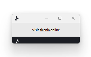 |
With movable: false but still resizable. |  |
With movable: false, resizable: false. |  |
Same but no footer movable: false, resizable: false, showFooter: false. |  |
No chrome (Window borders) movable: true, closable: true, chrome: false. |  |
Two LINK items. alternatingRowColors: true. |  |
Two LINK items. alternatingRowColors: false. |  |
First item with backgroundColor: "Red", foregroundColor: "White". |  |
ACTION item with icon: "BombSolid", iconColor: "Green". |  |
# GIF
The first is GIF which simply shows an (animated) gif - it may have the following properties:
sourcean url for a gif, can be remote or local
# ACTION
An ACTION will run the flow with the name given when the sticky is clicked. For the ACTION type the following are valid.
namethe name of the action to launch - this should be unique – or –flowcan be used as an alternative toname– it will match on both identifier, name and subjectheaderandbodyif set these will be shown instead of action name on stickyheightthe height of the item in pixelsinputsis an object containing the named inputs for the actionfocuswhether or not the item should have focus (only the first item with this property set to true will be focused)iconis an optional icon to displayìconColoris a color (string) for the icon (see table below)
Icons for the ACTION type sticky item
| Icon | Name |
|---|---|
_500pxBrands | |
AccessibleIconBrands | |
AccusoftBrands | |
AcquisitionsIncorporatedBrands | |
AddressBookRegular | |
AddressBookSolid | |
AddressCardRegular | |
AddressCardSolid | |
AdjustSolid | |
AdnBrands | |
AdSolid | |
AdversalBrands | |
AffiliatethemeBrands | |
AirbnbBrands | |
AirFreshenerSolid | |
AlgoliaBrands | |
AlignCenterSolid | |
AlignJustifySolid | |
AlignLeftSolid | |
AlignRightSolid | |
AlipayBrands | |
AllergiesSolid | |
AmazonBrands | |
AmazonPayBrands | |
AmbulanceSolid | |
AmericanSignLanguageInterpretingSolid | |
AmiliaBrands | |
AnchorSolid | |
AndroidBrands | |
AngellistBrands | |
AngleDoubleDownSolid | |
AngleDoubleLeftSolid | |
AngleDoubleRightSolid | |
AngleDoubleUpSolid | |
AngleDownSolid | |
AngleLeftSolid | |
AngleRightSolid | |
AngleUpSolid | |
AngrycreativeBrands | |
AngryRegular | |
AngrySolid | |
AngularBrands | |
AnkhSolid | |
ApperBrands | |
AppleAltSolid | |
AppleBrands | |
ApplePayBrands | |
AppStoreBrands | |
AppStoreIosBrands | |
ArchiveSolid | |
ArchwaySolid | |
ArrowAltCircleDownRegular | |
ArrowAltCircleDownSolid | |
ArrowAltCircleLeftRegular | |
ArrowAltCircleLeftSolid | |
ArrowAltCircleRightRegular | |
ArrowAltCircleRightSolid | |
ArrowAltCircleUpRegular | |
ArrowAltCircleUpSolid | |
ArrowCircleDownSolid | |
ArrowCircleLeftSolid | |
ArrowCircleRightSolid | |
ArrowCircleUpSolid | |
ArrowDownSolid | |
ArrowLeftSolid | |
ArrowRightSolid | |
ArrowsAltHSolid | |
ArrowsAltSolid | |
ArrowsAltVSolid | |
ArrowUpSolid | |
ArtstationBrands | |
AssistiveListeningSystemsSolid | |
AsteriskSolid | |
AsymmetrikBrands | |
AtlassianBrands | |
AtlasSolid | |
AtomSolid | |
AtSolid | |
AudibleBrands | |
AudioDescriptionSolid | |
AutoprefixerBrands | |
AvianexBrands | |
AviatoBrands | |
AwardSolid | |
AwsBrands | |
BabyCarriageSolid | |
BabySolid | |
BackspaceSolid | |
BackwardSolid | |
BaconSolid | |
BahaiSolid | |
BalanceScaleLeftSolid | |
BalanceScaleRightSolid | |
BalanceScaleSolid | |
BandAidSolid | |
BandcampBrands | |
BanSolid | |
BarcodeSolid | |
BarsSolid | |
BaseballBallSolid | |
BasketballBallSolid | |
BathSolid | |
BatteryEmptySolid | |
BatteryFullSolid | |
BatteryHalfSolid | |
BatteryQuarterSolid | |
BatteryThreeQuartersSolid | |
BattleNetBrands | |
BedSolid | |
BeerSolid | |
BehanceBrands | |
BehanceSquareBrands | |
BellRegular | |
BellSlashRegular | |
BellSlashSolid | |
BellSolid | |
BezierCurveSolid | |
BibleSolid | |
BicycleSolid | |
BikingSolid | |
BimobjectBrands | |
BinocularsSolid | |
BiohazardSolid | |
BirthdayCakeSolid | |
BitbucketBrands | |
BitcoinBrands | |
BityBrands | |
BlackberryBrands | |
BlackTieBrands | |
BlenderPhoneSolid | |
BlenderSolid | |
BlindSolid | |
BloggerBBrands | |
BloggerBrands | |
BlogSolid | |
BluetoothBBrands | |
BluetoothBrands | |
BoldSolid | |
BoltSolid | |
BombSolid | |
BoneSolid | |
BongSolid | |
BookDeadSolid | |
BookmarkRegular | |
BookmarkSolid | |
BookMedicalSolid | |
BookOpenSolid | |
BookReaderSolid | |
BookSolid | |
BootstrapBrands | |
BorderAllSolid | |
BorderNoneSolid | |
BorderStyleSolid | |
BowlingBallSolid | |
BoxesSolid | |
BoxOpenSolid | |
BoxSolid | |
BoxTissueSolid | |
BrailleSolid | |
BrainSolid | |
BreadSliceSolid | |
BriefcaseMedicalSolid | |
BriefcaseSolid | |
BroadcastTowerSolid | |
BroomSolid | |
BrushSolid | |
BtcBrands | |
BufferBrands | |
BugSolid | |
BuildingRegular | |
BuildingSolid | |
BullhornSolid | |
BullseyeSolid | |
BurnSolid | |
BuromobelexperteBrands | |
BusAltSolid | |
BusinessTimeSolid | |
BusSolid | |
BuyNLargeBrands | |
BuyselladsBrands | |
CalculatorSolid | |
CalendarAltRegular | |
CalendarAltSolid | |
CalendarDaySolid | |
CalendarMinusRegular | |
CalendarMinusSolid | |
CalendarPlusRegular | |
CalendarPlusSolid | |
CalendarRegular | |
CalendarSolid | |
CalendarTimesRegular | |
CalendarTimesSolid | |
CalendarWeekSolid | |
CameraRetroSolid | |
CameraSolid | |
CampgroundSolid | |
CanadianMapleLeafBrands | |
CandyCaneSolid | |
CannabisSolid | |
CapsulesSolid | |
CarAltSolid | |
CaravanSolid | |
CarBatterySolid | |
CarCrashSolid | |
CaretDownSolid | |
CaretLeftSolid | |
CaretRightSolid | |
CaretSquareDownRegular | |
CaretSquareDownSolid | |
CaretSquareLeftRegular | |
CaretSquareLeftSolid | |
CaretSquareRightRegular | |
CaretSquareRightSolid | |
CaretSquareUpRegular | |
CaretSquareUpSolid | |
CaretUpSolid | |
CarrotSolid | |
CarSideSolid | |
CarSolid | |
CartArrowDownSolid | |
CartPlusSolid | |
CashRegisterSolid | |
CatSolid | |
CcAmazonPayBrands | |
CcAmexBrands | |
CcApplePayBrands | |
CcDinersClubBrands | |
CcDiscoverBrands | |
CcJcbBrands | |
CcMastercardBrands | |
CcPaypalBrands | |
CcStripeBrands | |
CcVisaBrands | |
CentercodeBrands | |
CentosBrands | |
CertificateSolid | |
ChairSolid | |
ChalkboardSolid | |
ChalkboardTeacherSolid | |
ChargingStationSolid | |
ChartAreaSolid | |
ChartBarRegular | |
ChartBarSolid | |
ChartLineSolid | |
ChartPieSolid | |
CheckCircleRegular | |
CheckCircleSolid | |
CheckDoubleSolid | |
CheckSolid | |
CheckSquareRegular | |
CheckSquareSolid | |
CheeseSolid | |
ChessBishopSolid | |
ChessBoardSolid | |
ChessKingSolid | |
ChessKnightSolid | |
ChessPawnSolid | |
ChessQueenSolid | |
ChessRookSolid | |
ChessSolid | |
ChevronCircleDownSolid | |
ChevronCircleLeftSolid | |
ChevronCircleRightSolid | |
ChevronCircleUpSolid | |
ChevronDownSolid | |
ChevronLeftSolid | |
ChevronRightSolid | |
ChevronUpSolid | |
ChildSolid | |
ChromeBrands | |
ChromecastBrands | |
ChurchSolid | |
CircleNotchSolid | |
CircleRegular | |
CircleSolid | |
CitySolid | |
ClinicMedicalSolid | |
ClipboardCheckSolid | |
ClipboardListSolid | |
ClipboardRegular | |
ClipboardSolid | |
ClockRegular | |
ClockSolid | |
CloneRegular | |
CloneSolid | |
ClosedCaptioningRegular | |
ClosedCaptioningSolid | |
CloudDownloadAltSolid | |
CloudMeatballSolid | |
CloudMoonRainSolid | |
CloudMoonSolid | |
CloudRainSolid | |
CloudscaleBrands | |
CloudShowersHeavySolid | |
CloudsmithBrands | |
CloudSolid | |
CloudSunRainSolid | |
CloudSunSolid | |
CloudUploadAltSolid | |
CloudversifyBrands | |
CocktailSolid | |
CodeBranchSolid | |
CodepenBrands | |
CodeSolid | |
CodiepieBrands | |
CoffeeSolid | |
CogSolid | |
CogsSolid | |
CoinsSolid | |
ColumnsSolid | |
CommentAltRegular | |
CommentAltSolid | |
CommentDotsRegular | |
CommentDotsSolid | |
CommentRegular | |
CommentSolid | |
CommentsRegular | |
CommentsSolid | |
CompactDiscSolid | |
CompassRegular | |
CompassSolid | |
CompressAltSolid | |
CompressArrowsAltSolid | |
CompressSolid | |
ConciergeBellSolid | |
ConfluenceBrands | |
ConnectdevelopBrands | |
ContaoBrands | |
CookieBiteSolid | |
CookieSolid | |
CopyRegular | |
CopyrightRegular | |
CopyrightSolid | |
CopySolid | |
CottonBureauBrands | |
CouchSolid | |
CpanelBrands | |
CreativeCommonsBrands | |
CreativeCommonsByBrands | |
CreativeCommonsNcBrands | |
CreativeCommonsNcEuBrands | |
CreativeCommonsNcJpBrands | |
CreativeCommonsNdBrands | |
CreativeCommonsPdAltBrands | |
CreativeCommonsPdBrands | |
CreativeCommonsRemixBrands | |
CreativeCommonsSaBrands | |
CreativeCommonsSamplingBrands | |
CreativeCommonsSamplingPlusBrands | |
CreativeCommonsShareBrands | |
CreativeCommonsZeroBrands | |
CreditCardRegular | |
CreditCardSolid | |
CriticalRoleBrands | |
CropAltSolid | |
CropSolid | |
CrosshairsSolid | |
CrossSolid | |
CrownSolid | |
CrowSolid | |
CrutchSolid | |
Css3AltBrands | |
Css3Brands | |
CubeSolid | |
CubesSolid | |
CutSolid | |
CuttlefishBrands | |
DailymotionBrands | |
DAndDBeyondBrands | |
DAndDBrands | |
DashcubeBrands | |
DatabaseSolid | |
DeafSolid | |
DeliciousBrands | |
DemocratSolid | |
DeploydogBrands | |
DeskproBrands | |
DesktopSolid | |
DevBrands | |
DeviantartBrands | |
DharmachakraSolid | |
DhlBrands | |
DiagnosesSolid | |
DiasporaBrands | |
DiceD20Solid | |
DiceD6Solid | |
DiceFiveSolid | |
DiceFourSolid | |
DiceOneSolid | |
DiceSixSolid | |
DiceSolid | |
DiceThreeSolid | |
DiceTwoSolid | |
DiggBrands | |
DigitalOceanBrands | |
DigitalTachographSolid | |
DirectionsSolid | |
DiscordBrands | |
DiscourseBrands | |
DiseaseSolid | |
DivideSolid | |
DizzyRegular | |
DizzySolid | |
DnaSolid | |
DochubBrands | |
DockerBrands | |
DogSolid | |
DollarSignSolid | |
DollyFlatbedSolid | |
DollySolid | |
DonateSolid | |
DoorClosedSolid | |
DoorOpenSolid | |
DotCircleRegular | |
DotCircleSolid | |
DoveSolid | |
DownloadSolid | |
Draft2digitalBrands | |
DraftingCompassSolid | |
DragonSolid | |
DrawPolygonSolid | |
DribbbleBrands | |
DribbbleSquareBrands | |
DropboxBrands | |
DrumSolid | |
DrumSteelpanSolid | |
DrumstickBiteSolid | |
DrupalBrands | |
DumbbellSolid | |
DumpsterFireSolid | |
DumpsterSolid | |
DungeonSolid | |
DyalogBrands | |
EarlybirdsBrands | |
EbayBrands | |
EdgeBrands | |
EditRegular | |
EditSolid | |
EggSolid | |
EjectSolid | |
ElementorBrands | |
EllipsisHSolid | |
EllipsisVSolid | |
ElloBrands | |
EmberBrands | |
EmpireBrands | |
EnvelopeOpenRegular | |
EnvelopeOpenSolid | |
EnvelopeOpenTextSolid | |
EnvelopeRegular | |
EnvelopeSolid | |
EnvelopeSquareSolid | |
EnviraBrands | |
EqualsSolid | |
EraserSolid | |
ErlangBrands | |
EthereumBrands | |
EthernetSolid | |
EtsyBrands | |
EuroSignSolid | |
EvernoteBrands | |
ExchangeAltSolid | |
ExclamationCircleSolid | |
ExclamationSolid | |
ExclamationTriangleSolid | |
ExpandAltSolid | |
ExpandArrowsAltSolid | |
ExpandSolid | |
ExpeditedsslBrands | |
ExternalLinkAltSolid | |
ExternalLinkSquareAltSolid | |
EyeDropperSolid | |
EyeRegular | |
EyeSlashRegular | |
EyeSlashSolid | |
EyeSolid | |
FacebookBrands | |
FacebookFBrands | |
FacebookMessengerBrands | |
FacebookSquareBrands | |
FanSolid | |
FantasyFlightGamesBrands | |
FastBackwardSolid | |
FastForwardSolid | |
FaucetSolid | |
FaxSolid | |
FeatherAltSolid | |
FeatherSolid | |
FedexBrands | |
FedoraBrands | |
FemaleSolid | |
FighterJetSolid | |
FigmaBrands | |
FileAltRegular | |
FileAltSolid | |
FileArchiveRegular | |
FileArchiveSolid | |
FileAudioRegular | |
FileAudioSolid | |
FileCodeRegular | |
FileCodeSolid | |
FileContractSolid | |
FileCsvSolid | |
FileDownloadSolid | |
FileExcelRegular | |
FileExcelSolid | |
FileExportSolid | |
FileImageRegular | |
FileImageSolid | |
FileImportSolid | |
FileInvoiceDollarSolid | |
FileInvoiceSolid | |
FileMedicalAltSolid | |
FileMedicalSolid | |
FilePdfRegular | |
FilePdfSolid | |
FilePowerpointRegular | |
FilePowerpointSolid | |
FilePrescriptionSolid | |
FileRegular | |
FileSignatureSolid | |
FileSolid | |
FileUploadSolid | |
FileVideoRegular | |
FileVideoSolid | |
FileWordRegular | |
FileWordSolid | |
FillDripSolid | |
FillSolid | |
FilmSolid | |
FilterSolid | |
FingerprintSolid | |
FireAltSolid | |
FireExtinguisherSolid | |
FirefoxBrands | |
FirefoxBrowserBrands | |
FireSolid | |
FirstAidSolid | |
FirstdraftBrands | |
FirstOrderAltBrands | |
FirstOrderBrands | |
FishSolid | |
FistRaisedSolid | |
FlagCheckeredSolid | |
FlagRegular | |
FlagSolid | |
FlagUsaSolid | |
FlaskSolid | |
FlickrBrands | |
FlipboardBrands | |
FlushedRegular | |
FlushedSolid | |
FlyBrands | |
FolderMinusSolid | |
FolderOpenRegular | |
FolderOpenSolid | |
FolderPlusSolid | |
FolderRegular | |
FolderSolid | |
FontAwesomeAltBrands | |
FontAwesomeBrands | |
FontAwesomeFlagBrands | |
FontAwesomeLogoFullBrands | |
FontAwesomeLogoFullRegular | |
FontAwesomeLogoFullSolid | |
FonticonsBrands | |
FonticonsFiBrands | |
FontSolid | |
FootballBallSolid | |
FortAwesomeAltBrands | |
FortAwesomeBrands | |
ForumbeeBrands | |
ForwardSolid | |
FoursquareBrands | |
FreebsdBrands | |
FreeCodeCampBrands | |
FrogSolid | |
FrownOpenRegular | |
FrownOpenSolid | |
FrownRegular | |
FrownSolid | |
FulcrumBrands | |
FunnelDollarSolid | |
FutbolRegular | |
FutbolSolid | |
GalacticRepublicBrands | |
GalacticSenateBrands | |
GamepadSolid | |
GasPumpSolid | |
GavelSolid | |
GemRegular | |
GemSolid | |
GenderlessSolid | |
GetPocketBrands | |
GgBrands | |
GgCircleBrands | |
GhostSolid | |
GiftSolid | |
GiftsSolid | |
GitAltBrands | |
GitBrands | |
GithubAltBrands | |
GithubBrands | |
GithubSquareBrands | |
GitkrakenBrands | |
GitlabBrands | |
GitSquareBrands | |
GitterBrands | |
GlassCheersSolid | |
GlassesSolid | |
GlassMartiniAltSolid | |
GlassMartiniSolid | |
GlassWhiskeySolid | |
GlideBrands | |
GlideGBrands | |
GolfBallSolid | |
GoodreadsBrands | |
GoodreadsGBrands | |
GoogleBrands | |
GoogleDriveBrands | |
GooglePlayBrands | |
GooglePlusBrands | |
GooglePlusGBrands | |
GooglePlusSquareBrands | |
GoogleWalletBrands | |
GopuramSolid | |
GraduationCapSolid | |
GratipayBrands | |
GravBrands | |
GreaterThanEqualSolid | |
GreaterThanSolid | |
GrimaceRegular | |
GrimaceSolid | |
GrinAltRegular | |
GrinAltSolid | |
GrinBeamRegular | |
GrinBeamSolid | |
GrinBeamSweatRegular | |
GrinBeamSweatSolid | |
GrinHeartsRegular | |
GrinHeartsSolid | |
GrinRegular | |
GrinSolid | |
GrinSquintRegular | |
GrinSquintSolid | |
GrinSquintTearsRegular | |
GrinSquintTearsSolid | |
GrinStarsRegular | |
GrinStarsSolid | |
GrinTearsRegular | |
GrinTearsSolid | |
GrinTongueRegular | |
GrinTongueSolid | |
GrinTongueSquintRegular | |
GrinTongueSquintSolid | |
GrinTongueWinkRegular | |
GrinTongueWinkSolid | |
GrinWinkRegular | |
GrinWinkSolid | |
GripfireBrands | |
GripHorizontalSolid | |
GripLinesSolid | |
GripLinesVerticalSolid | |
GripVerticalSolid | |
GruntBrands | |
GuitarSolid | |
GulpBrands | |
HackerNewsBrands | |
HackerNewsSquareBrands | |
HackerrankBrands | |
HamburgerSolid | |
HammerSolid | |
HamsaSolid | |
HandHoldingHeartSolid | |
HandHoldingMedicalSolid | |
HandHoldingSolid | |
HandHoldingUsdSolid | |
HandHoldingWaterSolid | |
HandLizardRegular | |
HandLizardSolid | |
HandMiddleFingerSolid | |
HandPaperRegular | |
HandPaperSolid | |
HandPeaceRegular | |
HandPeaceSolid | |
HandPointDownRegular | |
HandPointDownSolid | |
HandPointerRegular | |
HandPointerSolid | |
HandPointLeftRegular | |
HandPointLeftSolid | |
HandPointRightRegular | |
HandPointRightSolid | |
HandPointUpRegular | |
HandPointUpSolid | |
HandRockRegular | |
HandRockSolid | |
HandScissorsRegular | |
HandScissorsSolid | |
HandshakeAltSlashSolid | |
HandshakeRegular | |
HandshakeSlashSolid | |
HandshakeSolid | |
HandsHelpingSolid | |
HandSparklesSolid | |
HandSpockRegular | |
HandSpockSolid | |
HandsSolid | |
HandsWashSolid | |
HanukiahSolid | |
HardHatSolid | |
HashtagSolid | |
HatCowboySideSolid | |
HatCowboySolid | |
HddRegular | |
HddSolid | |
HeadingSolid | |
HeadphonesAltSolid | |
HeadphonesSolid | |
HeadsetSolid | |
HeadSideCoughSlashSolid | |
HeadSideCoughSolid | |
HeadSideMaskSolid | |
HeadSideVirusSolid | |
HeartbeatSolid | |
HeartBrokenSolid | |
HeartRegular | |
HeartSolid | |
HelicopterSolid | |
HighlighterSolid | |
HikingSolid | |
HippoSolid | |
HipsBrands | |
HireAHelperBrands | |
HistorySolid | |
HockeyPuckSolid | |
HollyBerrySolid | |
HomeSolid | |
HooliBrands | |
HornbillBrands | |
HorseHeadSolid | |
HorseSolid | |
HospitalAltSolid | |
HospitalRegular | |
HospitalSolid | |
HospitalSymbolSolid | |
HospitalUserSolid | |
HotdogSolid | |
HotelSolid | |
HotjarBrands | |
HotTubSolid | |
HourglassEndSolid | |
HourglassHalfSolid | |
HourglassRegular | |
HourglassSolid | |
HourglassStartSolid | |
HouseDamageSolid | |
HouseUserSolid | |
HouzzBrands | |
HryvniaSolid | |
HSquareSolid | |
Html5Brands | |
HubspotBrands | |
IceCreamSolid | |
IciclesSolid | |
IconsSolid | |
ICursorSolid | |
IdBadgeRegular | |
IdBadgeSolid | |
IdCardAltSolid | |
IdCardRegular | |
IdCardSolid | |
IdealBrands | |
IglooSolid | |
ImageRegular | |
ImageSolid | |
ImagesRegular | |
ImagesSolid | |
ImdbBrands | |
InboxSolid | |
IndentSolid | |
IndustrySolid | |
InfinitySolid | |
InfoCircleSolid | |
InfoSolid | |
InstagramBrands | |
InstagramSquareBrands | |
IntercomBrands | |
InternetExplorerBrands | |
InvisionBrands | |
IoxhostBrands | |
ItalicSolid | |
ItchIoBrands | |
ItunesBrands | |
ItunesNoteBrands | |
JavaBrands | |
JediOrderBrands | |
JediSolid | |
JenkinsBrands | |
JiraBrands | |
JogetBrands | |
JointSolid | |
JoomlaBrands | |
JournalWhillsSolid | |
JsBrands | |
JsfiddleBrands | |
JsSquareBrands | |
KaabaSolid | |
KaggleBrands | |
KeybaseBrands | |
KeyboardRegular | |
KeyboardSolid | |
KeycdnBrands | |
KeySolid | |
KhandaSolid | |
KickstarterBrands | |
KickstarterKBrands | |
KissBeamRegular | |
KissBeamSolid | |
KissRegular | |
KissSolid | |
KissWinkHeartRegular | |
KissWinkHeartSolid | |
KiwiBirdSolid | |
KorvueBrands | |
LandmarkSolid | |
LanguageSolid | |
LaptopCodeSolid | |
LaptopHouseSolid | |
LaptopMedicalSolid | |
LaptopSolid | |
LaravelBrands | |
LastfmBrands | |
LastfmSquareBrands | |
LaughBeamRegular | |
LaughBeamSolid | |
LaughRegular | |
LaughSolid | |
LaughSquintRegular | |
LaughSquintSolid | |
LaughWinkRegular | |
LaughWinkSolid | |
LayerGroupSolid | |
LeafSolid | |
LeanpubBrands | |
LemonRegular | |
LemonSolid | |
LessBrands | |
LessThanEqualSolid | |
LessThanSolid | |
LevelDownAltSolid | |
LevelUpAltSolid | |
LifeRingRegular | |
LifeRingSolid | |
LightbulbRegular | |
LightbulbSolid | |
LineBrands | |
LinkedinBrands | |
LinkedinInBrands | |
LinkSolid | |
LinodeBrands | |
LinuxBrands | |
LiraSignSolid | |
ListAltRegular | |
ListAltSolid | |
ListOlSolid | |
ListSolid | |
ListUlSolid | |
LocationArrowSolid | |
LockOpenSolid | |
LockSolid | |
LongArrowAltDownSolid | |
LongArrowAltLeftSolid | |
LongArrowAltRightSolid | |
LongArrowAltUpSolid | |
LowVisionSolid | |
LuggageCartSolid | |
LungsSolid | |
LungsVirusSolid | |
LyftBrands | |
MagentoBrands | |
MagicSolid | |
MagnetSolid | |
MailBulkSolid | |
MailchimpBrands | |
MaleSolid | |
MandalorianBrands | |
MapMarkedAltSolid | |
MapMarkerAltSolid | |
MapPinSolid | |
MapSignsSolid | |
MarkdownBrands | |
MarkerSolid | |
MarsDoubleSolid | |
MarsSolid | |
MarsStrokeHSolid | |
MarsStrokeSolid | |
MarsStrokeVSolid | |
MaskSolid | |
MastodonBrands | |
MaxcdnBrands | |
MdbBrands | |
MedalSolid | |
MedappsBrands | |
MediumBrands | |
MediumMBrands | |
MedkitSolid | |
MedrtBrands | |
MeetupBrands | |
MegaportBrands | |
MehBlankRegular | |
MehBlankSolid | |
MehRegular | |
MehRollingEyesRegular | |
MehRollingEyesSolid | |
MehSolid | |
MemorySolid | |
MendeleyBrands | |
MenorahSolid | |
MercurySolid | |
MeteorSolid | |
MicroblogBrands | |
MicrochipSolid | |
MicrophoneAltSlashSolid | |
MicrophoneAltSolid | |
MicrophoneSlashSolid | |
MicrophoneSolid | |
MicroscopeSolid | |
MicrosoftBrands | |
MinusCircleSolid | |
MinusSolid | |
MinusSquareRegular | |
MinusSquareSolid | |
MittenSolid | |
MixBrands | |
MixcloudBrands | |
MixerBrands | |
MizuniBrands | |
MobileAltSolid | |
MobileSolid | |
ModxBrands | |
MoneroBrands | |
MoneyBillAltRegular | |
MoneyBillAltSolid | |
MoneyBillSolid | |
MoneyBillWaveAltSolid | |
MoneyBillWaveSolid | |
MoneyCheckAltSolid | |
MoneyCheckSolid | |
MonumentSolid | |
MoonRegular | |
MoonSolid | |
MortarPestleSolid | |
MosqueSolid | |
MotorcycleSolid | |
MountainSolid | |
MousePointerSolid | |
MouseSolid | |
MugHotSolid | |
MusicSolid | |
NapsterBrands | |
NeosBrands | |
NetworkWiredSolid | |
NeuterSolid | |
NewspaperRegular | |
NewspaperSolid | |
NimblrBrands | |
NodeBrands | |
NodeJsBrands | |
NotEqualSolid | |
NotesMedicalSolid | |
NpmBrands | |
Ns8Brands | |
NutritionixBrands | |
ObjectGroupRegular | |
ObjectGroupSolid | |
ObjectUngroupRegular | |
ObjectUngroupSolid | |
OdnoklassnikiBrands | |
OdnoklassnikiSquareBrands | |
OilCanSolid | |
OldRepublicBrands | |
OmSolid | |
OpencartBrands | |
OpenidBrands | |
OperaBrands | |
OptinMonsterBrands | |
OrcidBrands | |
OsiBrands | |
OtterSolid | |
OutdentSolid | |
Page4Brands | |
PagelinesBrands | |
PagerSolid | |
PaintBrushSolid | |
PaintRollerSolid | |
PaletteSolid | |
PalfedBrands | |
PalletSolid | |
PaperclipSolid | |
PaperPlaneRegular | |
PaperPlaneSolid | |
ParachuteBoxSolid | |
ParagraphSolid | |
ParkingSolid | |
PassportSolid | |
PastafarianismSolid | |
PasteSolid | |
PatreonBrands | |
PauseCircleRegular | |
PauseCircleSolid | |
PauseSolid | |
PawSolid | |
PaypalBrands | |
PeaceSolid | |
PenAltSolid | |
PencilAltSolid | |
PencilRulerSolid | |
PenFancySolid | |
PenNibSolid | |
PennyArcadeBrands | |
PenSolid | |
PenSquareSolid | |
PeopleArrowsSolid | |
PeopleCarrySolid | |
PepperHotSolid | |
PercentageSolid | |
PercentSolid | |
PeriscopeBrands | |
PersonBoothSolid | |
PhabricatorBrands | |
PhoenixFrameworkBrands | |
PhoenixSquadronBrands | |
PhoneAltSolid | |
PhoneSlashSolid | |
PhoneSolid | |
PhoneSquareAltSolid | |
PhoneSquareSolid | |
PhoneVolumeSolid | |
PhotoVideoSolid | |
PhpBrands | |
PiedPiperAltBrands | |
PiedPiperBrands | |
PiedPiperHatBrands | |
PiedPiperPpBrands | |
PiedPiperSquareBrands | |
PiggyBankSolid | |
PillsSolid | |
PinterestBrands | |
PinterestPBrands | |
PinterestSquareBrands | |
PizzaSliceSolid | |
PlaceOfWorshipSolid | |
PlaneArrivalSolid | |
PlaneDepartureSolid | |
PlaneSlashSolid | |
PlaneSolid | |
PlayCircleRegular | |
PlayCircleSolid | |
PlaySolid | |
PlaystationBrands | |
PlugSolid | |
PlusCircleSolid | |
PlusSolid | |
PlusSquareRegular | |
PlusSquareSolid | |
PodcastSolid | |
PollHSolid | |
PollSolid | |
PoopSolid | |
PooSolid | |
PooStormSolid | |
PortraitSolid | |
PoundSignSolid | |
PowerOffSolid | |
PrayingHandsSolid | |
PraySolid | |
PrescriptionBottleAltSolid | |
PrescriptionBottleSolid | |
PrescriptionSolid | |
PrintSolid | |
ProceduresSolid | |
ProductHuntBrands | |
ProjectDiagramSolid | |
PumpMedicalSolid | |
PumpSoapSolid | |
PushedBrands | |
PuzzlePieceSolid | |
PythonBrands | |
QqBrands | |
QrcodeSolid | |
QuestionCircleRegular | |
QuestionCircleSolid | |
QuestionSolid | |
QuidditchSolid | |
QuinscapeBrands | |
QuoraBrands | |
QuoteLeftSolid | |
QuoteRightSolid | |
QuranSolid | |
RadiationAltSolid | |
RadiationSolid | |
RainbowSolid | |
RandomSolid | |
RaspberryPiBrands | |
RavelryBrands | |
ReactBrands | |
ReacteuropeBrands | |
ReadmeBrands | |
RebelBrands | |
ReceiptSolid | |
RecordVinylSolid | |
RecycleSolid | |
RedditAlienBrands | |
RedditBrands | |
RedditSquareBrands | |
RedhatBrands | |
RedoAltSolid | |
RedoSolid | |
RedRiverBrands | |
RegisteredRegular | |
RegisteredSolid | |
RemoveFormatSolid | |
RenrenBrands | |
ReplyAllSolid | |
ReplydBrands | |
ReplySolid | |
RepublicanSolid | |
ResearchgateBrands | |
ResolvingBrands | |
RestroomSolid | |
RetweetSolid | |
RevBrands | |
RibbonSolid | |
RingSolid | |
RoadSolid | |
RobotSolid | |
RocketchatBrands | |
RocketSolid | |
RockrmsBrands | |
RouteSolid | |
RProjectBrands | |
RssSolid | |
RssSquareSolid | |
RubleSignSolid | |
RulerCombinedSolid | |
RulerHorizontalSolid | |
RulerSolid | |
RulerVerticalSolid | |
RunningSolid | |
RupeeSignSolid | |
SadCryRegular | |
SadCrySolid | |
SadTearRegular | |
SadTearSolid | |
SafariBrands | |
SalesforceBrands | |
SassBrands | |
SatelliteDishSolid | |
SatelliteSolid | |
SaveRegular | |
SaveSolid | |
SchlixBrands | |
SchoolSolid | |
ScrewdriverSolid | |
ScribdBrands | |
ScrollSolid | |
SdCardSolid | |
SearchDollarSolid | |
SearchenginBrands | |
SearchLocationSolid | |
SearchMinusSolid | |
SearchPlusSolid | |
SearchSolid | |
SeedlingSolid | |
SellcastBrands | |
SellsyBrands | |
ServerSolid | |
ServicestackBrands | |
ShapesSolid | |
ShareAltSolid | |
ShareAltSquareSolid | |
ShareSolid | |
ShareSquareRegular | |
ShareSquareSolid | |
ShekelSignSolid | |
ShieldAltSolid | |
ShieldVirusSolid | |
ShippingFastSolid | |
ShipSolid | |
ShirtsinbulkBrands | |
ShoePrintsSolid | |
ShopifyBrands | |
ShoppingBagSolid | |
ShoppingBasketSolid | |
ShoppingCartSolid | |
ShopwareBrands | |
ShowerSolid | |
ShuttleVanSolid | |
SignalSolid | |
SignatureSolid | |
SignInAltSolid | |
SignLanguageSolid | |
SignOutAltSolid | |
SignSolid | |
SimCardSolid | |
SimplybuiltBrands | |
SistrixBrands | |
SitemapSolid | |
SithBrands | |
SkatingSolid | |
SketchBrands | |
SkiingNordicSolid | |
SkiingSolid | |
SkullCrossbonesSolid | |
SkullSolid | |
SkyatlasBrands | |
SkypeBrands | |
SlackBrands | |
SlackHashBrands | |
SlashSolid | |
SleighSolid | |
SlidersHSolid | |
SlideshareBrands | |
SmileBeamRegular | |
SmileBeamSolid | |
SmileRegular | |
SmileSolid | |
SmileWinkRegular | |
SmileWinkSolid | |
SmogSolid | |
SmokingBanSolid | |
SmokingSolid | |
SmsSolid | |
SnapchatBrands | |
SnapchatGhostBrands | |
SnapchatSquareBrands | |
SnowboardingSolid | |
SnowflakeRegular | |
SnowflakeSolid | |
SnowmanSolid | |
SnowplowSolid | |
SoapSolid | |
SocksSolid | |
SolarPanelSolid | |
SortAlphaDownAltSolid | |
SortAlphaDownSolid | |
SortAlphaUpAltSolid | |
SortAlphaUpSolid | |
SortAmountDownAltSolid | |
SortAmountDownSolid | |
SortAmountUpAltSolid | |
SortAmountUpSolid | |
SortDownSolid | |
SortNumericDownAltSolid | |
SortNumericDownSolid | |
SortNumericUpAltSolid | |
SortNumericUpSolid | |
SortSolid | |
SortUpSolid | |
SoundcloudBrands | |
SourcetreeBrands | |
SpaceShuttleSolid | |
SpaSolid | |
SpeakapBrands | |
SpeakerDeckBrands | |
SpellCheckSolid | |
SpiderSolid | |
SpinnerSolid | |
SplotchSolid | |
SpotifyBrands | |
SprayCanSolid | |
SquareFullSolid | |
SquareRegular | |
SquareRootAltSolid | |
SquareSolid | |
SquarespaceBrands | |
StackExchangeBrands | |
StackOverflowBrands | |
StackpathBrands | |
StampSolid | |
StarAndCrescentSolid | |
StarHalfAltSolid | |
StarHalfRegular | |
StarHalfSolid | |
StarOfDavidSolid | |
StarOfLifeSolid | |
StarRegular | |
StarSolid | |
StaylinkedBrands | |
SteamBrands | |
SteamSquareBrands | |
SteamSymbolBrands | |
StepBackwardSolid | |
StepForwardSolid | |
StethoscopeSolid | |
StickerMuleBrands | |
StickyNoteRegular | |
StickyNoteSolid | |
StopCircleRegular | |
StopCircleSolid | |
StopSolid | |
StopwatchSolid | |
StoreAltSlashSolid | |
StoreAltSolid | |
StoreSlashSolid | |
StoreSolid | |
StravaBrands | |
StreamSolid | |
StreetViewSolid | |
StrikethroughSolid | |
StripeBrands | |
StripeSBrands | |
StroopwafelSolid | |
StudiovinariBrands | |
StumbleuponBrands | |
StumbleuponCircleBrands | |
SubscriptSolid | |
SubwaySolid | |
SuitcaseRollingSolid | |
SuitcaseSolid | |
SunRegular | |
SunSolid | |
SuperpowersBrands | |
SuperscriptSolid | |
SuppleBrands | |
SurpriseRegular | |
SurpriseSolid | |
SuseBrands | |
SwatchbookSolid | |
SwiftBrands | |
SwimmerSolid | |
SwimmingPoolSolid | |
SymfonyBrands | |
SynagogueSolid | |
SyncAltSolid | |
SyncSolid | |
SyringeSolid | |
TableSolid | |
TabletAltSolid | |
TableTennisSolid | |
TabletSolid | |
TabletsSolid | |
TachometerAltSolid | |
TagSolid | |
TagsSolid | |
TapeSolid | |
TasksSolid | |
TaxiSolid | |
TeamspeakBrands | |
TeethOpenSolid | |
TeethSolid | |
TelegramBrands | |
TelegramPlaneBrands | |
TemperatureHighSolid | |
TemperatureLowSolid | |
TencentWeiboBrands | |
TengeSolid | |
TerminalSolid | |
TextHeightSolid | |
TextWidthSolid | |
TheaterMasksSolid | |
ThemecoBrands | |
ThemeisleBrands | |
TheRedYetiBrands | |
ThermometerEmptySolid | |
ThermometerFullSolid | |
ThermometerHalfSolid | |
ThermometerQuarterSolid | |
ThermometerSolid | |
ThermometerThreeQuartersSolid | |
ThinkPeaksBrands | |
ThLargeSolid | |
ThListSolid | |
ThSolid | |
ThumbsDownRegular | |
ThumbsDownSolid | |
ThumbsUpRegular | |
ThumbsUpSolid | |
ThumbtackSolid | |
TicketAltSolid | |
TimesCircleRegular | |
TimesCircleSolid | |
TimesSolid | |
TintSlashSolid | |
TintSolid | |
TiredRegular | |
TiredSolid | |
ToggleOffSolid | |
ToggleOnSolid | |
ToiletPaperSlashSolid | |
ToiletPaperSolid | |
ToiletSolid | |
ToolboxSolid | |
ToolsSolid | |
ToothSolid | |
TorahSolid | |
ToriiGateSolid | |
TractorSolid | |
TradeFederationBrands | |
TrademarkSolid | |
TrafficLightSolid | |
TrailerSolid | |
TrainSolid | |
TramSolid | |
TransgenderAltSolid | |
TransgenderSolid | |
TrashAltRegular | |
TrashAltSolid | |
TrashRestoreAltSolid | |
TrashRestoreSolid | |
TrashSolid | |
TreeSolid | |
TrelloBrands | |
TrophySolid | |
TruckLoadingSolid | |
TruckMonsterSolid | |
TruckMovingSolid | |
TruckPickupSolid | |
TruckSolid | |
TshirtSolid | |
TtySolid | |
TumblrBrands | |
TumblrSquareBrands | |
TvSolid | |
TwitchBrands | |
TwitterBrands | |
TwitterSquareBrands | |
Typo3Brands | |
UberBrands | |
UbuntuBrands | |
UikitBrands | |
UmbracoBrands | |
UmbrellaBeachSolid | |
UmbrellaSolid | |
UnderlineSolid | |
UndoAltSolid | |
UndoSolid | |
UniregistryBrands | |
UnityBrands | |
UniversalAccessSolid | |
UniversitySolid | |
UnlinkSolid | |
UnlockAltSolid | |
UnlockSolid | |
UntappdBrands | |
UploadSolid | |
UpsBrands | |
UsbBrands | |
UserAltSlashSolid | |
UserAltSolid | |
UserAstronautSolid | |
UserCheckSolid | |
UserCircleRegular | |
UserCircleSolid | |
UserClockSolid | |
UserCogSolid | |
UserEditSolid | |
UserFriendsSolid | |
UserGraduateSolid | |
UserInjuredSolid | |
UserLockSolid | |
UserMdSolid | |
UserMinusSolid | |
UserNinjaSolid | |
UserNurseSolid | |
UserPlusSolid | |
UserRegular | |
UsersCogSolid | |
UserSecretSolid | |
UserShieldSolid | |
UserSlashSolid | |
UserSolid | |
UsersSolid | |
UserTagSolid | |
UserTieSolid | |
UserTimesSolid | |
UspsBrands | |
UssunnahBrands | |
UtensilSpoonSolid | |
UtensilsSolid | |
VaadinBrands | |
VectorSquareSolid | |
VenusDoubleSolid | |
VenusMarsSolid | |
VenusSolid | |
ViacoinBrands | |
ViadeoBrands | |
ViadeoSquareBrands | |
VialSolid | |
VialsSolid | |
ViberBrands | |
VideoSlashSolid | |
VideoSolid | |
ViharaSolid | |
VimeoBrands | |
VimeoSquareBrands | |
VimeoVBrands | |
VineBrands | |
VirusesSolid | |
VirusSlashSolid | |
VirusSolid | |
VkBrands | |
VnvBrands | |
VoicemailSolid | |
VolleyballBallSolid | |
VolumeDownSolid | |
VolumeMuteSolid | |
VolumeOffSolid | |
VolumeUpSolid | |
VoteYeaSolid | |
VrCardboardSolid | |
VuejsBrands | |
WalkingSolid | |
WalletSolid | |
WarehouseSolid | |
WaterSolid | |
WaveSquareSolid | |
WazeBrands | |
WeeblyBrands | |
WeiboBrands | |
WeightHangingSolid | |
WeightSolid | |
WeixinBrands | |
WhatsappBrands | |
WhatsappSquareBrands | |
WheelchairSolid | |
WhmcsBrands | |
WifiSolid | |
WikipediaWBrands | |
WindowCloseRegular | |
WindowCloseSolid | |
WindowMaximizeRegular | |
WindowMaximizeSolid | |
WindowMinimizeRegular | |
WindowMinimizeSolid | |
WindowRestoreRegular | |
WindowRestoreSolid | |
WindowsBrands | |
WindSolid | |
WineBottleSolid | |
WineGlassAltSolid | |
WineGlassSolid | |
WixBrands | |
WizardsOfTheCoastBrands | |
WolfPackBattalionBrands | |
WonSignSolid | |
WordpressBrands | |
WordpressSimpleBrands | |
WpbeginnerBrands | |
WpexplorerBrands | |
WpformsBrands | |
WpressrBrands | |
WrenchSolid | |
XboxBrands | |
XingBrands | |
XingSquareBrands | |
XRaySolid | |
YahooBrands | |
YammerBrands | |
YandexBrands | |
YandexInternationalBrands | |
YarnBrands | |
YCombinatorBrands | |
YelpBrands | |
YenSignSolid | |
YinYangSolid | |
YoastBrands | |
YoutubeBrands | |
YoutubeSquareBrands |
Named colors for ACTION icons
# PDF document
Will show a pdf with an optional preview. The options are:
sourcean url (remote or local) to the pdf to showheaderandbodyif set these will be shown instead of the sourcelinkTextan optional text (or unicode icon) to show as a link to the source filelinkan optional link to direct the user to (default is value of source)heightthe height of the preview pane in pixelscollapsiblewhether or not the preview should be collapsible (defaultfalse)collapsedthe initial state of the preview (defaultfalse)saveablewhether or not it should be possible to save the pdf (defaulttrue)printablewhether or not it should be possible to print the pdf (defaulttrue)focuswhether or not the item should have focus (only the first item with this property set to true will be focused)
# HTML page
Will render a HTML snippet or a whole HTML page into an item. Should be used for render styled text, e.g. headers and such - not recommended for complete pages. Options are:
sourcehtml text or an url (remote or local) to the pdf to showheightthe height of the itemfocuswhether or not the item should have focus (only the first item with this property set to true will be focused)browserwhich browser engine to use"IE"(default) or"Edge"
# LINK
Will act as a link (e.g. to an internet resource or a local file).
linkthe link to activate (when clicked)textoptional - the text to display (default is the url of the link)prefixoptional - the text to display before the link textsuffixoptional - the text to display after the link textfocuswhether or not the item should have focus (only the first item with this property set to true will be focused)
# FLOWTRACER
Shows the flow tracer notification embedded in a sticky
Options are:
showFlow(bool, defaulttrue)showStep(bool, defaulttrue)showStopButton(bool, defaulttrue)showPlayPauseButton(bool, defaulttrue)showDebugButton(bool, defaulttrue)
Which are switches for the various UI elements in the sticky. It has the following actions:
- primary: stop flow if
showStopButtonelse play/pause ifshowPlayPauseButtonelse debug ifshowDebugButton - secondary: play/pause if
showPlayPauseButtonelse debug ifshowDebugButton - tertiary: debug if
showDebugButton
Example
Sticky.open("tracer", {
  title: "Tracer",
  showFooter: true,
  items: [
    {
      type: "FLOWTRACER",
      showStep: false,
    },
  ],
});
It looks like:
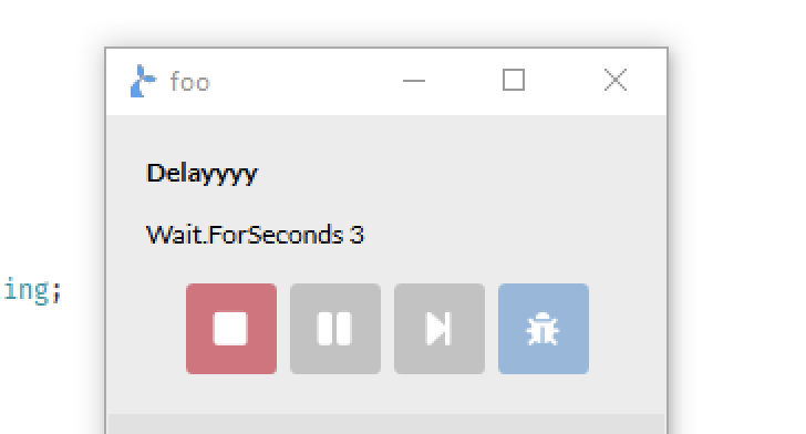
when a flow is running, and:
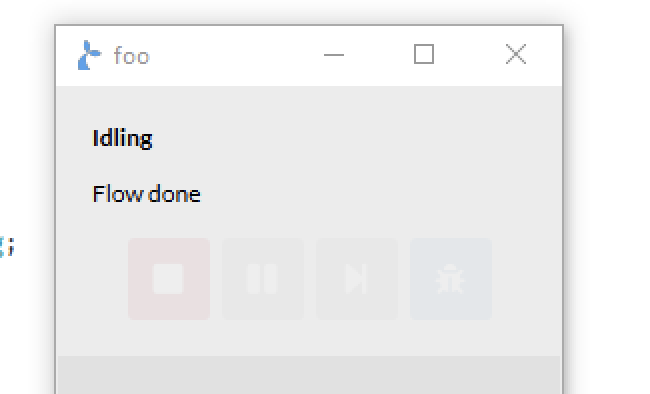
when the flow is done/no flow is running.
# PROGRESS
You can instantiate a Progress instance and use it to indicate progress on some task. The Progress object can be given to both a Sticky and a notification to display progress bars. A Progress object is essentially either a single progress tracker or a list or tree of other Progress objects to track.
If you just need a simple progress bar, you can do:
var p = new Progress("Simple progress");
// indicate some progress has been made
p.complete(0.75); // 75%
The .complete(...) method is used to indicate the level of progress. It can be invoked with a decimal value (e.g. 0.75) to indicate the completion percentage or with no arguments to complete the progress bar fully (100% done).
A Progress object also has a state which can be;
NotBegunOngoingCompletedFailed
The state is rendered as a coloured icon. If you use the Progress from the previous example in a Sticky like below.
// assume p from previous example
Sticky.open("progressExample", {
  items: [{ type: "PROGRESS", progress: p }],
});
This is displayed as:

# Custom appearance
Where the blue “play” icon indicates that the Progress is Ongoing. You can customise the appearance of a progress by giving it an options arg (3rd argument) in the constructor.
var p = new Progress("Simply progress", [], {
  barColor: "Pink",
  ongoingIcon: "BugSolid",
});
You will get the following Sticky appearance.

The following appearance configuration is available:
barColorthe background color for the progress bar (default is greenish) (default light green) – for available colours see the action documentationongoingIconColorthe foreground color for the icon shown when the state of theProgressisOngoing(default blue)notBegunIconColorthe color for the icon when in theNotBegunstate (default light gray)completedIconColorthe color for the icon when in theCompletedstate (default green)failedIconColorthe color for the icon when in theFailedstate (default red)ongoingIconthe icon for theOngoingstate – for available icons see the action documentationnotBegunIconthe icon for theNotBegunstatecompletedIconthe icon for theCompletedstatefailedIconthe icon for theFailedstate
It is also possible to specify configuration options directly on a Progress object, e.g.:
p.failedIcon = "CocktailSolid";
p.failedIconColor = "HotPink";
# Indeterminate state
Instead of showing a completed percentage you can put the Progress in an indeterminate state when it is Ongoing to show something is going on. One way to do this is to invoke the .start() method:
// start puts the Progress in Ongoing state
p.start();
p.indeterminate = true;
// or a shorter version
p.start(true);
This will appear in a Sticky as.
# Multiple steps
You can nest multiple Progress objects if the task you are tracking consists of multiple steps. Steps are added in the 2nd argument to the Progress constructor:
var step1 = new Progress("Step 1");
var step2 = new Progress("Step 2");
var step3 = new Progress("Step 3");
var main = new Progress("Main", [step1, step2, step3]);
The main progress will automatically set its completion level based on its sub-steps. If we e.g. do step2.complete(); it will show as:
Indicating that step2 is complete and the main task is ongoing.
You can also use the .next() method to step through the sub-steps of a Progress:
Wait.forSeconds(1);
main.next(); // start step 1
Wait.forSeconds(1);
main.next(); // complete step 1, start step 2
Wait.forSeconds(1);
main.next(); // complete step 2, start step 3
Wait.forSeconds(1);
main.next(); // complete step 3 (main will now complete as all sub-steps are completed)
This will look like the following:
You can also partially complete sub-steps to have the main Progress update as well:
step1.complete(0.23);
step2.complete(0.67);
step3.complete(0.86);
Failing a sub-step with e.g. step2.fail() will also fail the main Progress.
You can nest Progress items in an arbitrary depth:
var main = new Progress("Main", [
  new Progress("Step 1", [new Progress("Step 1.1"), new Progress("Step 1.2")]),
]);
To render as:
Starting a sub-step will cause parents to be started as well. Here we’ve started the “Step 1.2” sub-step:
# Further configuration options
Further Progress configuration options are:
showPercentCompleteTextwhether or not to show the completed percentage as a text on the progress bar (defaultfalse)showCounterswhether or not to show counts for sub-steps (total, completed and failed) (defaultfalse)showCurrentStepwhether to show the name of the currentOngoingsub-step on the parent (defaultfalse)
The showCurrentStep configuration option for a Progress is used to indicate which sub-step is currently active on a parent-step. E.g.:
var main = new Progress(
  "Main",
  [
    new Progress(
      "Step 1",
      [new Progress("Step 1.1"), new Progress("Step 1.2")],
      { showCurrentStep: true },
    ),
  ],
  { showCurrentStep: true },
);
To get:
An example of the showCounters option to display counters (total, completed and failed) on a parent-step:
# Use in notifications
A Progress can also be used in a notification. It will be rendered as a very simple progress bar and does not support the appearance configuration that is used for the Sticky UI. An example:
var pn = new Progress("My progress");
Notification.progress("Show a Progress", "In a notification", pn);
pn.complete(0.72);

The notification will be closed ~5s after the Progress is completed.
# Interacting with a Progress
We’ve already seen some examples of interacting with a Progress object using e.g. the .complete(...) and the .next() methods. The full API for Progress is given here:
# Properties
description(string) to update the text shownsteps(array) will return a list of sub-steps as an array ofProgressobjects (you can also set the sub-steps to a given array)current(Progress) can be used to get the firstOngoingsub-step of a parentProgressindeterminate(bool) to get/set whether the state of theProgressis indeterminatestate(string) to get/set the current state of theProgressobjectfractionComplete(number) to get/set the completion level from 0-1totalSteps(number) to get the total sub-stepscompletedSteps(number) to get the number of completed sub-stepsfailedSteps(number) to get the number of failed sub-steps
All configuration options are available to set/get:
showCurrentStep(bool)showCounters(bool)showPercentageCompleteText(bool)showSteps(bool)
Furthermore the appearance configuration options can also be read/written after the Progress object is constructed via:
barColorongoingIconColornotBegunIconColorcompletedIconColorfailedIconColorongoingIconnotBegunIconcompletedIconfailedIcon
# Methods
The following methods are also available:
start()will set theProgresstoOngoingand if given a boolean as argument it will set theindeterminatestate to it.next()will, when used on aProgresswith sub-steps, complete the first non-completed sub-step and start the next step.complete(percentage)will update the completed percentage and if no percentage argument is given then complete (100%) theProgressobject.fail()will cause the state to change to failed andindeterminatewill be set tofalse.reset()will reset completed progress onProgressand all-substeps.
# MARKDOWN
The MARKDOWN sticky element item can display markdown formatted (opens new window) text, e.g.
Sticky.open(
  ...{
    foo: { type: "MARKDOWN", text: "Hello\n*this* is **markdown**" },
  },
);
# Model
Get the model used to construct the sticky,
# Parameter
namethe name of the sticky to retrieve the model for (must be opened prior…)
# Example
var m = Sticky.model("mySticky");
// Perhaps do some changes to model m and then
// Sticky.open('mySticky', m);
// to update the stikcy with the changes made to its model
# Close
Close a named sticky.
# Parameter
namethe name of the sticky to close (must be opened prior…)
# Example
Sticky.close("mySticky");
# Hide
Hide a named sticky.
# Parameter
namethe name of the sticky to hide (must be opened prior…)
# Example
Sticky.hide("mySticky");
# Show
Show a previously hidden sticky.
# Parameter
namethe name of the sticky to show (must be hidden prior…)
# Example
Sticky.show("mySticky");
# Timer
The timer module provides a simple interface for timing parts of flows. It is especially useful in combination with our Analytics product allowing you to time crucial parts of your flows.
# Start
Start a named timer. If you invoke this method twice with the same name (argument) you’ll reset the timer every time.
# Parameter
namethe name of the timer to start
# Example
Timer.start("myTimer");
# Log
Log an event on a named timer. Useful only in combination with our Analytics product. The logged event will contain the name of the timer, the milliseconds since the timer was started and the given message.
# Parameter
namethe name of the timer to log an event onmessagethe message to log
# Returns
The number of milliseconds since the timer was started.
# Example
Timer.log("myTimer", "A message goes here");
# Stop
Stop a named timer.
# Parameter
namethe name of the timer to stoplogwhether or not a message should be logged
# Returns
The number of milliseconds since the timer was started.
# Example
// Will log an event and stop 'myTimer'
Timer.stop("myTimer", true);
# Tip
A Tip is a window that can be placed relative to a Field and keep its position. It can be used to indicate an action that the user should take or that the robot is working on something related to that UI element. It has a smallish to configure the behaviour and appearance of the displayed window.
To show a tip invoke the tip function on a Field instance. In the simplest case you can supply the text to be shown:
Fields.MiddleButton.tip("I am a tip");

// You can then access all tips shown on a Field via the `tips` property
Fields.MiddleButton.tips[0].text = "New text";
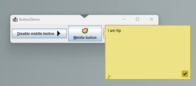
If you want more control over the appearance you should provide an object as argument to tip. E.g. to control the size of the tip window:
Fields.MiddleButton.tip({ text: "I am a tip", width: 150, height: 100 });
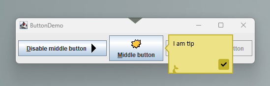
Or to change the color and/or display an icon:
Fields.MiddleButton.tip({
  text: "I am a tip",
  width: 200,
  height: 150,
  color: "MistyRose",
  icon: "BellSolid",
});
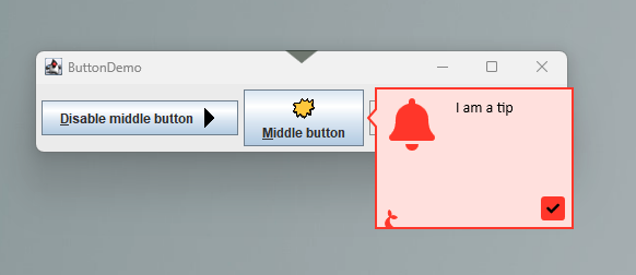
# Markdown
The text displayed in the tip window can be formatted with markdown (opens new window).
Fields.MiddleButton.tip({
  text: "# I am a tip\nWith support for *markdown* in all its **glory**.",
  width: 200,
  height: 150,
  color: "MistyRose",
  icon: "BellSolid",
});
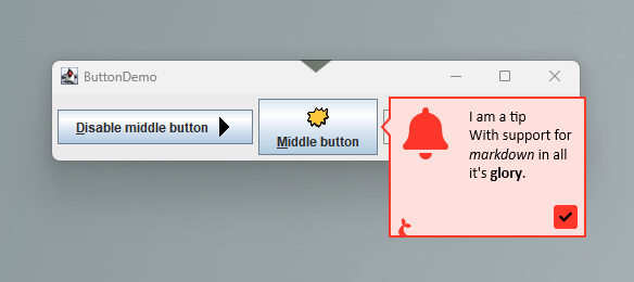
# Placement
Use the pointing property to provide a preferred location of the tip window relative to the Field to which it is anchored. The tip will re-position itself if it extends beyond the screen bounds.
Fields.MiddleButton.tip({
  text: "# I am a tip\nWith support for *markdown* in all its **glory**.",
  width: 200,
  height: 150,
  color: "MistyRose",
  icon: "BellSolid",
  pointing: "right",
});
# Buttons
If you need the user to interact with the field you can set the buttons property.
var t = Fields.MiddleButton.tip({
  text: "# I am a tip\nWith support for *markdown* in all its **glory**.",
  width: 200,
  height: 150,
  color: "MistyRose",
  icon: "BellSolid",
  pointing: "right",
  buttons: [
    {
      value: "OK",
      foregroundColor: "White",
      backgroundColor: "Green",
      isDefault: true,
    },
    { icon: "SadCrySolid", backgroundColor: "Yellow", isCancel: true },
  ],
});

if (t.wait(10000) == "OK") {
  // user clicked ok within 10s
}
Then you can .wait() on the field and the return value from this invocation will give you the button value or null if timed out or the tip was otherwise closed.
# Re-use tips
Tip configurations can be re-used if you e.g. want to display the same information on multiple fields.
var t = Fields.MiddleButton.tip("I am tip");
Fields.DisabledButton.tip(t);
// Update text in both tip windows
t.text = "I am a tip shown twice";
# Tip API
# Properties
text(string) the (markdown) text to displaypointing(string) whether to point the tip on theleft,right,toporbottomside (defaultleftcolor(string) the color to use as background (the text, icon and border colors will adjust automatically) (defaultKhaki) – see Sticky action colorsicon(string) an optional icon to be displayed (default ´None´) – see Sticky action iconswidth(int) the width of the tip windowheight(int) the height of the tip windownoFin(bool) set totrueto hide the Manatee icontimeout(int) how long to show the tip (default30000= 5 min)isVisible(bool) returns whether or not the field is currently visible (cannot be altered)buttons(array) an array of buttons to show, each button can have the following properties:valuethe text to display on the buttoniconan optional icon to showforegroundColorthe color of the text and iconbackgroundColorthe color of the button backgroundisDefaultto provide an emphasis on the buttonisCancelwhich automatically closes the tip when shown
# Methods
closecloses all tip windows displaying this tip
# Notifications
The notifications module makes it possible to display non-interactive notifications.
# Show
Shows a notification.
# Parameter
namethe name of the notification, save this for future update invocationsheaderthe header text to showbodythe body text to showoptionsis an object with the following additional options:severitythe severity of the notification, choose between “INFO”, “WARN” and “ERROR”. Default is “INFO”.timeoutseconds for the notification to show. Default is 30.callbacka javascript function to execute when the user clicks the notification. Default null.embeddefines whether the notification should be embedded in the current application or shown on the desktop (default isfalse= show on desktop)sounda string (one ofasterisk,beep,exclamation,hand,question) which indicates a system sound to play once the notification is shown.boundsOffset(for embedded notifications) an object withx,y,wandhproperties which define the a rectangle inside the current app which will be used to calculate the position of the notificationmarginTop(for embedded notifications) an integer with the top margin for the topmost notification (can be used to move notifications a bit down or up)markdownwhether or not thebodyis formatted using markdown (opens new window) (defaultfalse)
# Example
Show an INFO notification for 30 seconds.
Notification.show("hello", "Seasonal greetings!", "Felice navidad", {});
Show a WARN for 5 seconds.
Notification.show("warn", "Its complicated", "Something broke down", {
  severity: "WARN",
  timeout: 5,
});
Notifications with callbacks.
function RaiseTheAlarm() {
  Notification.show("error", "Oh no!", "You clicked the first notification", {
    severity: "ERROR",
  });
}

// Callback to previously defined function
Notification.show(
  "warn",
  "Its complicated",
  "Something broke down, click here",
  { severity: "WARN", timeout: 5, callback: RaiseTheAlarm },
);

// Callback to anonymous function
Notification.show(
  "warn",
  "Its complicated",
  "Something broke down, click here",
  {
    severity: "WARN",
    timeout: 5,
    callback: function () {
      Log.info("clicked", "Notification was clicked");
    },
  },
);
# A note on boundsOffset
Setting a well-functioning boundsOffset can be tricky and should be done when the placement of the embedded notifications is off (partly outside the window etc). Generally speaking you’d probably only want to set either y or x and w or h. It determines how the boundary for the application is offset to allow us to place the notification. An example;
If no boundsOffset is given then the notification will generally be placed:
┌────────────────────────────────┐
│                          ┌────┐│
│                          └────┘│
│                                │
│                                │
│                                │
│                                │
│                                │
│                                │
│                                │
│                                │
│                                │
│                                │
└────────────────────────────────┘
However the bounds calculation of the window might be off for some reason – often when the window is a custom window that draws its own chrome.
If you’ve set boundsOffset: { y: 10, w: -10 } then a new rectangle will be calculated from the original window where its y position is moved down 10 pixes and its width is made 10 pixels less. This is illustrated below with the inner rectangle and the new placement of the notification:
┌────────────────────────────────┐
├──────────────────────────────┐ │
│                        ┌────┐│ │
│                        └────┘│ │
│                              │ │
│                              │ │
│                              │ │
│                              │ │
│                              │ │
│                              │ │
│                              │ │
│                              │ │
│                              │ │
└──────────────────────────────┴─┘
The best approach for finding a value for boundsOffset is simply to try a few variations and see how the placement of the notification is affected.
# Update
Update the information in an already shown notification.
# Parameter
namethe name of the notificationheaderthe header text to changebodythe body text to changeoptionsis same as for invoking show
# Example
Update the notification named “hello”.
Notification.update("hello", "Seasonal greetings anew!", "Merry Christmas", {});
# Close
Close an open notification. Notifications will automatically be hidden but this can force that action.
# Parameter
namethe name of the notification
# Example
Close the notification named “hello”.
Notification.close("hello");
# Display a Progress
As described in the progress section you can display Progress object in a notification:
var pn = new Progress("My progress");
Notification.progress("Show a Progress", "In a notification", pn);
pn.complete(0.72);
# Tasks
The Tasks module can be used to paralellize parts of a flow. This is useful for e.g. doing concurrent http requests or running background tasks. It is not intended for use with field-operations i.e. interacting with a host applications UI since this interaction cannot be parallelized. Furthermore you should not display dialogs in parallelized tasks as they can block the calling flow.
# Run
Use the run method to start a new task.
# Parameters
funa function to run in parallel
# Returns
- a
Taskobject.
# Example
Run some tasks and wait for the result.
var t = Task.run(
  function() {
    var i = 0;
    while (i<1000) {
      i = i + 1;
    }
    return i;
  });

// Wait for t to complete or 1000ms to elapse
if (t.wait(1000)) {
  // Access the result
  if (t.done && !t.failed) {
    Debug.showDialog("It completed with result="+t.result);
  } else (t.failed) {
    // only access t.error if t.failed == true
    Debug.showDialog("Took too long or errored? "+t.error !== null);
  }
} else {
  // 1 sec elapsed without the task completing
}
Run a task and execute a function when the task is done.
Task.run(...).then(function(result){
  // do something with the result of the task
});
# Wait for all tasks to complete
This is used to wait until all the tasks given as arguments complete or given milliseconds elapse.
# Parameters
tasks- an [array of tasks or javascript functions] to run asynchronously (and then wait for)timeout[int] denoting the max number of milliseconds to wait for the tasks to complete
# Returns
A [bool] indicating wether or not all tasks completed.
# Example
var t = Task.run(function() { ... });
var tasks = [Task.run(function() { ... }), function() { ... }, t];

// Wait for tasks to complete or 1000ms to elapse
if (Task.waitAll(tasks, 1000)) {
  for (var i=0; i<tasks.length; i++) {
    Debug.showDialog("Task "+i+" resulted in "+tasks[i].result);
  }
  Debug.showDialog("It completed!");
} else {
  Debug.showDialog("Took too long");
}
# Wait for any tasks to complete
This is used to wait until one of the tasks given as arguments completes or given milliseconds elapse.
# Parameters
tasks- an [array of tasks or javascript functions] to run asynchronously (and then wait for one of)timeout[int] denoting the max number of milliseconds to wait for any of the task to complete
# Returns
An [int] denoting the index of the first task to complete or -1 if no tasks complete within given deadline.
# Example
var t = Task.run(function() { ... });
var tasks = [Task.run(function() { ... }), function() { ... }, t];

// Wait for tasks to complete or 1000ms to elapse
var idx = Task.waitAny(tasks, 1000);
if(idx > 0) {
  Debug.showDialog("We have a winner: "+idx);
} else {
  Debug.showDialog("Took too long. Everybody lost.");
}
# JavaScript Task
A javascript representation of a .NET task. It has 2 methods; wait(milliseconds) which can be used to wait for the task to complete or the given milliseconds to elapse, whichever comes first and then(func) which can be used to run a function when the task completes.
For an example see the Run method on the Task module.
# Guid
This very simple module provides utility functionality for dealing with globally unique identifiers - aka standardized random strings. Use these if you need to generate a unique file name or unique string in general.
# Get
Returns a new random standard globally unique identifier
# Example
var guid = Guid.get();
# Tables
The tables module provides functionality to read and write information stored on Kwanza and accessible from the configuration interface (Cuesta). It is meant to provide an easy way to add mapping or other types of tabular data to a flow. The UI for managing tables are shown below.
Note that only UTF8 formatted csv files are supported.
# Navigation
Navigating the indvidual cells in the table can be done via the keyboard in a spreadsheet like manner. alt+<arrow-key> will move the focus depending on the arrow-key pressed. The video below shows an example of this (the keys pressed are shown in the bottom left corner of the video).
# Inserting and removing rows
Inserting and deleting rows can also be done via the keyboard. Press ctrl+n to insert a row directly below the currently focused row.
Deleting a row is done via the ctrl+backspace key. It will remove the currently focused row.
# Inserting and removing columns
This is done similarly to adding and removing rows but the cursor must be placed in the column header. ctrl+n adds a new column, while ctrl+backspace removes the current.
# Shortcuts
| Key | Action |
|---|---|
alt+<down-arrow> | Focus cell below |
alt+<up-arrow> | Focus cell above |
alt+<right-arrow> | Focus cell right |
alt+<left-arrow> | Focus cell left |
ctrl+shift+a | Insert new row/column |
ctrl+shift+backspace | Remove row/column |
# Read table as a map
The .map function will parse a table as a map, meaning that it will use a given column as an index. This is mainly useful if there is a column with unique values to use for the index. The returned structure will be a map with the column headers as keys.
# Example
Given the table named foo:
| A | B |
|---|---|
| idx1 | val1 |
| idx2 | val2 |
And the code:
var m = Table.map("foo", "A");
You’ll get the following object back:
{
  'idx1': { 'A': 'idx1', 'B': 'val1' },
  'idx2': { 'A': 'idx2', 'B': 'val2' }
}
Which can then be used in the following manner:
var idx2val = m["idx2"]["B"];
// or if the column names are valid javascript identifiers
var idx1val = m.idx1.B;
# Parameters
name- [string] the name of the table to create a map fromindex- [string] the name of the column to use as an indexoptions- [object] an optional options object which supportsuseCacheto set whether to allow use of a disk-based cache when fetching the table (default istrue)
# Read table as list of rows
The .rows function will return the raw table as a javascript array of arrays.
# Example
Given the table named foo identical to the table from .map and the code:
var m = Table.rows("foo");
You’ll get the following object back:
{
  rows: [
    ["idx1", "val1"],
    ["idx2", "val2"],
  ];
}
Which can then be used in the following manner:
var idx2val = m.rows[1][1];
# Parameters
name- [string] the name of the table to create fromoptions- [object] an optional options object which supportsuseCacheto set whether to allow use of a disk-based cache when fetching the table (default istrue)
# Update the contents of a table
The object returned from both .map and .rows contains a .save function which can be used to write data back to a table.
# Examples
# Update existing entries
Given the table from the previous examples and the code:
var m = Table.rows("foo");
m.rows[0][1] = "newval1";
m.save();
Will change the value of the specified cell and update the table. This also works if .map is used:
var m = Table.map("foo", "A");
m.idx1.A = "newval1";
m.save();
# Add new entries
Adding to a table read by the rows approach:
var m = Table.rows("foo");
m.rows.push(["idx3", "val3"]);
m.save();
This will add a new row with idx3 and val3. When using rows the order of the input elements matter and should match the order of the columns.
The same information can be added when the table is read via the map approach as follows:
var m = Table.map("foo", "A");
m["idx3"] = { A: "idx3", B: "val3" };
m.save();
# Remove entries
Removing a row from a table read by the rows approach is done by removing the corresponding array entry:
var rowToDelete = 0;
var foo = Table.rows("foo");
foo.rows.splice(rowToDelete, 1); // Delete the row w index 0
foo.save();
and the equivalent delete of a entry from a map table:
foo = Table.map("foo", "A");
delete foo["idx1"]; // Delete the entry with key 'idx1'
foo.save();
# Use the contents of a Table as options for a typeahead
This is achieved by calling the selectFrom method on the structure created by the .map function. The selectFrom function takes either a format string or an object with options to generate the content for a typeahead.
var m = Table.map(...);
m.selectFrom('{{someColumn}} some text {{someOtherColumn}}');
Using a format string (above) and an object with options (below).
var m = Table.map(...);
m.selectFrom({
format: '{{someColumn}} some text {{someOtherColumn}}',
minInputLength: 3,
filterMode: 'contains'
});
# Tables as queues
It is possible to use a table as a sort of message queue. To do this use the Array.push, Array.pop as well as Array.unshift and Array.shift methods on a table. These will modify the table which can then be .save()d to the backend. The methods are safe to use concurrently from multiple machines.
var foo = Table.rows("foo");
// Enqueue two items to the table/queue
Array.push(foo, ["idx10", "val10"], ["idx11", "val11"]);
foo.save();
// Now we'll remove them again
var item1 = Array.pop(foo);
var item2 = Array.pop(foo);
foo.save();
// The save is needed to ensure the table has not been modified elsewhere
# Tables as a means to synchronize flows
You can also use Tables as a global synchronization mechanism:
# Update
The update func can be used to check-and-write in one operation. Given the table:
| Name | Age |
|---|---|
| Bill | 42 |
| George | 21 |
You can increment the age of “Bill” like so:
Table.update("ages", function (row) {
if (row[0] == "Bill") return [row[0], row[1] + 1];
});
I.e. you return the updated rows as individual arrays. You can stop the iteration by throwing any kind of error. In the example below we rename the first person we encounter who is older than 20:
var firstUpdate = true;
var updates = Table.update("ages", function (row) {
if (!firstUpdate) throw "stop"; // kind of errors do not matter
if (row[1] > 20) {
firstUpdate = false;
return ["Toby", row[1]];
}
});
The return value is a list of the updated rows.
An optional 3rd options argument may contain:
attemptshow many attempts to update before giving up (default is 10)
# Delete
Deletes any rows for which the func given returns true. E.g.:
var deletes = Table.delete("foo", function (row) {
return row[6] === "123";
});
will atomically delete all rows where the value in column 6 is '123' and return the deleted rows. Throwing an error also stops the iteration here. Like for update the 3rd optional argument may contain an attempts property.
# Wait for a global lock
The Wait.forLock func has been modified to be able to grab a global lock backed by a Table. The first argument is the name of the table and then the global: true option must be set while optionally giving values for:
waithow many seconds to wait to acquire the lock before giving up (default is 10s),holdhow many seconds the lock is maximum held, after this duration any other flow will be able to grab the lock, even if you are still within the critical region (default is 60s)delayseconds to wait between trying to acquire the lock (default is 5s)reasona human readable reason for acquiring the log (will get written to the table so you can see it there)
An example would be;
if (
Wait.forLock(
"foo",
function () {
Wait.forSeconds(10);
},
{ global: true },
)
) {
Notification.show("done", "I had the lock");
} else {
Notification.show("done", "I did not get the lock");
}
Caveats
- If you have a great number of machines competing for e.g. a global lock then you’ll rather quickly run into some of the rate-limiting and throttling mechanisms in Kwanza and you’ll have a hard time getting access to a lock then
- The larger the clock-drift between Manatees the greater the risk of a Manatee grabbing a lock that it had no business grabbing. This is due to the fact that Manatee record a timestamp after which the lock is “automatically” released, and if another Manatee thinks the time is ripe for grabbing a lock it will do so.
# Env
The env module provides some contextual information for flows.
# Username
Get the username for the current user.
# Example
var u = Env.userName;
# Name of machine
Get the name of the machine.
# Example
var m = Env.machineName;
# Domain
Get the domain for the current user.
# Example
var u = Env.userDomain;
# Groups
Get the AD groups for the current user. Includes user name and machine name.
# Example
var groups = Env.userGroups;
groups will now be an array of strings.
# Primary screen
Get information about the primary screen of the local machine.
# Example
var s = Env.primaryScreen;
s will now be an object like so:
// s
{
width: 1024,
height: 768,
primary: true
}
# Screens
Get information about all the screens attached to the local machine.
# Example
var screens = Env.screens;
screens will now be an array of screen objects, like so:
// screens
[
{
width: 1024,
height: 768,
primary: true,
},
{
width: 1280,
height: 1024,
primary: false,
},
];
# Version
Get the Manatee version.
var v = Env.version;
# Branch
Get the branch of Manatee - can indicate whether its a production or testing version for example.
var branch = Env.branch;
# Session type
Get the current type of windows user session. This allows a flow to know the type of user session it is running under.
Returns one of the following values
remotedesktop: The flow is running on a manatee operated through remote desktop clientcitrix: The flow is running on a manatee operated through a citrix clientnormal: The flow is running on a manatee that is operated via a normal local login
if (Env.sessionType !== "normal")
throw Error("Remote automation not supported by this flow!");
# Connected
Returns which services Manatee is connected to.
var c = Env.connected;
// c is e.g. { kwanza: true } if connected to kwanza
# Kwanza
This method returns Kwanza’s about information.
Env.kwanza();
will give you e.g.:
{
"Name": "f5d4e5973c5c-c38suabhjrp000cgmri0",
"Version": "v3.0.3-3-g222c7f9",
"Color": "orange",
"Features": ["user-management"],
"Env": {
"name": "",
"icon": "",
"color": ""
}
}
# Webview runtime info
This property provides information about available WebView2 runtime installations, which are used for embedded Edge browser components such as certain sticky components, input dialogs and the built-in Cuesta window.
var webviewInfo = Env.webviewInfo;
will give you e.g.:
[
{
"path": "C:\\USERS\\LOS\\APPDATA\\ROAMING\\SIRENIA\\MANATEE\\PLUGINS\\KANTPLUGIN\\1.0.0\\Kant\\WebView2",
"version": "103.0.1264.37"
},
{
"path": "system",
"version": "103.0.1264.44"
}
]
Depending on its configuration, Manatee may provide its own webview installation or a plugin might provide it. The entry in the result array with the path system is provided by Microsoft’s own webview installer and is used if no other webview is available.
# Crypto
The Crypto module can be used to encrypt/decrypt secrets and other sensitive information. It can be used together with e.g. the Table module to keep passwords or similar items for use in flows but not visible for other than the intended users.
# Encrypt
Make an encrypted string from the given input and access-scope. Access-scope can be:
Crypto.forUserto allow only the current logged in user to decrypt the information. Decryption may happen on a different machine or using a different application than Manatee, but only the current logged in Windows user will be able to do the decrypt.Crypto.forMachineto only allow users on the current machine to decrypt. Again decrypting is not limited to Manatee - any program on the local machine will be able to decrypt.- a
stringpassword to only allow users who know the supplied password to decrypt the message (min 12 characters). - an
objectdescribing the algorithm and its options, we currently support algorithms:aes-gcmandaes-cbc(see examples below). nullorundefinedor no argument given to make the encrypted string decryptable only by the Manatee application across all users and all machines.
# Examples
// for the current user
var encryptedString = Crypto.encrypt("my secret", Crypto.forUser);
// for the current machine
encryptedString = Crypto.encrypt("my secret", Crypto.forMachine);
// for users with the correct password
encryptedString = Crypto.encrypt("my secret", "password12345678");
// with a specified algorithm and password
var encrypted = Crypto.encrypt("my secret", {
algorithm: "aes-gcm", // or "aes-cbc"
password: "thel0ng3rth3b3tterf0rp455w0rds000000",
});
// for Manatee eyes only
encryptedString = Crypto.encrypt("my secret");
# Decrypt
Take an ecnrypted string and decrypt. Supply it with the same access-scope used when the string was encrypted.
# Examples
// for the current user
var originalString = Crypto.decrypt(encryptedString, Crypto.forUser);
// for the current machine
originalString = Crypto.decrypt(encryptedString, Crypto.forMachine);
// for users with the correct password
originalString = Crypto.decrypt(encryptedString, "password12345678");
// for Manatee eyes only
originalString = Crypto.decrypt(encryptedString);
# HMAC
Generates a HMAC (opens new window) auth code.
var authCode = Crypto.hmac("secret-goes-here", "content-to-sign-goes-here", {
encoding: "UTF8",
algorithm: "HMACSHA256",
base64: true,
});
// or using the defaults; encoding = UTF8, algorithm: HMACSHA256, base64: true
authCode = Crypto.hmac("secret-goes-here", "content-to-sign-goes-here");
The optional arguments are;
encodingwhich determines howsecretandcontentare encoded to bytes and how the resulting code is decoded to a string (unlessbase64=true) – default isUTF8algorithmdetermines the underlying hashing func; options are here (opens new window) – default isHMACSHA256base64whether or not encode the result as Base64 (default istrue)
# Hash
Generates a SHA (opens new window) hash.
var hash = Crypto.hash("content-to-encode", { encoding: "UTF8", algorithm: "SHA1" base64: true });
// or with hexadecimal output
var hex = Crypto.hash("hello", { algorithm: "MD5", hex: true });
// hex is "5d41402abc4b2a76b9719d911017c59"
The optional arguments are;
encodingwhich determines howsecretandcontentare encoded to bytes and how the resulting code is decoded to a string (unlessbase64=true) – default isUTF8algorithmdetermines the underlying hashing func; options are here (opens new window) – default isSHA1base64whether or not encode the result as Base64 (default istrue)hexoption to get a hexadecimal output. Iftruethen we encode the hash as a hex string and return it. The hex option takes precedence overbase64and encoding since it is expected to be used more often.
# Clipboard
The Clipboard module lets you interact with the windows clipboard for programmatic copy and paste purposes.
# Get
Get the current string value of the system clipboard
# Examples
var copyValue = Clipboard.get();
# Set
Sets the current value of the system clipboard to a string. By default, the value is only available for pasting until the flow has ended. If you need to be able to paste the value after the flow has ended, use the persist option as shown below. It is best not to use the persist option when sensitive data is put in the clipboard.
# Examples
Clipboard.set(
"This text can be pasted by the user or by the flow until the flow has finished",
);
Clipboard.set("This text can be pasted even after the flow has finished", {
persist: true,
});
# Clear
Clears the current value of the system clipboard. Useful if the flow needs to temporarily put sensitive data in the clipboard.
# Examples
try {
Clipboard.set("This is not for everyone to see");
Clipboard.paste();
} finally {
Clipboard.clear();
}
# Copy
Carries out a standard copy (Ctrl + c) operation
# Examples
Clipboard.copy();
var copiedValue = Clipboard.get();
# Cut
Carries out a standard cut (Ctrl + x) operation
# Examples
Clipboard.cut();
var cutValue = Clipboard.get();
# Paste
Carries out a standard paste (Ctrl + v) operation
# Examples
Clipboard.set("some text to paste");
Clipboard.paste();
# Desktop
The Desktop module is a Windows 10 only can be used for manipulating virtual desktops and for moving application windows between desktops.
# All
Get a list containing the ids of all virtual desktops.
# Example
var desktops = Desktop.all();
for (var i = 0; i < desktops.length; i++) {
Debug.showDialog("Desktop " + desktops[i]);
}
# Current
Get the id of the current/active virtual desktop.
# Example
var current = Desktop.current();
# Add a new desktop
Will create a new virtual desktop and return its id.
# Example
var d = Desktop.add();
# Moving windows between virtual desktops
The moveWindow, moveWindowRight and moveWindowLeft methods can be used to move a window between virtual desktops.
# Example
// Move the window of the current application to an identified desktop (123)
var success = Desktop.moveWindow("123");
// Move window to the desktop to the right of the current desktop
var idOfDesktopMovedTo = Desktop.moveWindowRight();
// ... same for left
idOfDesktopMovedTo = Desktop.moveWindowLeft();
# Switching between desktops
Use the switchTo, switchRight and switchLeft methods to switch between virtual desktops.
# Example
// Switch to an identified desktop
var idOfDesktopSwitchedTo = Desktop.switchTo("123");
// Switch to a desktop to the left/right of the current
vidOfDesktopSwitchedTo = Desktop.switchLeft();
idOfDesktopSwitchedTo = Desktop.switchRight();
# Html
The Html module can be used to parse and query html formatted files and remote pages. It also contains encoding/decoding helper methods for html.
# Loading data
The methods load and loadFrom can be used to load and parse a html document. They both return a HtmlDoc object which can be used for querying/extracting information.
// Load html from a string
var doc = Html.load("<html><body>Hello, world!</body></html>");
// Load html from an url
doc = Html.loadFrom("http://sirenia.eu");
# Html.encode
Use this method to encode a string to replace unicode characters etc with their html encoded counterparts.
var encoded = Html.encode("1 < 2");
// encoded is now "1 < 2"
# Html.decode
Decode an already html encoded string also includes html5 named entities (opens new window) in the decoding.
var decoded = Html.decode("1 < 2 = Å");
// decoded is now "1 < 2 = Å"
# HtmlDoc
The HtmlDoc object return from Html.load and .loadFrom has two primary methods for querying and extracting information from the html document it represents - the first is via an XPath query and the second is to convert the html to json.
# XPath
The xpath method can be used to query the HtmlDoc with a given XPath (opens new window) query. All innerTexts are html decoded strings.
var d = Html.load("<html><body>Hello</body>");
var body = d.xpath("//body");
Debug.showDialog(body.innerText); // shows "Hello"
# Converting to json
Converting the html to json is done with the .json() method. Each node in the resulting tree of objects has the following properties:
attrsan object containing the attributes of the html nodechildrenis an array of child json nodesinnerTextis a textual representation of the contents of the node (html decoded)tagNameis the name of the original html node
It also has xpath, querySelector and querySelectorAll methods which can be used to query the subtree of the json node as is possible for the HtmlDoc object.
var d = Html.load("<html><body>Hello</body>");
var json = d.json();
Debug.showDialog(json.tagName);
The json() function takes the can also include #text nodes.
var d = Html.load("<html><body>He<br>llo</body>");
var json = d.json({ includeTextNodes: true });
This allows for better reconstruction of the original html using the html() function (perhaps after modifying).
var d = Html.load("<html><body>Hello</body>");
var json = d.json();
// Now we get back get back the original html (if possible)
var html = json.html();
# QuerySelectorAll
Use the querySelectorAll method to query the HtmlDoc using CSS selectors.
// We'll assume we have a `HtmlDoc` object in `d`
var myClassDivs = d.querySelectorAll("div.myClass");
# QuerySelector
The querySelector works similarly to the querySelectorAll except it returns the first hit only.
# Table
The table(...) function can be used to extract js objects from html tables.
Given the table:
<table id="myTable">
<thead>
<tr><td>A</td></tr>
</thead>
<tbody>
<tr><td>100</td></tr>
<tr><td>200</td></tr>
</tbody>
</table>
We can use the table function as follows:
// Assume we have the html already loaded in `d`
var t = d.table("#myTable");
// and now we can query the contents of the table as follows
var firstRowFirstColumn = t[0]["A"];
if the table does not have header information then the function will return a double array.
We can also use an object to pinpoint the header and/or the body of the table. This is useful if we have on our hands a table where the header is one location while the data is somewhere else. This is often the case for scrollable tables.
<table id="myTableHeader">
<thead>
<tr><td>A</td></tr>
</thead>
</table>
<table id="myTableBody">
<tbody>
<tr><td>100</td></tr>
<tr><td>200</td></tr>
</tbody>
</table>
Now do this:
// Assume we have the html already loaded in `d`
var t = d.table(
{
headerAt: "#myTableHeader thead tr th",
rowAt: "#myTableBody tbody tr"
}
);
// and now we can (again) query the contents of the table as follows
var firstRowFirstColumn = t[0]["A"];
The headerSelector needs to point out the individual header elements, typically th elements, while the rowSelector must point out the tr elements in the table.
# Tracer
The Tracer module enables remote (via flows) controlling of the tracer functionality. To enable the UI of the Tracer open the settings for Manatee and search for “Tracer”. When the UI is enabled it will show a small window (notification-style) in which output from the current flow is shown. Output includes which API functions are called, which fields are interacted with etc. The window also holds buttons to pause, resume and step forward in the flow as well as a button to pause and bring up the debug.ger window. By using this module in a flow you can control much of the same functionality.
Note that care should be taken using the Tracer functionality in production flows. It is primarily a developer tool.
# Delay
The delay methods controls how fast your flow is running. By setting a >0 delay you can slow down your flow.
# Example
// Delay each flow "step" 1s
Tracer.delay(1000);
# Pause
Allows you to pause the flow. Resuming can only be done in the flow-tracer UI.
# Example
Tracer.pause();
# Resume
Resume a paused flow. Be aware that you can only resume a flow using this method if it is running asynchronously.
# Example
Tracer.resume();
# Message
Show a message in the Tracer UI.
Tracer.msg("Hello from a flow");
# Manatee
The Manatee module allows flows to shutdown and restart Manatee itself.
# Shutdown
This shuts down Manatee. Use with caution - especially when running the flow on many machines at once as there is no easy way to reverse such an action. The shutdown occurs after the flow has completed. For immediate (mid-flow) shutdown, pass true as an argument. Note that this is not a good way to abort a flow.
# Example
Manatee.shutdown();
# Restart
This restarts Manatee. The restart occurs after the flow has completed. For immediate (mid-flow) restart, pass true as an argument.
# Example
Manatee.restart(true);
# HL7
The HL7 module can be used to parse content in the hats-and-pipes format and get JSON back.
# Parse
The parse(...) method takes an HL7 message (as a string) and returns an object as a Javascript representation of the message. For an idea of the structure you can consult a tool like http://hl7.eu/refactored/seg.html.
# Example
// Read the hl7Message from e.g. a file
var hl7Object = HL7.parse(hl7Message);
// Access the first-name of the patient (if available)
// See http://hl7.eu/refactored/segPID.html#108 and http://hl7.eu/refactored/dtXPN.html
var firstName = hl7Object["PID"][0]["5"]["1"];
# Plugins and modules
A plugin is a component that can be started and stopped and may provide some functionality while it is running. An example is the Sectra plugin which interfaces with the Sectra application and provides a bridge between its built-in context manager and the context manager embedded in Manatee.
A module is a component that provides an API for use in flows.
The Plugin module can be used to dynamically load extra functionality in the form of modules and customized context-participants or new and customized application types. The Module module has similar functionality but for modules that provide an API for use in flows.
Generally additional modules comes in two flavours; those that must simply be loaded (new modules for the Javascript runtime and new context-participants) and those requiring configuration and which may be active and runnable.
# Loading a plugin
You need to know the name and version of a plugin to load it.
Plugin.load("MyPlugin", "v1.0.0");
// Assuming MyPlugin contains a module called MyModule, you can now do something like:
MyModule.doSomething("foo", 1000);
Note that MyPlugin and MyModule are simply examples and the above snippet will fail because the plugin and module do not exist.
# Starting and configuring a plugin
// Note: Only one instance of each plugin identified by its name and version are allowed
Plugin.start("MyPlugin", "v1.0.0", { ConfParam1: "foo", ConfParam2: 100 });
The plugin should now be started and its functionality activated - whatever that may be.
# Stop a running plugin
Deactivates the plugin and its functionality.
Plugin.stop("MyPlugin", "v1.0.0");
# Check the status of a plugin
var s = Plugin.status("MyPlugin", "v1.0.0");
// if the plugin is runnable then it will have a `state` property
// which will be either "STOPPED" or "RUNNING"
Debug.ger(s.state);
// it will also contain its configuration
Debug.ger(s.configuration);
# Loading a module
A Module can be loaded like:
var foo = Module.load("foo", { version: "v1.0.0" });
// and now you can use the functionality provided by "foo"
var bar = foo.bar();
The 2nd argument containing the version is actually optional. If omitted you’ll get the latest version downloaded or if no module has been downloaded then the latest version published.
# Unloading a module
You can actively unload a module if you do not need it anymore:
Module.unload("foo", { version: "v1.0.0" });
# List modules
If you want to see which modules are globally available you can do:
var modules = Module.list(Module.GLOBALSCOPE);
This will give you a list of all modules either already downloaded or available for download. If you just want the modules already downloaded, then you can do:
var downloadedModules = Module.list(Module.LOCALSCOPE);
# Extract
The Extract module can be used to extract meta-data and textual content from a variety of files (opens new window).
Needs a backend service
In order for the Extract module to function you need to have a backend service running which does the heavy lifting. Contact us for instructions on how to set this up.
# Extract text
# Arguments
inputis either a singlestring, a singleFilePathobject, an array of strings (paths to files) or an array ofFilePathobjects (see theFsmodule) from which to extract meta-data and textual content.optionsis an optional argument which may contain:extractEmbeddedboolean (defaultfalse) to indicate whether we need to extract embedded images or the like first before trying to extract info from the file. If a PDF is scanned for instance, then the content consists of one or more images which must be extracted first (and then you need to set this option totrue).deadlineInSecondsis the number of seconds to wait for the processing of files to complete (default is30).
# Return value
The returned value is either an array of results or a single result. If the input argument is a single entity (string or FilePath) and the extractEmbedded argument has its default value then you’ll get a single object returned with the text extraction result. If not (you’ve supplied an array is input or extractEmbedded is set to true then you’ll get back an object/map of results with the keys of the map set to the file-names given as input. The extractEmbedded may extract multiple files from the given document(s) therefore the return value type is an array.
# Examples
var r = Extract.text("C:\\Users\\MrRobot\\Documents\\SomeFile.pdf");
Dialog.info("Extracted from " + r.title, r.text);
// Other properties are available, run e.g. `Debug.ger(r)` to see all
Or use a PDF file with embedded/scanned images:
var r = Extract.text("C:\\Users\\MrRobot\\Documents\\SomeFile.pdf", {
extractEmbedded: true,
});
Dialog.info(
"Extracted from " + r["Embbededfile01"].title,
r["Embbededfile01"].text,
);
// Other properties are available, run e.g. `Debug.ger(r)` to see all as well as the keys/names of the embedded files
// You can also iterate the embbeded results;
var embeddedFileNames = Object.keys(r);
for (var i = 0; i < embeddedFileNames.length; i++) {
Log.info(
"Embbeded file is called " +
embeddedFileNames[i] +
" and has text: " +
r[embeddedFileNames[i]].text,
);
}
You can supply multiple files:
var r = Extract.text([
"C:\\Users\\MrRobot\\Documents\\SomeFile.pdf",
"C:\\Users\\MrRobot\\Documents\\SomeOtherFile.pdf",
]);
// In this case you need to find the results for one of the files
// and you need the filename for that.
Dialog.info(
"Extracted from " + r["SomeOtherFile"].title,
r["SomeOtherFile"].text,
);
You can also use the output of Fs.ls:
var r = Extract.text(Fs.ls("C:\\Users\\MrRobot\\Documents\\*.pdf"));
# Extract html
Extract html works in a similar fashion as text-extraction but tries to render the document given as html. You can therefore (in some cases) use it to reason about positional properties of the elements in the document. The signature of the html method is identical to the text method. The method returns an HtmlDoc object which can be queries using XPath and CSS selectors.
# Examples
var r = Extract.html("C:\\Users\\MrRobot\\Documents\\SomeFile.pdf");
// `r` will contain a `html` object that represents the document rendered (best-effort) as HTML
Debug.ger(r);
# Extract tabular data
The tables method can be used to extract tabular data from non-scanned PDF files only. It will try to locate tables and return their contents as CSV formatted texts.
# Arguments
filesis an array of strings (paths to files) or FilePath objects (see theFsmodule) from which to tables.optionsis an optional argument which may contain:tableDetectionViais a string which determines how tables are detected. Use"stream"to find tables which are defined by the alignment and spacing of columns and rows and"lattice"to search for tables which are defined with vertical and horizontal lines. Default is"lattice".deadlineInSecondsis the number of seconds to wait for the processing of files to complete (default is30).- All the same options as
Csv.parsewhich are used when parsing the csv generated.
# Examples
var r = Extract.tables([
"C:\\Users\\MrRobot\\Documents\\SomeFileContainingTables.pdf",
]);
Debug.ger(r);
# Extends
The Extends module is useful for inlined hub published flows only and makes it possible to define extension points in strategical locations throughout the flow. When publishing the flow it is annotated with the extension points and these annotations are then used to provide a configuration UI when the flow is downloaded from the hub. Here the consumer of the flow can specify the inputs to these extensions which are then used when the flow is run in Manatee.
An example is the Extends.withString method. If you create a flow with the following content;
var greeting = Extends.withString("greet");
Dialog.info(greeting + "!", "...", {});
When you then publish this an inlined flow then you can provide info and directions for the consumer of the published flow wrt how to configure this extension point. E.g.:
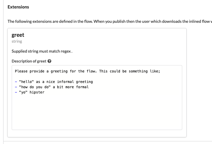
Once the flow is downloaded from the hub then it may configured as follows:
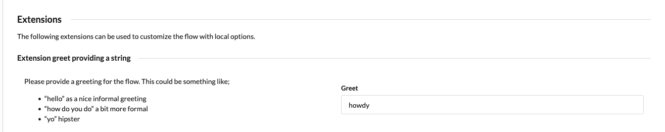
and when run the flow will display an info dialog with the “howdy!” title.
The following extension methods are implemented:
# String
Extends.withString(name, regex) can be used to allow the consumer of the published flow to provide a string matching a regex.
// Only allow greetings starting with "h"
var greeting = Extends.withString("greet", "h.*");
Dialog.info(greeting + "!", "...", {});
# Selection
Extends.withSelection(name, options) will let the consumer choose an item from the given options list. It returns the selected option as a string.
var greeting = Extends.withSelection("greet", ["hi", "hello", "howdy"]);
Dialog.info(greeting + "!", "...", {});
# Flow
Extends.withFlow(name, inputs) lets the consumer specify a flow to be run with the given inputs (only flows that have a matching input set can be selected). The output from the flow is returned.
// Run the selected flow giving it the `{"foo": "bar"}` input.
var result = Extends.withFlow("f", { foo: "bar" });
# Field
Extends.withField(name) lets the consumer select a field.
var f = Extends.withField("f");
f.click();
# Tables
Usages of table methods e.g. Table.map/row in a published inlined flow lets the consumer select a table to be used instead of the one specified. If no table is selected when the flow is downloaded then the original table specified is used (if it exists).
// table "foo" is used if the consumer have not selected to override this with a local table
var t = Table.map("foo", ...);
← User guide Audio →